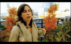
Adventures in the PSE

To Color Grade or to Not???

To Color Grade or to Not???

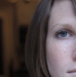
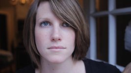
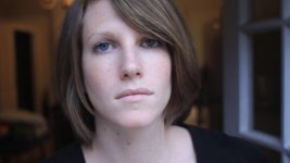
Working in low contrast light, I compared several different picture styles, as seen above. Below, is a comparison between cinestyle (new fave of flat crowd), and a more contrasty profile (in this case R303).

Cinestyle is graded to match the apparent contrast of the ungraded picture style.

The ungraded R303 won this round for me. It has more gradation which gives a more believable image. However, I was quite impressed with how well the Cinestyle image held up. I would not hesitate to use it for any dslr project. Upon closer examination of the Cinestyle grade, one will find bigger "steppy" artifact blocks in the background, and a slightly more plastic-like fakeness to the subjects complexion. (Go to flickr images for best reference)

Cinestyle Color Graded crop
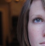
CinestyleCCvsR303grade_100crop_CCCinestyle.jpg

R303 crop
CinestyleCCvsR303grade_100crop_r303con1.jpg

Cinestyle Color Graded
R303vsCCCinestyle06.jpg

R303 ungraded
R303vsCCCinestyle01.jpg


CONCLUSION:
The advantages of having 'more' color correcting options in post will still appeal to many, and this test shouldn't discourage users from Cinestyle, Marvel, or Crooked Path picture styles. But at least this test shows that, in this case there is no advantage to using a flat picture.
 
Last edited:
Reverse Color Grading, Just for Kicks

For the fun of it, I reverse graded the R303 to mimic the flat profile, and found the results to be similar.

6376010147_316e598ee0_b.jpg

6376009887_7fd149e7aa_b.jpg


(color correction done in Adobe Premiere CS5.5, using RGB curves on H.264 footage, and than captured as jpeg image via timeline option.)

Compression artifacts are more prominent in the darkest areas of the picture with the R303 picture style. (fun fact: her shirt looks that way, it isn't just compression blocks, go to flickr to see RAW still picture.)
 
Last edited:
GRADING with CURVES can cause BANDING

Be careful, when grading with curves, as they can easily emphasize banding anomalies in footage.

on the flip side...

Skillful use of curves can also reduce the look of banding.

(this is outside the scope of this discussion. moving on...)
 
Last edited:
Picture Styles in Sets?

Picture styles typically do one thing well, and have drawbacks in other areas. It is nice to have a FLAT, NEUTRAL, and contrasty FINISHED picture styles. How exciting would it be if they actually matched???

FLAT: Draws out some extra shadow detail
NEUTRAL: A naturalistic look, that has flexibility.
FINISHED: Get lush images straight from the camera, speedy turn arounds.

I've created a set to cover all areas, and based them all on the same color palette*, so they share matching characteristics, and easier to match in post.


Refer to the first page for most recent updates....
-----------------------------------------------------------------------------------------------------------------------------------------------------
R303 SERIES (beta):
Flat:
http://dl.dropbox.com/u/37533131/R3_c0701L.pf2
Neutral:
http://dl.dropbox.com/u/37533131/R303L.pf2 (cool shade, maintains skin warmth in cool light.)
http://dl.dropbox.com/u/37533131/R3_0701L.pf2 (sunlight, all purpose)
http://dl.dropbox.com/u/37533131/IN_0701L.pf2 (works well under warm incandescent light, counteracts orange excess, different color palette than R303, same curve)
Finished:
http://dl.dropbox.com/u/37533131/R303_s0723L.pf2

*R303_s0723L has slightly more saturated blue. For users that want an exact match, replace it with: http://dl.dropbox.com/u/37533131/R3_s0701L.pf2

-------------------------------------------------------------------------------------------------------------------------------------------------------------


It will be interesting to see what others come up with.
 
Last edited:
Thanks a lot James for your work, I have been using your " Finished " picture style as I want something good straight out of the box and I like it !!
 
Thanks a lot James for your work, I have been using your " Finished " picture style as I want something good straight out of the box and I like it !!

Thank you! I tried to keep the colors somewhat natural, yet have that added smooth contrast which makes colors pop a bit.

And welcome to DVXuser! =)
 
Last edited:
Okay, I have been working on a flat cine log style. Flat styles are the most difficult for the PSE to make, because the black and white points are essentially anchored, unless you are adding contrast, but that's already been covered. Here are some screen grabs from the PSE, and how the different profiles are approximated (not actual video, RAW in PSE, with different profiles applied)

6391673445_b73539a579_b.jpg


6391673107_82ded94124_b.jpg


6391672849_2608ab2507_b.jpg
 
Last edited:
Marvelous?

Marvelous?

MARVELOUS TANGENT

I have stayed away from flat picture styles after months of finding them just not worth the hassle, as quality improvements just didn't stack up. That is not to say others don't use them to create some great imagery, it was just my personal taste. Also, the PSE does not allow the change of absolute black, which if lightened, can get better compression detail in the shadows, and reduce contrast while preserving the mid range gradation.

Testing the Marvel 3.4 and Cinestyle, I have been quite impressed. They both do quite well. I like them both. The marvel has a curve that is achievable in PSE, and Cinestyle is definitely impossible to replicate in PSE (there is a way, but the trade off is over exposing, not worth it.)

Reading the Marvel site today, I saw a message I overlooked before:
"UPDATE: Warning to all users of the Technicolor Cinema-style flat-profile! Using the Technicolor style will severely limit your dynamic range! Blacks are lifted and whites are crushed! With only 255 values between black and white for each color, snooping 10% off at both sides is simple “DR theft”! You remove another 10% of DR when using the Technicolor LUT (via LutBuddy); that’s probably two stops total!" - Marvel

I do not agree with Marvels criticism of technicolor
It's true that a default LUT can cut off 10% of the perceptible DR in a final image. But this is true of ALL general LUT's. To preserve maximum detail in a shot, each clip has to be custom adjusted. Marvel's criticism of Technicolor on raising the black levels is a bit misleading too. The black levels are raised, and therefore technically reducing DR, but effectively increasing shadow detail, which will be stretched back out in post. The plus is much more shadow detail is preserved, and compression artifacts reduced. So, you don't really lose that much if any effective DR compared to Marvel or any other picture style, but you do gain post color grading possibilities. I do not see why Marvel is threatened by Cinestyle, or feel the need to use misleading terms like "DR theft", as both are giving their profiles for free.

What does Jorgen consider DR theft?
6402267295_12f911e028_b.jpg

flat compare

Don't take my word for it, Here is Marvel 3.3 and Cinestyle together:
http://vimeo.com/32331462
 
Last edited:
James, I used the Finished R303 PS for some shooting I did over the Thanksgiving holiday and was really pleased with the results. Will post here as soon as I can.
 
James, I used the Finished R303 PS for some shooting I did over the Thanksgiving holiday and was really pleased with the results. Will post here as soon as I can.

Thanks Gary! I really look forward to it!
 
Last edited:
When I first started this thread, I assumed that Nikon, Canon, and Red would be introducing new products in the sub $12K range this year. It made me wonder whether I should even bother with this thread, but I am glad I did, because as of this year end's announcements, there has been no real replacement to the gen1 canon dslr's. Which means picture styles may actually be important for longer than I had thought.

So, hopefully picture styles are helping canon users out there, and hopefully some others are making their own to share.

I appreciate everyone that has got involved with this thread and the many that have emailed or PM'd me. It is an honor talking to you guys!
 
Last edited:
Curve Designing in PSE

When designing a curve in PSE, do not waste your time with a generic perfectly balance S-curve. The in camera settings already do this. Instead, create a subtle curve that produces an image characteristic that you desire.
 
When I first started this thread, I assumed that Nikon, Canon, and Red would be introducing new products in the sub $12K range this year. It made me wonder whether I should even bother with this thread, but I am glad I did, because as of this year end's announcements, there has been no real replacement to the gen1 canon dslr's. Which means picture styles may actually be important for longer than I had thought.

Well, DSLRs will always have their place, but you may have to switch focus on the picture styles to helping the cameras better match their bigger brethren like the Scarlet/C300/F3.
 
This was shot with the R303 Series (beta) Finished PS on a Canon 60D with EF-S lenses (the 18-55 and the 55-200) and Tiffen ND filters. No color correction save for one shot that was a CU of a wide just to help it match.


Password: fall
 
Wow, spectacular! Gorgeous scenery. Just a few weeks ago, I went through Tenesse and on into Austin, TX. Wish I could've had some time to enjoy their natural beauty other than from a car.
 
I saw a video posted about working with the PSE. It is in German, otherwise I would post it. It looked to have some very good info, but I noticed that the instructor was applying a very perfectly balanced S-curve to add contrast. This is nearly a complete waste of time, because you will get the same effect using the in-camera settings. Same goes for the inverted S-curve when making flat profiles. Using a perfect 50-50 inverted S-curve to make a flat profile will kill your mid-tones if you are just going to be adding the -4 contrast in-camera.

The camera settings are a given, so use the PSE to change the character of the image.

Below are some extreme examples, just to show what I mean.....


Using a picture I have used already because we are familiar with it.
6431885957_8ca6abfd69.jpg


6432071861_a88a593ebf.jpg


6431886997_ac553f56d7.jpg


6432044867_625d6e3615.jpg


6431888025_405ed9f968.jpg


6432081511_4e44520fef.jpg
 
Last edited:
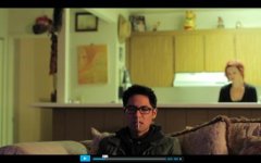
Another bad combo of compression and flat profiles?
Screen Shot 2011-11-28 at 5.42.17 PM.jpg
6432892471_ce3f01dfbf_z.jpg


this is a highly compressed video short from the BBC or some news website.


I am not against flat profiles, I just believe that they are not always the best choice, and they do not make up for bad use of lighting or bad white balance.

Factoring in exactly how compressed your image is going to be is not always an option, so perhaps this all is moot(American English use).
 
Last edited:
Back
Top