Adventures in the PSE

G

Guest

Guest
Canon Picture Styles
An in-depth look at using Canon's Picture Style Editor (PSE), and comparing picture styles.

(Be sure to visit often, and check the last page, as I regularly update.)


--------------------------------------------------------------------------------------------------------------------------------------------------------------------
Before I go any further, let me make some honorable mentions to those that have created or popularized the most influential picture styles of dslr shooting:

Stu Maschwitz (in camera flat Neutral 0,-4,-4,0 and 0,-4,-2,0) originated the idea of in camera flat neutral.
http://prolost.com/

Shane Hurlbut (0 sharpness and flat, helped popularize Stu's settings, now uses Cinestyle by Technicolor)
http://hurlblog.com/

Philip Bloom (in camera flat, Neutral 0,-4,-4,0) (Helped popularize Stu's in camera settings. I believe he now uses Neutral 0,-4,-2,0, as -4 saturation was too much)
http://philipbloom.net/

Martin Beek/Jorgen (Marvel Cine custom styles)
http://marvelsfilm.wordpress.com/201...or-canon-dslr/

Technicolor (cinestyle)
http://www.technicolor.com/en/hi/cin...ghts/cinestyle


Luka (picture style tutorial)
http://vimeo.com/7256322

Flaat
http://www.similaar.com/foto/flaat-picture-styles/

Dvxuser's own Sam H... with Flaat, and Roy with his black point alteration. And JCS's filmic skin ($50 purchase):
https://brightland.com/w/downloads/filmic-skin-pictures-styles-for-canon-dslrs/


I want to thank them for putting in the hard work and effort to perfect their own views on how to get the most from a dslr, and sharing that information freely. They are forerunners. There are many who have contributed, but few who have made as huge an impact in the picture style arena.

--------------------------------------------------------------------------------------------------------------------

64 picture styles tested: http://www.dvxuser.com/V6/showthrea...stom-Picture-Styles-quot-Tested-Part-I-II-III

other picture styles:
CRC series
Film by Sumit Agarwal
http://www.youtube.com/watch?v=3z-aMaaM2W0
R. Crook (custom flat style that helps prevent banding): http://crookedpathfilms.com/blog/
Gavin Films: http://gavinfilms.com/filmprofile/Giles_Film.pf2
Genesis Panalog
 
Last edited:
Here are listed some links to custom profiles...
Abunch here...
https://www.dropbox.com/sh/lsg8kt6vkhqop6j/uamZWyYhHy


Check out flaat, http://www.similaar.com/foto/flaat-picture-styles/index.html
Flaat was created by Sam H, and he frequents here at DVXuser.

My current favorite pic style: http://dl.dropbox.com/u/37533131/R3_0701L.pf2

R303 now has a complete set of FLAT, NEUTRAL, and FINISHED picture styles, which all use the same color recipe, and are therefore compatible:

------------------------------------------------------------------------------------------------------------------------------------------------------------------------
R303 SERIES (beta): (updated 11/26/2011)
Flat:
http://dl.dropbox.com/u/37533131/R3_c0701L.pf2
Neutral:
http://dl.dropbox.com/u/37533131/R303L.pf2 (cool shade, preserves warmth in skintones under cool light)
http://dl.dropbox.com/u/37533131/R3_0701L.pf2 (sunlight, all purpose)
http://dl.dropbox.com/u/37533131/IN_0701L.pf2 (incandescent light, different color palette, same curve)
Finished:
http://dl.dropbox.com/u/37533131/R303_s0723L.pf2

*R303_s0723L has slightly more saturated blue. For users that want an exact match, replace it with: http://dl.dropbox.com/u/37533131/R3_s0701L.pf2
------------------------------------------------------------------------------------------------------------------------------------------------------------------------
R3_s0701L characteristics
------------------------------------------------------------------------------------------------------------------------------------------------------------------------


Cinema look, no cc necessary: http://dl.dropbox.com/u/37533131/Cinema1L.pf2 (beta)

This video uses magic lantern as well as cinema1L.pf2 and Vision_beta01L.pf2:
http://vimeo.com/32206812
Video by Amjad


Here is the picture style I started for reason of using as examples in this thread. Two versions, same basic recipe.

http://dl.dropbox.com/u/37533131/Vision_beta01L.pf2 (V1 colors are more naturalistic and unhyped)....

http://dl.dropbox.com/u/37533131/Vision2_betaL.pf2 (V2 saturated colors are more beautiful and hyped)

Download it and try it out for now, and I will get back here in a few days and talk more about the PSE.


Some differences will be in the curve and the amount of saturation or desaturation in certain colors due to me not having a copy of the picture style from which to make direct comparisons. I also put a cap on how saturated a color can get, so there will not be random electric colors. The saturation is more neutral, so you can leave saturation at normal, or really desaturate it by going down to -4. But in essence it is similar. Some things may be better and others maybe not.
 
Last edited:
PSE, the basics:

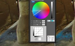
PSEinterface.jpg

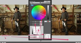
Above is the basic interface options and layout for the Canon Picture Style Editor (PSE). The tool palette is a floating window which you can move around. The main window displays the RAW image you have chosen to use as you adjust your new picture style.


(Lion OSX users beware. You can use the PSE on your system to make a picture style, but the application used to upload the picture styles onto your camera EOS utility may not work. The most current version EOS utility is not compatible with Lion. That means if you have a 60D or a T3i, you will not be able to upload a picture style onto your camera.)
 
Last edited:
The PSE is made to make very broad and very minor changes to how your camera replicates colors and shades.

-The colors are altered by selecting the 'dropper' tool, and using it to click the area anywhere that has the color you wish to change, and then use the adjustment sliders to effect hue, saturation, and lightness.
-The shades are controlled by the curves line in the square box. (sorry photoshop users, the curve control in this application does not play the same way. You'll see)

While that is about it, the actual making the thing work for you has a bit of a learning curve.
 
COLORS


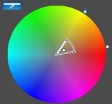
The eye dropper tool is used to select the color you want to change. A dot on the color wheel represents your selection. Changes made in the sliders below will effect that color, yes, but changes in hue, saturation, and lightness don't only change that color, they effect all of the colors within the wedge shaped border around the dot. You have to adjust the size of the wedge by grabbing the border and dragging it.


Colors can only be influenced by the color next to it. Blue can be turned into Green, but then you lose Cyan.

The wedge border around your selection is a hard edge, no feather. If you make extreme adjustments this hard edge becomes apparent.

hard_edge.jpg

In this example, Cyan has been selected from the grease stain, and then made highly saturated. However, every hue that is not Cyan, is left unsaturated. (Upon reviewing the image after i posted this, the jpeg compression has softened the hard edge between the saturated and unsaturated bits in the image. sorry)
 
Last edited:
Fun fact, here is where the skin tones live for every person on earth. We are all one race! =)

skintones.jpg
 
Curves in the PSE are an unwieldy thing, but it is easy enough to figure out. If you are used to the pliable curves in photoshop, you may get freaked out by these, at first.

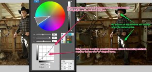
If you don't know what curves are, basically you make a dot on the diagonal line in the box, and drag it in the direction you want to make lighting adjustments. Up and to the left is lighter, Down and to the right is darker. Each node adjustment is effected by the others. If you move one, it will cause the line to pivot around the next node in line.
 
In the custom examples above, a custom profile I made to mimic the John Hope cinema picture style was applied. I will potentially post test videos, but I would rather you guys download it and try it your self. Here is the link again if you want to try it out:

http://dl.dropbox.com/u/37533131/Vision_beta01L.pf2

If you have any issues with it, I can always tweak it. I may add some saturation to some of the colors.

For a hyped beautiful look using a different recipe:

http://dl.dropbox.com/u/37533131/Cinema1L.pf2
 
Last edited:
Anyway, I hope that in this thread, you will see how inexact and broad brushed the PSE is. It is useful, but words like "Colorimetry" don't exactly mean too much here. Yes, you can dial in some exact numbers and color values, but the tool is not going to let you be exact in the overall execution.
 
Last edited:
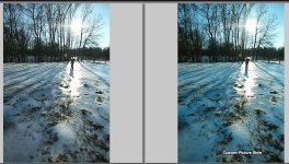
I've tried your picture style and the cinema style - not too similar. I found yours to be much closer to the Standard Picture Style than the Cinema Picture Style. Still relatively nice in its own way though. But I think for now I prefer the Cinema Style.
 
I've tried your picture style and the cinema style - not too similar. I found yours to be much closer to the Standard Picture Style than the Cinema Picture Style. Still relatively nice in its own way though. But I think for now I prefer the Cinema Style.

Thank you so much, gunnafan! Neat, to see people comparing the two styles.

Yes, I am a pretty reserved person, i think my way of doing things is less extreme, and I tend not to go-all-out. Some of the things I didn't like about cinemaPS was the electric saturated colors, but then maybe others do. After using Vision_beta a few times, I realized it was maybe too subtle to get an immediate reaction. It, at times, also requires a cooler white balance to really bring out the Cyan, and has a less extreme curve than cinema. Again, I am not trying to replicate anything, but providing alternatives. Especially, for students.


Here is a more vibrant version using an almost completely different recipe:
Cinema1 picture style:
http://dl.dropbox.com/u/37533131/Cinema1L.pf2

Use the saturation slider on the in-camera settings menu to dial in your desired amount of color. I have tried to keep the saturation as close to the middle as possible, so the user has the option to saturate or desaturate right in the camera.


My main aim is to create options. I am not trying to copy cinema. I do not even particularly like it, nor agree with the methodology used to create it. If someone were to ask me to create a replica of cinema, than they will need to send me a copy of the cinema.pf2 file, and I would make a copy for that individual so they can share it with their friends. But it is a digital file, and replicating is unnecessary, as you can already easily share it with whomever on a personal level. But there are a lot of other picture style options out there, whether you download or create. It's a shame to get all caught up with just a hand full, that would be a tragedy for cinematography.
 
Last edited:
Edit 2014 (this is not an accurate explanation, but rather an anecdotal one)

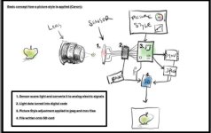
This is how a picture style is applied to an image.
This is a non-scientific explanation. =)

HowPScanon.jpg

This is to illustrate that when you are working with a RAW in the PSE, it is essentially you working with much more of the data straight off the sensor. It does keep a picture profile, but not baked in like in a more compressed format such as jpeg or h.264

ISO and WHITE BALANCE DO EFFECT your RAW image in the PSE. Make sure the white balance is where you want it before you start working on an image, as this effects your colors tremendously.


When you work with the curves adjustment tool, you are effecting how the camera interprets the RAW data. Changing the curve will change the lightness and sometimes saturation of only the image information that is already there. You are not changing the exposure. If the camera clips or blows out, you cannot apply an S-log, or flat-curve, or "subtractive-curve", or anything else to prevent it from clipping. Always expose properly. PICTURE STYLES DO NOT "SAVE" you from bad exposure. And THEY DO NOT EXTEND DYNAMIC RANGE.
 
Last edited:
Why do people shoot with flat picture styles, then? In brief..... it is a long story.


A "Flat" or "log" color profile is mainly used when shooting to a compressed format, everything from h.264 to prores.
 
Last edited:
Back
Top