
Navigation
Install the app
How to install the app on iOS
Follow along with the video below to see how to install our site as a web app on your home screen.
Note: This feature may not be available in some browsers.
More options
You are using an out of date browser. It may not display this or other websites correctly.
You should upgrade or use an alternative browser.
You should upgrade or use an alternative browser.

G
Guest
Guest
Here is an example of how the flat picture styles create a weird effect:
I can only assume that they want an effect look to the footage. It doesn't look natural, but seems like some quality crew working on this. The effect is not bad, I kind of like it, but it is definitely not natural looking. Almost that cheesy HDR look.
I can only assume that they want an effect look to the footage. It doesn't look natural, but seems like some quality crew working on this. The effect is not bad, I kind of like it, but it is definitely not natural looking. Almost that cheesy HDR look.
I don't like that orange / green cast that many call cinematic. That is the perfect example. All the blues have a green tinge and all the warm colors go orange or peach. Almost like all the true colors are tinted pastels. Definitely not my style, but obviously what I like is not very popular these days 
Cheers,
Pete
Cheers,
Pete
G
Guest
Guest
I also am not partial to these kinds of slow talk 'inspirational-music' videos. Too many of them used in advertising, or just someone trying to be deep. You can hear and see it coming from a mile away: "We are.... the generation... to take back..... our _____(insert-word or phrase)______________...." or "We stand.... because we hope..... we hope..... because we are________."I don't like that orange / green cast that many call cinematic. That is the perfect example. All the blues have a green tinge and all the warm colors go orange or peach. Almost like all the true colors are tinted pastels. Definitely not my style, but obviously what I like is not very popular these days
Cheers,
Pete
G
Guest
Guest
You've hit the nail on the head. I like good color palettes in cinematography, but dislike the unnatural forced ones.I don't like that orange / green cast that many call cinematic. That is the perfect example. All the blues have a green tinge and all the warm colors go orange or peach. Almost like all the true colors are tinted pastels. Definitely not my style, but obviously what I like is not very popular these days
Cheers,
Pete
Last edited:

Samuel H
Major Contributor
it has some images that I like (guy in front of window at 0:28, machines at 0:41, guy running at 4:30), but also many that seem way too muted (e.g. machines at 0:46), that seem to have the white balance way off (e.g. kids at 2:58 and 3:40), or that seem artificially colored (magenta man at 1:35)
also: I wouldn't call this "teal and orange", because they're rarely on screen at the same time: it's "teal or orange", and that succession of swinging color palettes is what bothered me most (now white balance is too cold and everything looks orange, now it's too hot and everything looks blue, now orange again...)
also: I wouldn't call this "teal and orange", because they're rarely on screen at the same time: it's "teal or orange", and that succession of swinging color palettes is what bothered me most (now white balance is too cold and everything looks orange, now it's too hot and everything looks blue, now orange again...)
G
Guest
Guest
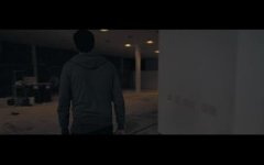
Though very slight, the greys and shadows have a slight cooling and saturating grade on them. It is almost monotone, but has a subtle two tone teal/orange palette going on.
But I agree with everything else you said. also, one dvx user has an awesome looking shot using your ps. I can't wait to see the graded version.
Samuel H
Major Contributor
@James: well, that would be "orange and nothing" in my book, but yes, there's some blue somewhere in those shadows...
btw: I'm not saying it's "that bad"
I was asked to critique it, and that's what I did; it's high quality, clearly a lot of effort went into it, and it shows; but it's not perfect, and the swinging white balance is what bothered me most about its image, that's all
in fact, I'm very aware I souldn't be too hard on others... right now I'm cutting a short I shot a few weeks back, and it's going to be absolutely awful: the image is nice (shot using Flaat, of course), but the acting is... well, better not say much about it... suffice it to say I shouldn't be too hard on others given what I'm working on right now
RE: the other Flaat short: yes, I've seen the little screengrab, I'm eagerly awaiting for his comments about working in post with footage shot with Flaat
btw: I'm not saying it's "that bad"
I was asked to critique it, and that's what I did; it's high quality, clearly a lot of effort went into it, and it shows; but it's not perfect, and the swinging white balance is what bothered me most about its image, that's all
in fact, I'm very aware I souldn't be too hard on others... right now I'm cutting a short I shot a few weeks back, and it's going to be absolutely awful: the image is nice (shot using Flaat, of course), but the acting is... well, better not say much about it... suffice it to say I shouldn't be too hard on others given what I'm working on right now
RE: the other Flaat short: yes, I've seen the little screengrab, I'm eagerly awaiting for his comments about working in post with footage shot with Flaat
G
Guest
Guest
Yeah, it is essentially monochrome in that sample. Though there is definitely a trend to make black and gray have saturated teal undertones. and all blues shifted towards the teal/cyan side of things. just look at the 'black bars' in that screen shot, and then look at the actors head, and you can see definite cyan hue.@James: well, that would be "orange and nothing" in my book, but yes, there's some blue somewhere in those shadows...
Here's one I just put together last week. Some clips were Flaat2 (2,-4,-2,0) and others Neutral (0,0,0,0).
I can't remember what the first two scenes are, but the Flaat2 scenes start at 0:29, 2:01, 2:30. The Neutral scenes are 1:22, 1:45 and 3:00 to the end.
http://vimeo.com/37739637
Trying to sort out what ps will work best for this type of work has been making my hair fall out. Neutral is actually proving to be the easiest to grade without it blowing up on me. Scenes like 2:30 which hasn't been graded much at all with Flaat2 are unmanagable. Just too much saturation to bring out the action that was really going on in the clouds.
Cinestyle doesn't seem to work at all for this type of thing and I haven't had any of James's Rec picture styles on my cam when I've had the chance to try to film one of these crazy clearings.
How to get something that really pops in post without blowing up? I probably just want more out of the DR the T3i is capible of, but I still feel there's a combo ps that mixes the best of nuetral, flaat2 and something like the rec303 finished that would preserve the most range yet aid in making it really come to life. I guess I might have to start playing with them myself too
Anyway for me the bright snow and cloud shadows is the ultimate test for a ps to determine it's true DR it can capture.
Cheers,
Pete
I can't remember what the first two scenes are, but the Flaat2 scenes start at 0:29, 2:01, 2:30. The Neutral scenes are 1:22, 1:45 and 3:00 to the end.
http://vimeo.com/37739637
Trying to sort out what ps will work best for this type of work has been making my hair fall out. Neutral is actually proving to be the easiest to grade without it blowing up on me. Scenes like 2:30 which hasn't been graded much at all with Flaat2 are unmanagable. Just too much saturation to bring out the action that was really going on in the clouds.
Cinestyle doesn't seem to work at all for this type of thing and I haven't had any of James's Rec picture styles on my cam when I've had the chance to try to film one of these crazy clearings.
How to get something that really pops in post without blowing up? I probably just want more out of the DR the T3i is capible of, but I still feel there's a combo ps that mixes the best of nuetral, flaat2 and something like the rec303 finished that would preserve the most range yet aid in making it really come to life. I guess I might have to start playing with them myself too
Anyway for me the bright snow and cloud shadows is the ultimate test for a ps to determine it's true DR it can capture.
Cheers,
Pete
G
Guest
Guest
Yes!!!I guess I might have to start playing with them myself too
G
Guest
Guest
You may be asking this rhetorically, but I will say, find out what part of the image you want to pop the most, or where detail is most critical and make slight adjustments to accentuate those parts of the exposure when creating a PS in the PSE. You won't get drastically different looks, meaning it will still fit the Canon 1Gen dslr look, but it will get you closer to what you want.How to get something that really pops in post without blowing up?
I imagine the 1080p files look even better than the 720p vimeo.
Also, are you using polarizers or gradient filters? That may get you even closer to what you want.
I have been using a circular polarizer for most of those. A couple of the bright ones also had an ND4 to keep the apurature down below f16. Experimenting with the PSE is not what I need to be working on right now but it looks inevitable
Here's the same clip on Youtube. I think it's a bit better at 1080p than the standard Vimeo hd. If you have a plus account and check the full HD playback it's about the same on vimeo. I don't have a plus account though so YMMV.
http://youtu.be/ERn-qMQyGnk
In any case thanks for all the testing you guys. It's been very useful learning how much I actually don't know
Cheers,
Pete
Here's the same clip on Youtube. I think it's a bit better at 1080p than the standard Vimeo hd. If you have a plus account and check the full HD playback it's about the same on vimeo. I don't have a plus account though so YMMV.
http://youtu.be/ERn-qMQyGnk
In any case thanks for all the testing you guys. It's been very useful learning how much I actually don't know
Cheers,
Pete
G
Guest
Guest
Super cute video.
It looks like a fairly straight forward picture style. Not flat, and not a lot of (if any) post color grading. Even in the feature film "Like Crazy", I could see distinct traces of flat picture style use (the occasional highlight funkiness or banding). My guess is they use a variant of Neutral or Standard. Portrait and Faithful mess with the blues (they go towards cyan), and Landscape shows up under warm light. I could be wrong, just what my impressions are from looking at the footage.
Some of that nice look is from the 5d2. I like the way it handles light and skin detail compared to the 'crop' canons.
If you look at their vimeo, they have several 'same day edit' videos. So I doubt they want to mess with any flat picture style. They may have made a custom ps, but it is not far off from in-camera Neutral.
It looks like a fairly straight forward picture style. Not flat, and not a lot of (if any) post color grading. Even in the feature film "Like Crazy", I could see distinct traces of flat picture style use (the occasional highlight funkiness or banding). My guess is they use a variant of Neutral or Standard. Portrait and Faithful mess with the blues (they go towards cyan), and Landscape shows up under warm light. I could be wrong, just what my impressions are from looking at the footage.
Some of that nice look is from the 5d2. I like the way it handles light and skin detail compared to the 'crop' canons.
If you look at their vimeo, they have several 'same day edit' videos. So I doubt they want to mess with any flat picture style. They may have made a custom ps, but it is not far off from in-camera Neutral.

JoeJITSU
Veteran
Thanks James,
You sound like you know a lot on this. Would you recommend a picture style straight out of the camera where I can also do a SDE (Same Day Edit)? I would be very appreciative. I was about to use Philip Blooms Neutral ..Sharpness all the way down, Contrast -3 and Sat -1 for our next wedding this weekend. But that would be if I wanted to color correct it, right?
You sound like you know a lot on this. Would you recommend a picture style straight out of the camera where I can also do a SDE (Same Day Edit)? I would be very appreciative. I was about to use Philip Blooms Neutral ..Sharpness all the way down, Contrast -3 and Sat -1 for our next wedding this weekend. But that would be if I wanted to color correct it, right?
Samuel H
Major Contributor
Here's one I just put together last week. Some clips were Flaat2 (2,-4,-2,0) and others Neutral (0,0,0,0).
I can't remember what the first two scenes are, but the Flaat2 scenes start at 0:29, 2:01, 2:30. The Neutral scenes are 1:22, 1:45 and 3:00 to the end.
http://vimeo.com/37739637
nice
that's not the kind of thing in which I'd think Flaat_2 would shine most, but thanks a lot for giving it a try!!
(actually, for something like that I'd shoot RAW and choose the look when developing the images in the PC)
anyway, the shot I liked most was the one at 0:18, and it seems it's not Flaat
G
Guest
Guest
For now, I would recommend Neutral as it is the most predictable in any given situation.Thanks James,
You sound like you know a lot on this. Would you recommend a picture style straight out of the camera where I can also do a SDE (Same Day Edit)? I would be very appreciative. I was about to use Philip Blooms Neutral ..Sharpness all the way down, Contrast -3 and Sat -1 for our next wedding this weekend. But that would be if I wanted to color correct it, right?
I've made some finished profiles, but I like them in certain situations, but not all. I could send you one to try out. Then compare your results with Neutral.
Compare in these situations:
- Daylight, Daylight shade, incandescent, street light, fluorescent, tinted fluorescent, etc (PS react differently to lighting situations based on their color palette in addition to simple things like curve, saturation, which are interrelated.)
- Low light. Are you okay with the noise levels?
- Skintone. What is the tonal range of the bride and groom? Some people have less red and others have too much. People with pale magenta skin don't do well with Neutral, but perhaps you can do a white balance shift towards warm, and keep using neutral.
- Change in-camera settings, in particular white balance to get desired look. Magic lantern may unlock white balance shift for T2i in video mode, but I don't use a T2i or ML. The 7D and 5D have WB shift in video mode. The 60D and T2i do not by manufacturer specs.
- Film your subject in high contrast and low contrast light. Also, adjust in-camera contrast to see different results.
- Film your subject back lit and slightly under exposed. Could the footage still be useable if it were needed?
- Film your subject almost over exposed. How does it look compare to other profiles?
One thing we have to combat, and crazy camera manufacturers still haven't made a preset for is Tinted Fluorescent lights!!! Sure, I could go in and tweak WB and tone, but these warm little engery savers are not very photogenic!
Okay, I hope that gets you started.
JoeJITSU
Veteran
Wow!For now, I would recommend Neutral as it is the most predictable in any given situation.
I've made some finished profiles, but I like them in certain situations, but not all. I could send you one to try out. Then compare your results with Neutral.
Compare in these situations:
- Daylight, Daylight shade, incandescent, street light, fluorescent, tinted fluorescent, etc (PS react differently to lighting situations based on their color palette in addition to simple things like curve, saturation, which are interrelated.)
- Low light. Are you okay with the noise levels?
- Skintone. What is the tonal range of the bride and groom? Some people have less red and others have too much. People with pale magenta skin don't do well with Neutral, but perhaps you can do a white balance shift towards warm, and keep using neutral.
- Change in-camera settings, in particular white balance to get desired look. Magic lantern may unlock white balance shift for T2i in video mode, but I don't use a T2i or ML. The 7D and 5D have WB shift in video mode. The 60D and T2i do not by manufacturer specs.
- Film your subject in high contrast and low contrast light. Also, adjust in-camera contrast to see different results.
- Film your subject back lit and slightly under exposed. Could the footage still be useable if it were needed?
- Film your subject almost over exposed. How does it look compare to other profiles?
One thing we have to combat, and crazy camera manufacturers still haven't made a preset for is Tinted Fluorescent lights!!! Sure, I could go in and tweak WB and tone, but these warm little engery savers are not very photogenic!
Okay, I hope that gets you started.
Thanks for all of that. We are looking something for "on the fly". We just got the 60D and I think you can only save 1 setting in the original movie mode...can't find 108/30 or 1080/24 etc.. in the other modes except in movie mode. We also usually set the white balance by using the Kelvin settings and just adjusting to our taste...usually trying to stay away from the "too orangy" look...then we set all the cameras to the same kelvin..we learned that by watching "stillmotion". Based on that...I will definitely look into the Neutrals more and experiment with different lighting situations, Thank you James