IMPORTANT: Server and software upgrade

I also fixed the issue where emails were not sending from the site. So, go check your PM inboxes and subscriptions to see if you missed anything due to no email notifications.
 
New Topics replaced New Posts in this version of vBulletin. It shows threads that have been updated and not read since last update. You have to be logged in.

Today's Post shows all threads updated in last 24 hours, where read or not. This is for guests (not registered).

Not defending their rationale, just explaining it.

Where would I find New Topics? I see Forums, Latest Activity and Photos. I need to click on a thread topic, then Latest Activity takes me to the end of the thread with every post laid out in reverse order, then I manually scroll down until I find a post I don't recognize.

I certainly hope there's a path that's a bit easier than this. I know it is not your fault as to what is available in this system, but if it remains this way I can't see myself sticking around such a dysfunctional setup.
 
I appreciate all the effort that is going in on this forum's upgrade but I'm still finding it a bit of a tricky one to sort through. For example, is there an "Unread" toggle on each range of post topics to go to the latest unread posts as there was on the old software? If so I cant seem to find it? Also, I'm finding the "Filters" drop-down overly complex in the options it offers. Do we need all that? I guess I'll get used to it but I honestly feel you will see a drop in traffic as the site seems far less intuitive to navigate. But then that's only my uneducated opinion from a user's POV. Also, how does one upload an image from one's PC. The only option I see offered is via a URL?

Chris Young
 
Am I doing something wrong? When I'm logged out, I can click on Today's Posts, which gives me a nice and intuitive list of the most recent posts and when they were made. (On the desktop version, it tells me who made the last post.) I like this.

Also, just tried to upload a screenshot, but the site tells me that the "attachment storage directory does not exist or is not writable."

When I'm logged in, I don't see New Topics. I see Latest Activity. Which shows me some but not all recent threads, but I'm not clear on how they're ordered. They don't tell me when the most recent post was made. If I click on them, they take me to the start of the thread
 
I'm finding the revised "dark theme" of the new setup really unpleasant on the eyes (compared to the old one) the level of contrast is MUCH higher than it used to be.

I've tried customising it extensively to make it easier to read, but am having no luck. Are there any other "default" themes that this new system comes with, that we might customise our profiles with?

 
I think I see why some of this is so wrong -- it doesn't work worth a flip on browsers that aren't Chrome based. Just because most people are using Chrome doesn't mean that everyone is.

So... any chance the admins will test on Firefox?

And... will this site finally be encrypted? That is, https instead of http?

Anyway, good work on the admins' part. I've been through this level of upgrade myself; it's a serious PITA and frustrating as it can be. That they got it running as well as it is right now in so short a time is impressive. Good on ya admins!
 
I think I see why some of this is so wrong -- it doesn't work worth a flip on browsers that aren't Chrome based. Just because most people are using Chrome doesn't mean that everyone is.

So... any chance the admins will test on Firefox?

And... will this site finally be encrypted? That is, https instead of http?

Anyway, good work on the admins' part. I've been through this level of upgrade myself; it's a serious PITA and frustrating as it can be. That they got it running as well as it is right now in so short a time is impressive. Good on ya admins!

Also, all of us Mac users who use Safari.
 
And I just logged in on Safari with no issues. Plus, I had to delete my recents and edit bookmarks on browsers to get rid of the non-formatted homepage. You also may be https in URL, not http (more on that later).

I am also working on the attachment issue. Still pointing to old server. Copying files to dump onto new server.

https is on to do list. Site is currently SSL but have to go change all instances of http to https.

As is, based on mod feedback, to re-org forum list/order to make it not 10 minutes of scrolling to get to the footer.

PS, it is admin, not admins : )
 
Where would I find New Topics? I see Forums, Latest Activity and Photos. I need to click on a thread topic, then Latest Activity takes me to the end of the thread with every post laid out in reverse order, then I manually scroll down until I find a post I don't recognize.

I certainly hope there's a path that's a bit easier than this. I know it is not your fault as to what is available in this system, but if it remains this way I can't see myself sticking around such a dysfunctional setup.

I assume you are speaking to mobile UI, not desktop? In mobile, click on the hamburger menu right under menu, you will see Forums with options of New Topics, Who's Online, Member List. Same as subtab bar on desktop.
 
And I just logged in on Safari with no issues. Plus, I had to delete my recents and edit bookmarks on browsers to get rid of the non-formatted homepage. You also may be https in URL, not http (more on that later).

I am also working on the attachment issue. Still pointing to old server. Copying files to dump onto new server.

https is on to do list. Site is currently SSL but have to go change all instances of http to https.

As is, based on mod feedback, to re-org forum list/order to make it not 10 minutes of scrolling to get to the footer.

PS, it is admin, not admins : )

Attachments now work. And going to take the site down for a sec while I attempt the https conversion.
 
I'm finding the revised "dark theme" of the new setup really unpleasant on the eyes (compared to the old one) the level of contrast is MUCH higher than it used to be.

I've tried customising it extensively to make it easier to read, but am having no luck. Are there any other "default" themes that this new system comes with, that we might customise our profiles with?

Alternate custom styles are on the list. The default ones that come with the software are really not appealing....
 
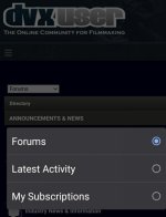
I have still never seen New Topics. Is this the same thing as Latest Activity? This is what I see when I'm logged in on chrome on android mobile (as well as when I select Desktop Site)
 

Attachments

  • photo128275.jpg
    photo128275.jpg
    50.7 KB · Views: 0
  • photo128276.jpg
    photo128276.jpg
    31.1 KB · Views: 0
  • photo128278.jpg
    photo128278.jpg
    39.9 KB · Views: 0
I have still never seen New Topics. Is this the same thing as Latest Activity? This is what I see when I'm logged in on chrome on android mobile (as well as when I select Desktop Site)

Hmm, when logged in on a Mac (both Safari and Chrome) as well as Chrome on iOS, I see under Forums, the options of New Topics, Who's Online, and Member List. Let me look into it.

EDIT: They way it is default configured, if you are logged in, you should see New Topics. Anyone else only seeing Member List?

EDIT2: I just created a test user in your same user group. On all devices and browsers, I see New Topics and Member List. So, as admin, I also see Who's Online.

Please let me know if there are others who cannot see the subnavigation page of New Topics where I described it should be.
 
One more redirect you might want to add: https://dvxuser.com/ to https://www.dvxuser.com/

Letting both domains work can wreak havoc on cookies. (For example, on www.dvxuser.com, I'm logged in. But on dvxuser.com, I am not.)

Some websites opt to standardize on the bare domain, without the www, because they think it looks cleaner. But as a web developer, I have found that it causes other problems, and it is best to standardize on the one with the www subdomain.
 
I am now seeing New Topics. Huzzah! And it looks like it's recent posts minus what I've already looked at... I think I can live with this. Thank you, Brent
 
I'm finding the revised "dark theme" of the new setup really unpleasant on the eyes (compared to the old one) the level of contrast is MUCH higher than it used to be.

I've tried customising it extensively to make it easier to read, but am having no luck. Are there any other "default" themes that this new system comes with, that we might customise our profiles with?
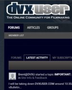
Yes. And like others have said, I really appreciate all the effort that Brent is going through and I know it’s not his fault, it’s the software and the designers choices they made.

That said, the current look and formatting are very hard on the eyes(too contrasty) and brain(no separation). It’s like a giant run-on sentence or 27 sentence paragraph. The old look(color scheme) and format was incredibly friendly.
 
Back
Top