DVX Scene Settings - In Camera Looks

Larry Rutledge

Fest Master
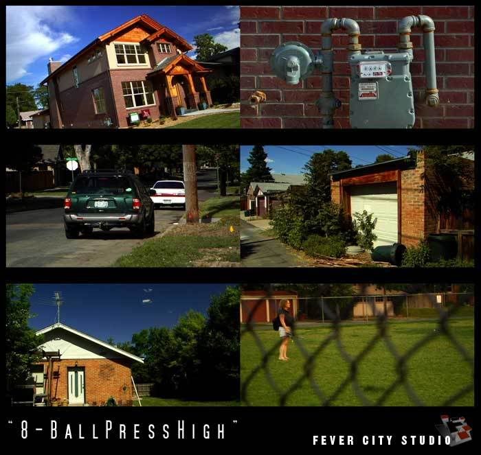
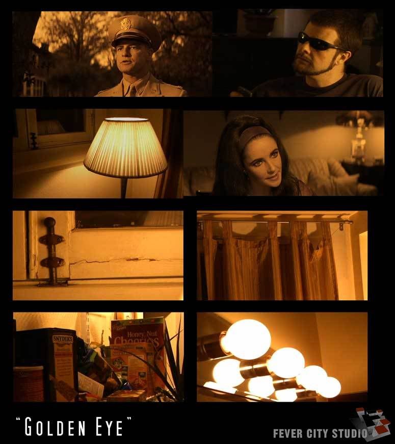
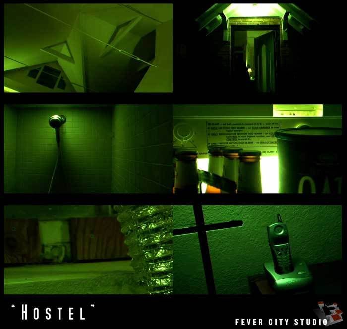
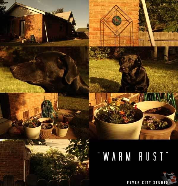
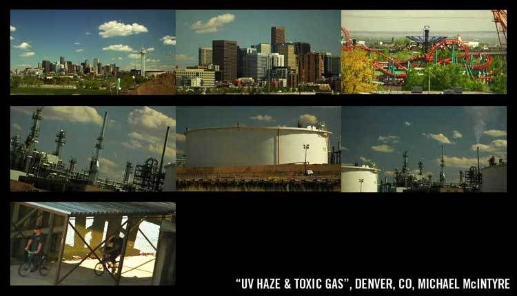
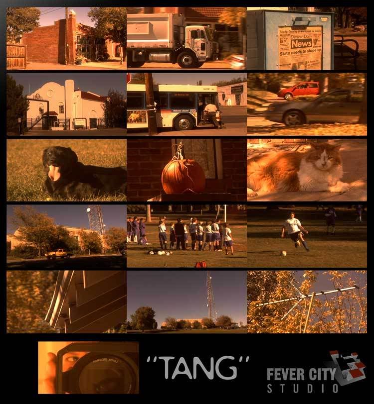
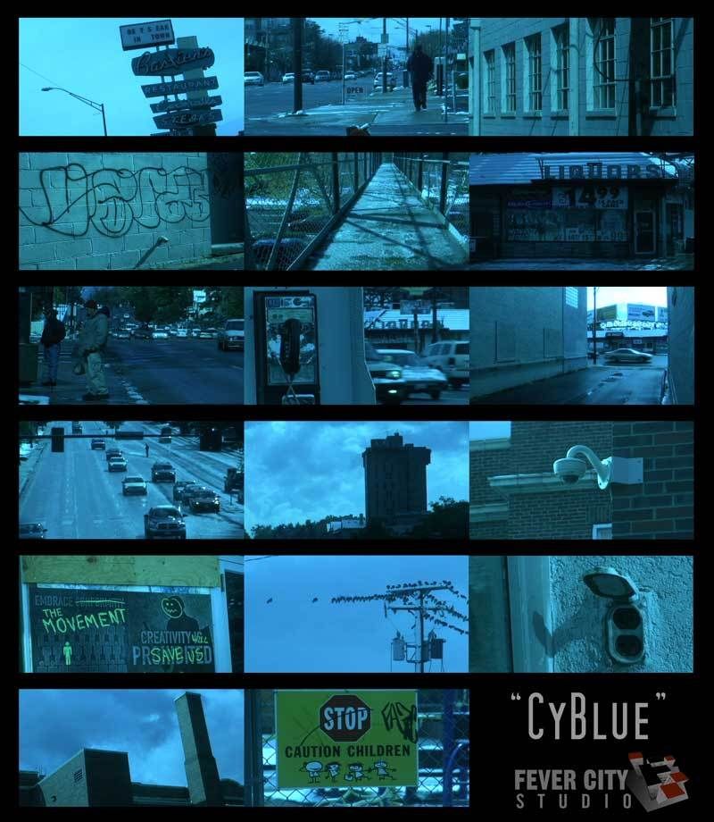
I was very impressed with the recent posts by fevercity's Scene Setting - In Camera looks. I know others have posted similar settings in the past, but finding them is a job and a half.

So I'm creating this sticky for the posting/discussion of these In Camera Looks and how to achieve them.

I'll post entries with fevercity's latest submissions and links to the original threads, rather than move all the discussion here.

Please feel free to post your own settings, preferably with sample images to show the look off.

If you have questions regarding a specific setting, please be sure to contact the original creator listed in that post. Even though these are all posted here by me, they are not my work. Rather I am trying to make a central point to showcase some great work I found that others have done.

- Larry
 
Last edited:
8-Ball Press High

8-Ball Press High

Author: fevercity
Original Thread: http://www.dvxuser.com/V6/showthread.php?t=100172


With this latest batch, chroma's a bit hot. This jpeg doesn't do justice to how saturated the new woodwork on that house is. The sky remains thanks to a polarizer filter. Otherwise, there's no other filtration and white balance is clean. The blacks are definitely solid. Maybe too solid - this gamma curve probably allows for some more room on the lower end (a -6 or -7 should be ideal). -8 is what's provided here for PEDESTAL and HIGH on the KNEE, hence the name.


8BallDVX2.jpg


Settings
DETAIL LEVEL -3
V DETAIL LEVEL -1
DETAIL CORING +2
CHROMA LEVEL +3
CHROMA PHASE 0
COLOR TEMP 0
MASTER PED -8
A. IRIS LEVEL -1
GAMMA B.PRESS
KNEE HIGH
MATRIX CINELIKE
SKIN TONE DTL OFF
V DETAIL FREQ THIN
PROGRESSIVE 24p
 
Last edited:
Golden Eye

Golden Eye

Author: fevercity
Original Thread: http://www.dvxuser.com/V6/showthread.php?t=101123

Nope. Not James Bond. Long before Pierce Brosnan took his turn as 007 in '95, John Huston released a very strange film in 1967, "Reflections in a Golden Eye" starring Marlon Brando & Elizabeth Taylor.

I used a Smead UltraColor Envelope 89532 (BLUE this time) for WHITE BALANCE. Add some adjustments in-camera and you've got a cheat on this weird look.


GoldenEyeCOMP1.jpg


Settings
DETAIL -3
V. DETAIL LEVEL -3
DETAIL CORING +3
CHROMA LEVEL 0
CHROMA PHASE -7
COLOR TEMP +5
MASTER PED -5
A. IRIS LEVEL -2
GAMMA B.PRESS
KNEE HIGH
MATRIX NORMAL
SKIN TONE DTL OFF
V. DETAIL FREQ THIN
PROGRESSIVE 24P
 
Last edited:
Hostel

Hostel

Author: fevercity
Original Thread: http://www.dvxuser.com/V6/showthread.php?t=100314


Okay, so technically it should be "Hostel 2" since that's what Eli Roth was on Conan O' Brien talking about tonight. Regardless, the 'green' look is overdone these days but it was late and scene settings have been on my mind lately (obviously). They showed an interior torture / horror scene and it was time to try and simulate that look on the DVX. The green was off the charts for a straight in-camera tweak alone. CHROMA PHASE will not take you that far green.

The 'look' needed to be a repeatable white-balance fake. It needed to be more specific than "experiment with card stock from your local printing supplier". Enter the Smead UltraColor Envelope (No. 89531 - Purple). It's a letter-sized envelope with a string thingie but you only need enough to grab white balance and it's nice to know that their 'purple' will yield this creepy green.


HOSTEL1.jpg


Settings
DETAIL LEVEL -3
V DETAIL LEVEL -1
DETAIL CORING +3
CHROMA LEVEL 0
CHROMA PHASE 0
COLOR TEMP -4
MASTER PED -10
A. IRIS LEVEL -2
GAMMA B.PRESS
KNEE AUTO
MATRIX NORMAL
SKIN TONE DTL OFF
V DETAIL FREQ THIN
PROGRESSIVE 24p

White Balance Reference:
Smead UltraColor Envelope (No. 89531 - Purple)
SMeadCOMP1.jpg
 
Last edited:
Warm Rust

Warm Rust

Author: fevercity
Original Thread: http://www.dvxuser.com/V6/showpost.php?p=970308&postcount=4


The idea with these settings ("Warm Rust" - lame name.... couldn't think of anything else) was to pull out most of the chroma and then warm it. Obviously, you can't pull ALL chroma out, so there are still hints of what's there. The idea is that late afternoon sun bouncing around, like you might get off some of the brown dirt and sand out here (or in Mexico maybe). Fact is, this is a very lush and green spring / summer in Colorado so that did not affect these settings. White balance was clean with no filtration up front.


WARMRUST2.jpg


Settings
DETAIL -3
V DETAIL +2
DETAIL CORING +2
CHROMA LVL -7
CHROMA PHASE 0
COLOR TEMP -5
M. PEDESTAL -6
A. IRIS -2
GAMMA CINELIKE V
KNEE (n/a)
MATRIX CINELIKE
V DTL THIN
SKIN DTL OFF
24pA
 
Last edited:
Scene Office

Scene Office

Author: EyeBite
Original Thread: http://www.dvxuser.com/V6/showthread.php?t=41088


I called this one "Office" because it's got a desaturated kind of look like they used on the Office(s). Dull, uninteresting


S1.jpg


Settings
Detail Level: +7
V Detail Level: +7
Detail Coring: +7
Chroma Level: -7
Chroma Phase: -7
Color Temp: -2
Master Ped: -10
A.Iris Level: +2

Gamma: Cine-Like
Knee: (Auto)
Matrix: Norm
Skin Tone Dtl: Off

V Detail Freq: Thin
Progressive: 24P(ADV)
 
Last edited:
Scene Diet

Scene Diet

Author: EyeBite
Original Thread: http://www.dvxuser.com/V6/showthread.php?t=41088


This name, "Diet," goes along with what I called Scene #6 (On Fire). "On Fire" stems from "Man on Fire," and "Diet" is a little less dramatic version of On Fire, in terms of the rich coloring and darkness.

S3.jpg


Settings
Detail Level: -3
V Detail Level: -7
Detail Coring: -7
Chroma Level: +7
Chroma Phase: -7
Color Temp: -7
Master Ped: -9
A.Iris Level: +3

Gamma: Cine-Like_V
Knee: (Low)
Matrix: Cine-Like
Skin Tone Dtl: On

V Detail Freq: Thick
Progressive: 24P
 
Last edited:
Scene Drama

Scene Drama

Author: EyeBite
Original Thread: http://www.dvxuser.com/V6/showthread.php?t=41088


This one's called "Drama" because it's dark, and "moody." I don't know what that means, but it comes in handy when you've got enough light to tone it down a little.

S4.jpg


Settings
Detail Level: 0
V Detail Level: 0
Detail Coring: 0
Chroma Level: -5
Chroma Phase: 0
Color Temp: -7
Master Ped: -15
A.Iris Level: 0

Gamma: B.Press
Knee: Mid
Matrix: Enriched
Skin Tone Dtl: On

V Detail Freq: Thick
Progressive: 24P
 
Last edited:
Scene 24p

Scene 24p

Author: EyeBite
Original Thread: http://www.dvxuser.com/V6/showthread.php?t=41088


This is very similar to the default settings for Scene #5 (24P), except the blacks are much more crushed.

S5.jpg


Settings
Detail Level: -4
V Detail Level: 0
Detail Coring: 0
Chroma Level: -7
Chroma Phase: +7
Color Temp: -7
Master Ped: -12
A.Iris Level: -2

Gamma: Cine-Like_V
Knee: (Auto)
Matrix: Cine-Like
Skin Tone Dtl: Off

V Detail Freq: Thick
Progressive: 24P
 
Last edited:
Scene On Fire

Scene On Fire

Author: EyeBite
Original Thread: http://www.dvxuser.com/V6/showthread.php?t=41088


This one's where I keep the scene dial by default. The colors are rich, the contrast is way up there, and it makes for fun color correcting in post. Like I explained earlier, the "On Fire" comes from the movie "Man On Fire," because the looks can be pretty similar.

S6.jpg


Settings
Detail Level: -7
V Detail Level: -7
Detail Coring: -7
Chroma Level: +4
Chroma Phase: -7
Color Temp: +4
Master Ped: -15
A.Iris Level: -2

Gamma: Cine-Like_V
Knee: (Auto)
Matrix: Norm
Skin Tone Dtl: On

V Detail Freq: Thick
Progressive: 24P(ADV)
 
Last edited:
Tang

Tang

Author: fevercity
Original Thread: http://www.dvxuser.com/V6/showthread.php?t=113122

The idea was to cook up a somewhat contrasty, autumnal, late afternoon warm look that bent towards yellow. Believe it or not, "TANG" does not bend towards yellow. Shot a batch and put them up on the old Tektronix 1740 scopes / waveform. "TANG" falls into a weird area between red and yellow - somewhat of a coral kind of orangey-pinkish fusion. Because the white-balance has shifted so dramatically, it behaves differently depending on exposure and colors in-frame. No surprises there but it ended up looking more like TANG than the intended October cornfield gold.

TANG_web_1.jpg


Settings

DETAIL LEVEL -3
V. DETAIL LEVEL 0
DETAIL CORING +2
CHROMA LEVEL -7
CHROMA PHASE -3
COLOR TEMP -5
MASTER PED -7
A. IRIS LEVEL -2
GAMMA CineLike
KNEE n/a
MATRIX NORM
SKIN TONE DTL OFF
V DETAIL FREQ THIN
24p

White-Balance from one sample of a BEHR paint color chip card (free from Home Depot).... It's a 4-color card from the 520F line. The 2nd color from the top is "520F-5 HARBOR". It's sort of a blue-ish green.
HARBOR_4_web.jpg
 
CyBlue

CyBlue

Author: fevercity
Original Thread: http://www.dvxuser.com/V6/showthread.php?t=113356

A 'cool blue' look actually leans heavily towards cyan, stopping just short of it. There's actually more cyan in any given 'blue look' than there is blue. Blue gets too blocky and noisy. Our first thought on seeing a similar shot is "Hey, that's a cool blue". Usually, there's some cyan-at-play. Cyan proved increasingly difficult to find its evil twin, reverse or anti-complementary color for a white balance fake. Yes, that's complementary, "relating to or constituting one of a pair of contrasting colors that produce a neutral color when combined in suitable proportions". Suffice to say, it can get old white-balancing and staring at scopes.

CyBlue_web_1.jpg


Settings
DETAIL LEVEL -4
V DETAIL LEVEL -3
DETAIL CORING +2
CHROMA LEVEL -7
CHROMA PHASE -7
COLOR TEMP -3
MASTER PED -6
A. IRIS LEVEL -2
GAMMA B. PRESS
KNEE LOW
MATRIX NORM
SKIN TONE DTL OFF
V DETAIL FREQ MID
PROGRESSIVE 24p

IB64 "Lifevest Orange" was the WINNER for this white-balance fake.

LifeVest_WEB1.jpg
 
I'll play!

UnTelecineded 16mm

Detail Level +4
Chroma Level +7
Chroma Phase +7
Color Temp 0
Master Ped +4
Gamma/matrix CineLike
V-Detail Freq Thick
24Pa


Hevey Blue (like cy blue sort of but geared toward the DVX100)

Detail Level +5
Chroma Level +7
Chroma Phase +4
Color Temp +7
Master Ped -7
Gamma/matrix CineLike
V-Detail Freq Thick
24Pa


30p Red Tint(would be good for a desert scene I would immagine)

Detail Level +1
Chroma Level +7
Chroma Phase -7
Color Temp -7
Master Ped +4
Gamma/matrix CineLike
V-Detail Freq Thick


24pa Hevy Red (much like the previous one, but in 24pa and slightly diferent)

Detail Level +7
Chroma Level +7
Chroma Phase +7
Color Temp -5
Master Ped -9
Gamma/matrix CineLike
V-Detail Freq Thick
 
Very Cool, But Why?

Very Cool, But Why?

Larry,

As a subscriber to this thread, I really enjoy the creativity you show in using different ways to trick the WB, and the looks you get are pretty cool to play with. I've shot some stuff using the looks you describe and have had fun playing with paint chips of my own.

Being new to this whole ability to tweak 'in camera' I'm wondering what the advantages would be to creating these looks in camera as opposed to post. It's fun, it's creative, but doesn't it tie you in to one look? If you shot normally exposed footage wouldn't you have more options in post for what kind of look to achieve?

Lookin' to learn,

John
 
Hey, Gang..... I can't vouch for these as I haven't tried them out. They're borrowed from Marc Levy's post over @ cinematography.com. I've cross-posted my settings there too (GoldenEye, 8Ball, WarmRust, etc.) I wouldn't have made the same choices but here's to keeping this thread alive.


From Marc Levy:
When I've shot with the DVX100B, these are the settings I've used for a "film-look" over and over again. If you want, you can change the chroma level to give you either a more saturated or less saturated image. Also, setting the color temp to -2 or -3 and then manually white balancing can yield a nice warmth that I've used a good bit for day exterior work.


Scene File F5:

Detail Level: -2
V Detail Level: +2
Detail Coring:0
Chroma Level: 0
Chroma Phase: 0
Color Temp: 0
Master Ped: -6
Auto Iris Level: 0
Gamma: Cinelike
Knee: Auto
Matrix: Cinelike
Skin Detail: Off
V Detail: Thin
Gain: 0db
Progressive: 24P
 
Back
Top