Stylized Lightings in different eras

I a bit of a heretic in that I think a lot of old stuff looks old. It is interesting to consider using hard lights which are now so unpopular for shooting people.

I think it is well worth considering the tech when examining images. As the cinematographer would have been restricted if, for example, shooting 25ISO stock. Many of these looks are created by slow stock, bright lights, and off colour film stock*

These may not have been options desired or specced by the cinematographer they were just the tech of the day. Just like most of us have LEDs now that are not as punchy as we want.

If looking to reproduce such images engagement of the ND would be the first step?


*not to mention stock can have degraded or been badly scanned (every digital image we see of film has been scanned!)

I agree, these images look dated. But the lighting styles have translated pretty well to what a lot of cinematographers are doing today.
Reading through American Cinematographer, I do see a few DPs using hard sources directly on talent today, it can be a cool look if a person
has the skills, equipment and crew to carry it off.

One thing that is commonly overlooked by modern cinematographers when looking at images of the era is that lights were big. Really big.
An 16" fresnel of the day might have been used as a key source by Hurrell. Few shooters, unless they have ten ton trucks and generators,
have access to 16" or 18" fresnels. Of course, a source so large, with a thick glass fresnel element, especially when used close to talent is a
relatively large and soft source compared to someone blasting talent today with an Arri 1K open faced light, which is what a lot of modern
shooters consider "using hard light".

When I produced the documentary on Harold Rosson's cinematography for The Wizard of Oz, which was shot with ASA 25 Technicolor three strip, the literal
wall of carbon arc instruments used, when added up into one key source, was literally the size of a huge wall, 50' high. So at say 35' from talent, a single one of
those sources would have been a very tiny, super hard source, the combined wall of them ended up acting as a huge, soft source, even though they were used
"bare" with no diffusion. Imagine trying to expose ASA 25 film stock indoors. Crazy. It's no wonder the talent and even crew were passing out from heat exhaustion
and things close to the source were catching fire.
 
Much of the early color work was done entirely on sound stages with McCandless style stage lighting setups (except for complementary color gelling).

Early color film stocks had at best 7 stops usable DR (Kodachrome).

Three strip Technicolor still holds up better in restoration than anything else.
 
Last edited:
(respond to pure)

I think using hard light is an art. I dont really think it often seems to work for me as Im usually replicating some form of real source, Im in the UK. It seems that US cities have a lot of mirror skysrapers and other thing which reflects the sun all over the place and one can use hard light motivated by that.

My old stills sinar was 25ISO so basically I had to light everything, I then moved to the 800 nikon D3 and my style changed towards a more natural look. Not because Id changed style but becasue I could get the job done quicker with fewer lights!

Id like to try some hard lighting soon :)
 
Considering some much more recent styles-of-the-era...

For whatever reason, I recently stopped to watch this video... just a bit under two decades old. It's said that everything comes back around in roughly 20-year cycles. With the floaty camera and liberal use of party-gel backlighting, veteran music video director Joseph Kahn is clearly amongst the primary influences of every single Youtube video gear pusher.

 
Last edited:
The first video reminds me of an argument with a friend, who says he hates Pink's and loves Carneys.
 
(respond to pure)

I think using hard light is an art. I dont really think it often seems to work for me as Im usually replicating some form of real source, Im in the UK. It seems that US cities have a lot of mirror skysrapers and other thing which reflects the sun all over the place and one can use hard light motivated by that.

My old stills sinar was 25ISO so basically I had to light everything, I then moved to the 800 nikon D3 and my style changed towards a more natural look. Not because Id changed style but becasue I could get the job done quicker with fewer lights!

Id like to try some hard lighting soon :)

Yeah the older stuff looks dated mostly. Partly because styles have shifted to naturalism. Part of that shift was because they could - more sensitive film/digital media and new lighting technology. Part of the old style was popularized by the needs of the medium, sure.

Hard light can be really nice but I think the angles are much less forgiving than soft light (though that's part of the excitement of the look). One thing I notice about the Star Trek TOS CUs is that people don't turn their heads much. All those shadows are neatly planted. They're basically lit like a statue.

I dont think you need a skyscraper reflection to motivate a hard light necessarily. People aren't that attuned to motivation (plus what about the sun?) That being said, part of why I screenshotted the Trek frames above was because when they cut to the CU I had that feeling of "wait- that's not what she looked like in the wide shot"

Those lightings have a bit of a feel of old formal school portraits. But I think part of it was the TVs they would be watched on. Low-resolution, probably mostly black-and-white (and maybe low-contrast?) So again the technological determination of style - needing to produce an image that would zing in black and white and produce clear-to-interpret facial expressions?

But it ain't ugly, its beautiful. Just unnatural
 
A book that I've really enjoyed, geared more toward stills, but with imagery similar to that of the old BW films is: Lighting for Portraiture, by Walter Nurnberg. Long since out of print but copies show up on eBay from time to time, and there are listings for it on Amazon too.
 
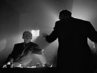
Black and white looks looks best with high contrast. If you light it normally, it becomes a disagreeable gray mush. I think that's why it worked so well in film noir. Besides lighting, photographers and cinematographers would use colored filters to darken the sky, lighten faces, etc. (I'm sure most of you already know this, but I just think it's cool)

citizen_kane.jpg

I notice a shift in the 1980s: more soft light, more practicals. We touched on this in a thread about The Graduate. Does anyone know the decade-by-decade history of improvements in film ISO? :)
 
I came up lighting for film where ISO was likely to be 100T or maybe 200T.

I wonder if one wanted to practice "lighting" then one easy way would be to pop some heavy ND in your camera. Try and light a night interior scene at ISO50. At that point the pracs can't light for you and you'll have to light it somehow.

Hey presto, you're lighting.

I think the combination of high sensitivity and IG filter LUT of the week means you get a decent looking picture form when you turn the camera on.

So if I was trying to teach lighting today, here's what I would do.

Light to expose for ISO 50.

You have to light without a camera. Using a meter. And your eye. And then at the end you can add a camera once it's all set and see how you did. And if we were mimicking the film days, we'd disconnect the monitor and you wouldn't see your results till the next day.... When we'd screen it to the whole class on the big screen....and talk about what worked and didn't.

Nothing like public humiliation to motivate you.....

When I did my MA this is exactly what we did for two weeks :-). We were lucky to have no less than Russell Boyd ASC ACS the first week and Andrew Lesnie ACS ASC the second week....hard to light with Oscar winners looking over your shoulder asking why you're going to put the bounce on THAT side....

You'd shoot the exercise, on 35mm, then next morning you'd sit for an hour in the theatre and watch rushes or dailies. Everyone would talk about the exercises as shot by the different cinematography students, and then we'd go out and do it again.

I used to use Polaroids, yeah the 600SE with some ISO 3000 B&W film for lighting previews way before we had digital stills cameras.....So if someone showed up with that I'd allow that :-)


JB
 
Last edited:
John Brawley:

"That's not a loight."
maxresdefault (1).jpg

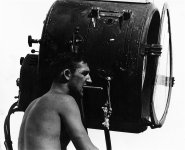
"This is a loight."
film-homage-lighting-crew-carbon-arc-light-young-billy-young-old-tucson-arizona-1968-david-lee-g.jpg

JK! :grin:
 
Last edited:
You have to light without a camera. Using a meter. And your eye. And then at the end you can add a camera once it's all set and see how you did. And if we were mimicking the film days, we'd disconnect the monitor and you wouldn't see your results till the next day.... When we'd screen it to the whole class on the big screen....and talk about what worked and didn't.


I was doing this at college, with film and my apprentice ben learned on digital. Honestly I think most of my college time was wasted waiting for film to come back from the lab. Ben learned twice as fast.
 
...We were lucky to have no less than Russell Boyd ASC ACS the first week and Andrew Lesnie ACS ASC the second week....hard to light with Oscar winners looking over your shoulder asking why you're going to put the bounce on THAT side....

That sounds intimidating. I've lit and shot interviews with Elswit, John Toll, Allen Daviau as well as a lot of directors who know their lighting pretty well, Scorsese, Jackson, Eastwood, Lucas and some were either neutral and more than a few were complimentary to my lighting and how I made them appear.
The most difficult was Maureen O'Hara. I flew to Ireland to interview her and she was VERY picky about key light height, wanted an Obie positioned just so, checked exposure levels, she was basically a DP in a way that many of the other legendary actresses of her day as she was lit
in her prime by the best DPs and Hurrell and she worked enough to know what flattered her facial and bone structure. She knew her stuff, I had to give it to her, it was weird having an actress be a DP for my interview. But she liked where we ended up and I thought it looked fine, if not a little higher key than I like.
But you didn't tell Maureen how you were going to light her, she told you.
 
Last edited:
Black and white looks looks best with high contrast. If you light it normally, it becomes a disagreeable gray mush. I think that's why it worked so well in film noir. Besides lighting, photographers and cinematographers would use colored filters to darken the sky, lighten faces, etc. (I'm sure most of you already know this, but I just think it's cool)

View attachment 139579

I notice a shift in the 1980s: more soft light, more practicals. We touched on this in a thread about The Graduate. Does anyone know the decade-by-decade history of improvements in film ISO? :)

I shot on a series for years and at one point there was a small spin-off and the interviews were all B&W. The problem, they didn't tell us they were going to do a B&W treatment, so we just lit them in the "look" that we normally did for the main series. In the end, the interviews just looked like the chroma had been turned all the way down. Boring.

I also shot a hype video a few years ago and the producer, who was on-site with me and putting it together, told me up-front it was going to be B&W. Cool. I flipped the VF into B&W and I got into a different mindset. Got to have a little fun. And after I got home, I even whipped up a quick, contrasty, crunchy look that looked great for this type of thing and sent it to the producer. The final piece... basically just killed the chroma.
 
I meant to motivate multiple sources - I have that image (coming from grey england) of NY having multiple reflections and complex hard shadows - google images doesnt deliver...
FWIW, that's LA (Hollywood, to be more precise) but I think we had discussed this before - the UK cinies prefer a much flatter look than the Americans. If one were to look at nature, a typical British outdoor scene - major metropolitan areas excepted - would look as a natural washout. In the US, that might be a Pacific Northwest look.
 
I shot on a series for years and at one point there was a small spin-off and the interviews were all B&W. The problem, they didn't tell us they were going to do a B&W treatment, so we just lit them in the "look" that we normally did for the main series. In the end, the interviews just looked like the chroma had been turned all the way down. Boring.

I also shot a hype video a few years ago and the producer, who was on-site with me and putting it together, told me up-front it was going to be B&W. Cool. I flipped the VF into B&W and I got into a different mindset. Got to have a little fun. And after I got home, I even whipped up a quick, contrasty, crunchy look that looked great for this type of thing and sent it to the producer. The final piece... basically just killed the chroma.

A bit over a year ago, I shot the Andre Iguodala section for this piece (@~1:50)... spec'd as two camera, distinct 90 degree angles, B&W. Good or bad, I lit it such that they had no other choice BUT super-contrasty :D.

 
looks good mcbob. that's the way to force the editor's hand! (but they'd better be happy with it)
 
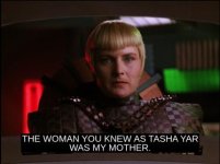
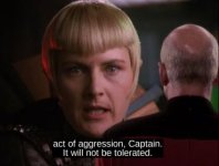
Here's a stylized lighting from an episode of star trek tng that aired in 1991. Compared to my OP from '60s Trek, it's clear that soft light is now in, and colored lighting is abundant in this situation. Overall, I'd say this looks pretty modern although it still feels more "lit" from her key-light to me than most TV nowadays that goes for greater naturalism. Perhaps today there's more side-lighting and less obvious rembrandt portrait placement.

This set-up clearly got more love than the usual CU. This is the introduction of this character. The actress was a good guy who died late in season 1. This is season 4 and she is playing the daughter of that character (that no one knew she had) who is in league with the bad guys. So, the shot is an interesting mix of sinister and beauty.

Screenshot 2020-07-03 at 11.44.37 PM.jpg
Screenshot 2020-07-03 at 11.45.37 PM.jpg


I'm pretty sure the closer shot of her is just an enlargement of the first. I gotta say, I love the way enlarging it brings out the grain.

A while back, I was watching Mandingo (1975) and I thought "this is so beautiful, I love this softer, grainier, low-contrast look." and then the opening credits ended and everything normalized and looked more boring. Clearly, the extra processing for the credits had slightly degraded the film. (And the rest of the movie was garbage storywise.)
 
I once met Denise Crosby. She wasn't lit at all.

(I also didn't know who she was ... someone had to tell me)
 
Back
Top