IMPORTANT: Server and software upgrade

Is it possible to make the page selection at the top of the thread the same as it is at the bottom? Can page navigation also be added to the thread list so that we can just click on the last page to go to the thread instead of clicking on the thread and then selecting the last page?

I know you already got the message about color scheme. Odd how it is just so off-putting I don't even want to visit the site.

Thanks for your patience Brent. It's a tough job.
 
One more redirect you might want to add: https://dvxuser.com/ to https://www.dvxuser.com/

Letting both domains work can wreak havoc on cookies. (For example, on www.dvxuser.com, I'm logged in. But on dvxuser.com, I am not.)

Some websites opt to standardize on the bare domain, without the www, because they think it looks cleaner. But as a web developer, I have found that it causes other problems, and it is best to standardize on the one with the www subdomain.

Done.
 
Ah, I see so many updates and the navigation is largely returned to the way it was before. Thanks Brent, I'm sure this was a lot of work.
 
Brent, hats off to you for continuing to tweak to make this work. I was a bit skeptical with the initial change, but it keeps getting better. Thanks for all of your efforts.
 
OK, I have reverted to the prior color palette (where possible).

Thanks Brent, it's certainly better now!

If it's at all possible to tweak the text colour from it's current white, to a (slightly darker) light shade of grey (to reduce the contrast even further), that'd be amazing.
 
Thanks Brent, it's certainly better now!

If it's at all possible to tweak the text colour from it's current white, to a (slightly darker) light shade of grey (to reduce the contrast even further), that'd be amazing.

I run into way too much grey text/white background now, and it’s almost impossible to read, especially at smaller font sizes. I think grey-on-grey will be/could be really tough, especially in dark environment where you may have the brightness of your screen turned down. Or do you mean doing grey text on the current blue backgrounds that are on the main and sub-forum pages, not the actual thread pages, which are grey?

But I will say, it’s crazy how contrasty that previous shade of blue with white text was. I think white text/black background would have been less contrasty. That blue was almost like super crushed black levels/shadows in an image. I kept looking expecting to see something hiding/buried in there, just barely visible... I seriously felt like I had eye strain after just a few minutes trying to read the first version of the new-look site. Should I mention that episode of GoT? Lol
 
Low contrast doesn't always meet accessibility standards. One has to be very careful not to go too far. Higher contrast is preferred to many with vision problems. A better solutions would be to allow us to pick a theme or at the very least tweak the site font color.
 
Oh wait we can customize. If you go into the user profile and click on "Customize My Style" You can pick a background color and font color.
 
Ok it only seems to alter the colors inside of my user profile. My history of posts now uses my custom colors but the main forum I guess doesn't count as content. Would be nice to be able to adjust the main site font color or at least use the content color for all of it.
 
Guys, some people want more contrast. Some want less, some want different colors. I get it. Just note doing a new theme takes me a full day. And I could do 10, and I don't know if that would even make everyone have an option they are 100% satisfied with. I will work on more options in time.
 
Brent, start charging for color themes and the requests will quickly go away. Or maybe offer to customize the site to the highest bidder's theme.
 
Nice! I used to work on vbulletin boards back on version 2/3, nearly twenty years ago. Before smartphones. They were pretty in-depth, even back then, so I can't imagine what they are like now in the era of mobile compatibility/responsive design.

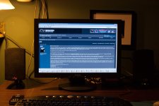
Attached is a screenshot of my desktop from 2006 with DVXuser up on screen. Side note: that terrible Xerox LCD was returned promptly and replaced by a Viewsonic.

I think the only thing throwing me off about the new design/color scheme is having the same color background for both the text area on the right and the user info on the left (when reading the threads). It's not a big deal. And maybe the white borders around each post instead of the dark blue. Although that kind of makes each post pop more.
Obviously things don't have to look like they used to look. Changes take time to adjust to. Overall, good job.
:)
 

Attachments

  • photo128281.jpg
    photo128281.jpg
    132.2 KB · Views: 0
Brent, start charging for color themes and the requests will quickly go away. Or maybe offer to customize the site to the highest bidder's theme.

Are we going to be able to upvote again? The above post deserves an upvote
 
Back
Top