FEATURE: DEUCE OF SPADES - How I made a period full feature film all by myself on ZERO budget

Here is your answer Azmyth - I already answered you a few pages back ;)

Well... I'm weird when it comes to storyboarding. Or shot lists for that matter...
Basically ...

I've got it all in my head...

So when I work, I arrive on the set with a precise mental idea of what the shots are going to be and how they will edit together and I just go for it. I know this is an unusual way to do things and I am pretty sure it is NOT the right way to do this, but this is the way I do it. because I am entirely self contained, I can pull it off but I would not recommend this at all to anyone else.

I know it used to drive my grip crazy cause he wanted to snoop around and figure out what I was up to, but never could LOL. He never knew what was coming up next. When I work I like being in my own zone and don't like being disturbed, interrupted. If I need my crew to prepare for the next shot ahead of time I'll instruct them on what to do and sometimes explain to them what the next shot is, but otherwise, I keep it all inside my head.

Ironically, this has not caused me to forget to film a shot.

On occasion I have made a shot list and highlighted each shot, like a good little girl LOL. I think that out of 150 shoots I did that , like... 6 times?

But storyboarding? No way, Jose.

I usually came up with my camera move, blocking, approach concepts while driving, I let my mind float and let the vision come to me. Once I SEE it in my head I'm good to go. But I got to SEE it first. Also, a lot of shots are improvised on thr set at the time of the shoot. there are shots you stumble upon by "accident" that end up being your best shots. So I always keep my eyes open and my mind open for any new ideas that might sprout from being at the location and now looking at the real setting through the eye of the camera.

A good exemple of that was the bookstore shoot with dvx user Robert Eldon. I waltzed in the bookstore, saw the potential for a dolly shot I had not at all planned for and improvised on the spot to make it happen "borrowing" a local supermarket shopping cart to execute the shot. And the crazy thing is IT CAME OUT SMOOTH AS A BABY'S BUTT, and looks marvelous.

So trusting my instincts and spontaneous creativity have basically been my approach during the entire filming.
 
I just realized that I read about this film on this site ages ago and my friend Kelly is in it! I acted with her in another zero budget feature shot in Santa Cruz.
 
I just realized that I read about this film on this site ages ago and my friend Kelly is in it! I acted with her in another zero budget feature shot in Santa Cruz.

What's Kelly's last name and do you know what part she has in my film? (sorry I have around 150 actors & extras - but i think I know who your friend is)
 
Home sick nursing a cold. Guess I caught my death at the last shoot. Rats. This has put a damper on my progress. I've been sleeping a lot, no apetite nor energy...

:undecided

Better get well soon cause to quote my character in the film:

"d**mn it! I don't have time for this s**t!"


Meanwhile, got a new review in Finland. I had no idea, but a "spy" of mine located in that country scanned the article, translated it and emailed it to me hehehehehe...


V8%20article%20nb%202%20120909%20web.jpg


TRANSLATION


Deuce of Spades is ready

The Hotrod Movie Deuce of Spades is now ready. The no budget American made movie represents the true spirit of hotrodding and according to filmmaker Faith Granger it is a tribute to all who where there in the good old days and created the American hot rod scene. In the real life the filmmaker put everything on the line for the movie, including her own pension savings. The movie was created with the help of volunteers, and everything was donated, including the actors time and talent as well as the cars.

In the story a modern day hotrodder finds a unopened letter while working on her car. The film takes you back through a series of flashbacks to 50’s dragstrips and hotrodding. A Test Screening version of the movie was shown at a big car events in America last October and the reaction was very good. Distribution for the movie has not yet been finalized but you can order in advance a copy of the film at www.deuceofspadesmovie.com . The release target date is around January 2010.
 
MOVIE POSTER, REVISITED...

Back to working on my poster.

Went to high res, and worked on elements some more, with goal of increasing the emotional drama of the image.

Currently have two slight variations, let me know which you prefer and why.

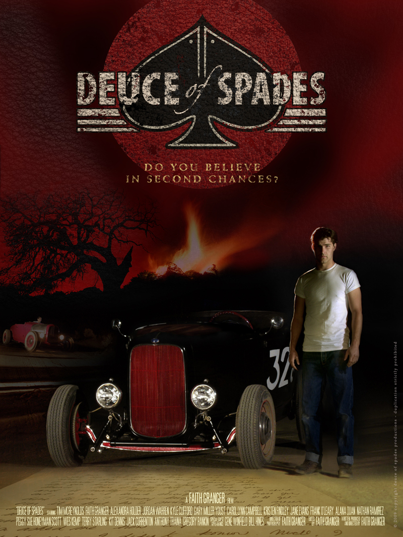
below is the latest version (TAG NAME : WITH BLACK SMOKE)

FIFTH%20POSTER%20black%20smoke%20sky%20800%20pixel%20for%20web.jpg


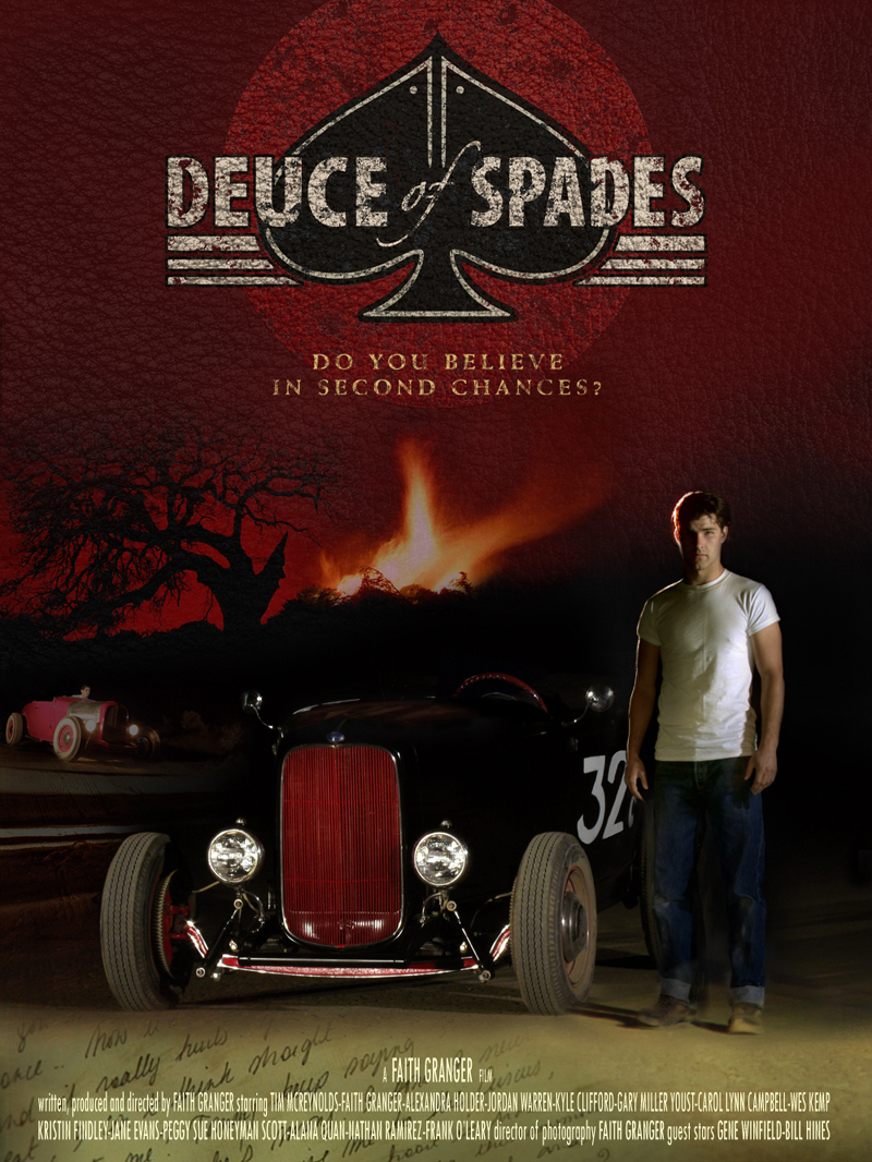
Below is a previous verson with older letter graphic and red sky (TAG NAME WITHOUT BLACK SMOKE)


FIFTH%20POSTER%20red%20sky%20800%20pixel%20for%20web.jpg
 
Hmmmmm. I just compared teh two versions myself, as posted above, and right off the bat I noticed that top poster guides the eyes towards the deuce because of the 2 inverted Vs. the V formed by black smoke above deuce and the V formed by lines left of deuce and letter below deuce. Also logo stand out better on top poster, because of bettr contrast with black smoke.

So I think I like top version better, more dynamic and pulls you in. But I await your feedbacks.

I NEED SOMEONE REAL GOOD TO PAINT HIGHLIGHTS ON THE DEUCE so red sky and fire are reflecting on it... Can anyone help or know someone who could?
 
for what it's worth I like the top one as well....only for the fact that it kind of 'dirties' up the leather a bit. The bottom version is too clean.
 
I'm torn between the two. The letter feels more natural and flowing on the bottom one, but I do like the visual flow of the top one.

I'd be curious to see a version with no leather look except for on the title.
 
Faith, do you want this done as in Photoshop or actually
painted on the car, or painted on your poster? Mike C.
 
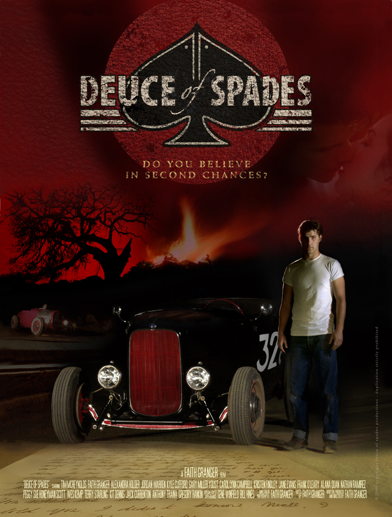
OK, today I made one more variation of poster (this one with a kiss on right side)


So here is the recap of 3 variations: Let me know which looks most like a movie poster, which you like best and why.


1- WITH KISS

FIFTH%20POSTER%20with%20kiss%20800%20pixel%20for%20web.jpg


2 - SAME WITHOUT KISS


FIFTH%20POSTER%20black%20smoke%20sky%20800%20pixel%20for%20web.jpg


3- SAME WITHOUT BLACK SMOKE AND WITH MORE PLAIN BACKGROUND

FIFTH%20POSTER%20red%20sky%20800%20pixel%20for%20web.jpg
 
I like the one with the kiss but suggest getting another image to balance that one on the left side. It feels a little uneven as is.

-Martin
 
I like the one with the kiss but suggest getting another image to balance that one on the left side. It feels a little uneven as is.

-Martin


I tried that already and found it became too busy. I will play around with different images on left to see if this dea could work, maybe with the right image.

As far as being uneven, the poster was left heavy (red roadster, big tree) while on the right there was nothing but Johnny, hence the idea of putting a small image, with the girl in it, on the right....

Anyone care to give input? It would help.... even if just to say which one you like best, as a general audience so I can get a larger number of polls...

First the original poster is not left heavy. Yes, the red roadster and the tree are on the left, but see how big Johnny and his deuce are? That more than balances the picture. So I think the original poster is well balanced.

Since your movie is more about romance than about cars, I think adding the kiss is appropriate. The "love" theme may also interest more people who see the poster. I think the kiss picture looks good, but it does throw the picture off balance. I agree there's not much room on the left side. You might want to try moving the tree to the middle if you want to add something on the left. And I'm not sure what you would put there. Maybe something representing another theme from the movie, such as betrayal or perseverance. Or maybe just a picture of some hot legs ;)

Hey, sex sells.

Or, if you move the tree to the middle or to the right, you'd have more room on the left for a bigger kiss picture. A more prominent kiss can help sell the film. But if it still doesn't balance out, you may want to consider moving (dare I say it?) the logo, too.

Or just forget the kiss and have a balanced picture.

In the top 2 pictures, the 2 borders of the letter lead your eyes straight to the car. But if you try to read the letter, your eyes go right off the page. In the bottom picture, the 8 lines of writing lead your eyes go right to the car and Johnny keeps you from falling off. It also looks more organic and less Star Wars-like. But it's not a big deal either way.

Probably what bothers me most is that Johnny has a crease down the middle of his t-shirt. But maybe that was the style back then...

Just my $.02.
 
I vote number 1 with the kiss, but I like the writing of the letter standing up, rather than just looking like the road texture.

I didn't perceive the blackness as smoke, but either way it helps the logo have more punch.

Number 1 with the letter standing up would introduce all of the key elements, or trigger all the recollection points for someone that knows the story line, without giving it away.

:thumbsup:
 
First the original poster is not left heavy. Yes, the red roadster and the tree are on the left, but see how big Johnny and his deuce are? That more than balances the picture. So I think the original poster is well balanced.

Since your movie is more about romance than about cars, I think adding the kiss is appropriate. The "love" theme may also interest more people who see the poster. I think the kiss picture looks good, but it does throw the picture off balance. I agree there's not much room on the left side. You might want to try moving the tree to the middle if you want to add something on the left. And I'm not sure what you would put there. Maybe something representing another theme from the movie, such as betrayal or perseverance. Or maybe just a picture of some hot legs ;)

Hey, sex sells.

Or, if you move the tree to the middle or to the right, you'd have more room on the left for a bigger kiss picture. A more prominent kiss can help sell the film. But if it still doesn't balance out, you may want to consider moving (dare I say it?) the logo, too.

Or just forget the kiss and have a balanced picture.

In the top 2 pictures, the 2 borders of the letter lead your eyes straight to the car. But if you try to read the letter, your eyes go right off the page. In the bottom picture, the 8 lines of writing lead your eyes go right to the car and Johnny keeps you from falling off. It also looks more organic and less Star Wars-like. But it's not a big deal either way.

Probably what bothers me most is that Johnny has a crease down the middle of his t-shirt. But maybe that was the style back then...

Just my $.02.


HAHAHA I'll be darn, you are right! I;ve been so busy looking at the composition i forgot to iron Johnny's shirt LOL - I can easily fix that. So tomorrow I'll post anotehr version of poster with ironned T-shirt (really Johnny you could look a little more respectable dude!) and the other letter layout, so we can compare. I'll leave the kiss hwre it is, I don't want to move the tree nor the logo, but will try some different images up left see if I find one that works and balances things out.

Keep the imput coming they are very helpful.
 
I'm going to repeat some things I said in an earlier comment, sorry in advance.

I still prefer the letter from the third version.

I still would be curious to see a version with no leather texturing, except for on the title.

I like the kiss, but it bothers me that it is the only image with a partial opacity. I think adding another partial opacity image to the other side would solve that, while also balancing the poster.

Perhaps you could make the title slightly smaller, to give more room for the new image on the left (and increase the size of the kiss).
 
I have to be honest here. I think I would like to see a more simplified version of the poster. All the ones you have put up so far have been very busy. While some times that can be a good thing. Often times some of the best movie posters are the simplest ones. Just my opinion though.
 
Back
Top