FEATURE: DEUCE OF SPADES - How I made a period full feature film all by myself on ZERO budget

While there are many things to like about the designs you've posted, and I don't have a particularly strong preference for any of the variations, there are a few things that I would like to offer by way of constructive criticism.

For what it's worth, I will mention that while I made my career elsewhere, I majored in graphic design in college, and come from a long line of artists in my ancestry, some of whom were professional. Among my grandfather's many specializations as a commercial artist was movie and theater posters. Two of them, from the early 1900s, hang in my apartment. But I digress...

Here's what I'd like to offer:

--------------

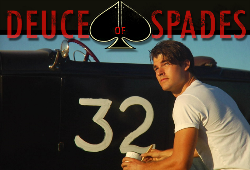
1) In my graphics training, one of the design considerations that was strongly, repeatedly advocated was termed "quantity contrast". The idea is that in a design, interest and 'dynamics', if you will, are created when elements have substantially (sometimes drastically) varied sizes or employ other means of creating contrast among them in visual 'weight' or impact. This is one of the first issues I had with your poster from the earliest versions I saw of it. Simply put, the visual weight of the three main elements - Johnny, the car, and the title, are almost exactly equal. Going further, the width of the title and hot rod are virtually identical, as well as the height of Johnny. Johnny's overall image size is smaller due its being narrower, but the brightness of the white shirt makes up for that, bringing him into almost perfect equality with the others. Lastly, the background treeline is almost exactly at the halfway point vertically, dividing the poster into two equal sections. Equal sizes and weights of elements tend to be 'static' where contrasting ones are 'dynamic'. The experts will tell you that the latter is what you want to go for.

Two excellent examples of this being done well are right here in this thread; the posters for Gladiator and Braveheart that you included in post #775 here:

http://www.dvxuser.com/V6/showthread.php?t=160032&page=78

In both cases, the star is the biggest element, and sure, you don't have a Mel Gibson or Russell Crowe to show off, but purely from a design standpoint the star-actor aspect is actually incidental. The designs have great power and dynamics in large part because of the effective use of quantity contrast.

In the Braveheart one, Mel and the sword are huge, and the horses and soldiers, though multitudinous, are tiny. The kissing couple to the left (hmm...now what does that remind me of?:happy:) are large, but very low contrast and colorized to blend in, effectively making them 'small' as well, but in a different way. Lastly, the gray sky in the upper right corner contrasts with the much larger area of mostly orange dust/sky in the background. So visual dynamics are achieved very effectively *using three different methods*: sheer size (Mel/army), color blend/size (couple/sky), and color contrast/size (orange sky/gray sky).

The Gladiator one is a bit simpler, but similar in a number of ways: Big Russel/sword, small Coliseum (which like Mel's army is an enormous thing in reality, thus enhancing its effective contrast when made small), and a bright, near-blown out sky behind the heavily shadowed Russell. One might note that the total 'square footage' that Russell and the sky each occupy are similar, and they are, but the brightness difference is so huge that it creates all the contrast needed anyway.

-----------------

2) Maybe it's just me, but I find Johnny's pose to be a pretty wishy-washy. Like he doesn't really have a reason to be standing there - he's just...standing there. Like an actor. Who's not real comfortable. Waiting for the camera to snap or something. Like I said, maybe it's just me, but I'm not feeling what I think you want me to be feeling from that shot, like "wow...that's one cool dude...or pensive dude...or lonely dude"...or whatever it is you want me to feel. I'm betting you have better ones.

----------------

3) The lighting on Johnny (moot if you use a different shot of course) is *very* hot, and looks very unrelated to the car's lighting, which sort of screams "composite" when the scale of the two are otherwise almost correct (or incorrect, as I opined in item #1 above). The edge light on Johnny seems also to come from nowhere. The overall effect is very studio-ish, and I think you could do it better, even if only via another trip through Photoshop. Of course everyone knows movie posters are composited, but with the Johnny/car scale so similar, the lighting anomales become distracting, at least to me.

-----------------

Otherwise, like I said, I like a lot of things about the design. The elements themselves are appealing (aside from my quibbles with Johnny's pose), the colors are nice, I like the logo design, the red sky/tree are cool, and the little hotrod in the back (the only place where quantity contrast is used effectively IMO) is a nice touch.

I hope this is useful to you!
 
Last edited:
Just curious, and you may have mentioned it already but where in Daytona did the movie screen? We are in the Daytona area, and wish we'd have known about it.
 
Tedd, your post below was very helpful to me. It makes good sense too. thank you for investing so much time to educate me. My photoshop abilities are somewhat limited, so I am not sure I can take this poster (on my own) further than where it is at. I think I need to turn it over now to someone who can implement these last changes of size, fading, color etc.

JOHNNY'S POSE: As far as Johnny's pose... It is very resminiscent of 40's and 50's hot rod photos where the dudes would stand next to their rods. So I picked it for that reason. We tried many poses that night but a casual pose did not work well, although they seemed natural looking (as opposed to posed). Maybe if same position was shot from below, it would seem more like icon like stance, such as the other 2 posters you mentionned (Mel and Russell). When Tim returns from Oregon I am planning to do one more shoot with him, with different angles this time. Johnny does not have a weapon in his hand so it is harder to have a hero like stance when you are empty handed.

That said, I personally like the feel I get when I look at him. He seems collected, calm but still bad ass, determined. To me when I look at him I feel he is standing next to the deuce, waiting for rival to pull in so they can race. He is facing whatever is coming his way (good or in our case - real bad) with courage. But it is not exagerated, such as Russell or Crow shots.

LIGHTING: Ironically the shot of the car and man is ONE shot and was lit by same light source. Although I swapped cars and tims in the composite, they were all taken the same night with same light, same location. I added the back light later to Johnny but the car has not had the backlight added yet I cannot do it myself, need help from pro.

I guess to conclude my thoughts, I do think I need help to take it to the next level. This is still a mock up poster, afterall.


While there are many things to like about the designs you've posted, and I don't have a particularly strong preference for any of the variations, there are a few things that I would like to offer by way of constructive criticism.

For what it's worth, I will mention that while I made my career elsewhere, I majored in graphic design in college, and come from a long line of artists in my ancestry, some of whom were professional. Among my grandfather's many specializations as a commercial artist was movie and theater posters. Two of them, from the early 1900s, hang in my apartment. But I digress...

Here's what I'd like to offer:

--------------

1) In my graphics training, one of the design considerations that was strongly, repeatedly advocated was termed "quantity contrast". The idea is that in a design, interest and 'dynamics', if you will, are created when elements have substantially (sometimes drastically) varied sizes or employ other means of creating contrast among them in visual 'weight' or impact. This is one of the first issues I had with your poster from the earliest versions I saw of it. Simply put, the visual weight of the three main elements - Johnny, the car, and the title, are almost exactly equal. Going further, the width of the title and hot rod are virtually identical, as well as the height of Johnny. Johnny's overall image size is smaller due its being narrower, but the brightness of the white shirt makes up for that, bringing him into almost perfect equality with the others. Lastly, the background treeline is almost exactly at the halfway point vertically, dividing the poster into two equal sections. Equal sizes and weights of elements tend to be 'static' where contrasting ones are 'dynamic'. The experts will tell you that the latter is what you want to go for.

Two excellent examples of this being done well are right here in this thread; the posters for Gladiator and Braveheart that you included in post #775 here:

http://www.dvxuser.com/V6/showthread.php?t=160032&page=78

In both cases, the star is the biggest element, and sure, you don't have a Mel Gibson or Russell Crowe to show off, but purely from a design standpoint the star-actor aspect is actually incidental. The designs have great power and dynamics in large part because of the effective use of quantity contrast.

In the Braveheart one, Mel and the sword are huge, and the horses and soldiers, though multitudinous, are tiny. The kissing couple to the left (hmm...now what does that remind me of?:happy:) are large, but very low contrast and colorized to blend in, effectively making them 'small' as well, but in a different way. Lastly, the gray sky in the upper right corner contrasts with the much larger area of mostly orange dust/sky in the background. So visual dynamics are achieved very effectively *using three different methods*: sheer size (Mel/army), color blend/size (couple/sky), and color contrast/size (orange sky/gray sky).

The Gladiator one is a bit simpler, but similar in a number of ways: Big Russel/sword, small Coliseum (which like Mel's army is an enormous thing in reality, thus enhancing its effective contrast when made small), and a bright, near-blown out sky behind the heavily shadowed Russell. One might note that the total 'square footage' that Russell and the sky each occupy are similar, and they are, but the brightness difference is so huge that it creates all the contrast needed anyway.

-----------------

2) Maybe it's just me, but I find Johnny's pose to be a pretty wishy-washy. Like he doesn't really have a reason to be standing there - he's just...standing there. Like an actor. Who's not real comfortable. Waiting for the camera to snap or something. Like I said, maybe it's just me, but I'm not feeling what I think you want me to be feeling from that shot, like "wow...that's one cool dude...or pensive dude...or lonely dude"...or whatever it is you want me to feel. I'm betting you have better ones.

----------------

3) The lighting on Johnny (moot if you use a different shot of course) is *very* hot, and looks very unrelated to the car's lighting, which sort of screams "composite" when the scale of the two are otherwise almost correct (or incorrect, as I opined in item #1 above). The edge light on Johnny seems also to come from nowhere. The overall effect is very studio-ish, and I think you could do it better, even if only via another trip through Photoshop. Of course everyone knows movie posters are composited, but with the Johnny/car scale so similar, the lighting anomales become distracting, at least to me.

-----------------

Otherwise, like I said, I like a lot of things about the design. The elements themselves are appealing (aside from my quibbles with Johnny's pose), the colors are nice, I like the logo design, the red sky/tree are cool, and the little hotrod in the back (the only place where quantity contrast is used effectively IMO) is a nice touch.

I hope this is useful to you!
 
Just curious, and you may have mentioned it already but where in Daytona did the movie screen? We are in the Daytona area, and wish we'd have known about it.

Oh yes, I posted announcement with details here on the thread, too bad you missed it... It was screened outdoors in the Marina, during the DAYTONA BEACH DREAM CRUISE huge event, see below:

 
I have to be honest here. I think I would like to see a more simplified version of the poster. All the ones you have put up so far have been very busy. While some times that can be a good thing. Often times some of the best movie posters are the simplest ones. Just my opinion though.

I agree with this.

I think there is too much stuff going on to take your eyes away from the focus of the poster.. which seems to me is the actor/deuce.

Maybe try a poster with just them and the name.. and see how it looks..
 
You have inspired me so much. Thank you for posting this! I am at work and was only able to watch one of the teasers, even still, I am blown away that you did this on your own. Man, I have such a respect for people that just do it. I love it! Thank you for inspiring me! I can't wait to get home and watch the rest of the clips you've posted!
 
I agree with this.

I think there is too much stuff going on to take your eyes away from the focus of the poster.. which seems to me is the actor/deuce.

Maybe try a poster with just them and the name.. and see how it looks..

Mmmm yeah, no... I tried that and it is lifeless. I'll make some smaller size grabs of them and post them in a moment. All the variations of same idea... When it's just the deuce and the car, it doesn't evoque "film" to me... but I have some other ideas I want to try next... A new approach.
 
You have inspired me so much. Thank you for posting this! I am at work and was only able to watch one of the teasers, even still, I am blown away that you did this on your own. Man, I have such a respect for people that just do it. I love it! Thank you for inspiring me! I can't wait to get home and watch the rest of the clips you've posted!

Angenoux, glad I could inspire you. I very much abide by the moto "JUST DO IT"

:)

Sorta like jump in the deep side of the pool and sink or swim type of deal...
 
Last night I had a top Hollywood pro come to my house and screen the film. He's been mixing movies for Hollywood for 25 years, his clients include Mr. Tarantino himself (weeeheeee)... He came to gauge the sound and what will need to be done to sweeten it. I must confess thia was a rather nerve wrecking experience cause he is brutally honest and brutally critical and picky. I honestly expected him to hate the film, but to my surprise he didn't. In fact, he actually said it is GOOD. :eek:

All these stomachs ulcers for nothing LOL.

He did warn me though that doing sound design and mixing is going to take some time and to not rush it. Said: "This film is good and deserves to be taken to the next level, deserves to invest some time to do it right".

Now do you understand why it is impossible for me to predict a release date with any accuracy?

SCREENGRAB%20Saugus%2016.jpg
 
man, hats off to all of you. you guys stuck with it man and to do a period piece?
more power to all of you!!!!!!!!!!!!!!!!!!!!!!


Who's "ALL OF YOU"? You mean "me, myself and I" :) ????

HAHAHAHAHA!!

Well, I did it again this week-end. Two short shoots back to back, one on Saturday and one on Sunday. Saturday I filmed in Encino at a PO Box rental store, it was smooth. Sunday I filmed at a private collection mini museum place, high production value, the room was filled with classic cars, antique motorcycles and other vintage collectibles. The star of the scene, was however, a cheap, crappy old phone and answering machine combo, probably from the 80's LOL.... Amazing how long it took to perfectly light these two objects, one of which (the answering machine) was pitch black in color and litterally disappeared in the otherwise, "low key lighting" shot, in which I primarily used ambiant natural light coming from the sky lights.

Came out nice though :)....

I now have all the footage I need to add the little section of scene to scene #2 of the film. This added scene is to clarify a few things about the purchase of the Deuce and I hope to keep it around 40 to 50 seconds in length.

Meanwhile I continue my final tweak and am amazed at how much tighter everything is. I continue to improve the scenes, performence, pace and to shorten the film in the process.

And just for fun, I even did a drastic edit, removing scenes one at a time to see when the whole film would collapse. I found that at this point, I am close to having all the fat out and nothing else can really be removed without severely hurting the soul of the film, as well as the emotional connection of the audience with the characters / story. It was very educative, to see how removing a particular scene impacted everthing... Like a dominoe effect of some sort...

So there you have it, still plugging away in Filmland, everyday of the week, every week of the month and every month of the year...

But... 2010 IS definitely going to be the year of the DEUCE :thumbsup:


SCREENGRAB%2010%2020.jpg
 
Who's "ALL OF YOU"? You mean "me, myself and I" :) ????

HAHAHAHAHA!!

I know obviously that this is your project and it never would have happened without your blood, sweat and tears, but don't minimize the cast that's stuck with you and all the various people who've helped you along the way.

Sounds like editing is going great, and I can't wait to get my DVD!
 
I know obviously that this is your project and it never would have happened without your blood, sweat and tears, but don't minimize the cast that's stuck with you and all the various people who've helped you along the way.

Sounds like editing is going great, and I can't wait to get my DVD!


Are u kidding me? I worship my cast :)... but I don't think when he said "you guys" he meant the cast, but rather, the production company people... At least that's how I understood it... Of course I could be wrong... ;)
 
Had a good editing session last night, my friend Blue is giving me his fresh (and expert) eye and helping me finalize edits... He loved my lastest little tweaks, so we are progressing nicely. He has a very sensitive eye, and usually makes pages and pages of editing correction suggestions to people that consult him, so I was darn happy to see he only had ONE line yesterday... Means we are getting close to picture lock!!!


SCREENGRAB%2032B%202.jpg
 
Thank you :)

UPDATES:

Took advantage of my 4 day off, where I could dive into editing fully, without having to be interrupted by a day job :)... Spent Christmas day editing, too. This editing marathon yielded amazing results.

EPIPHANY!

The light blub finally went on after a second session with Hollywood pro Patrick Ciconne who once again encouraged me to lose some of the length of the film first 35 minutes. Patrick became very animated while we were watching the flashbacks and even said: " This is f***en' amazing!!". Which surprised me, considering how darn picky he is. After he left I had an epiphany and I hit the jackpot. I tried an idea and it worked beautifully thus ending several weeks of struggling with the first 35 minutes of the film. Trying to figure out how to get to the 50's faster was no easy task, but I FINALLY DID IT and very successfully so. I love the new streamlined approach and how the film pace has been improved, while the soul and emotional connection of audience with plot and characters has been preserved. I am now able to move forward and I finalized the first half of the film, which is at this point pretty darn close to picture lock. :happy:

This week I have editing meetings every day with Blue Nelson, who's father has made no less than 200 films (big time movie and TV producer). So I am in good hands. We aim to finalize most of the film edits by week end. It's good to have a second pair of eyes looking at every edit I have done. For the most part, he is loving everything, so there has been very little need for changes. Mostly a frame here, a transition there.

Saturday I do a last session of pick up shots, I believe that I will then officially be done with filming then.

Looks like we are getting closer and closer to starting color correction and sound mix... Weeeheeee....


SCREENGRAB%2023%207.jpg
 
First off great work!! This is amazing! Really an inspiration to us all! I think that you should write a novel or something because this is just absolutely amazing!

Secondly, (and i know this is totally random) but where did you shoot the scene that was at 1:56 in the Revamped Teaser - trailer. It was the scene where they were racing in the open desert at sunrise/sunset. I am doing a film right now and I need a location that looks similar to that. Also did you get permits for all of this?

Yes, I have been writing a novel (sorta), it's called my BLOG :)).

http://deuceofspades.bravejournal.com/

Now, about the location, I am not sure which of the two teasers you are referring to. I recently revamped the main teaser, so shots are no longer in the same place and many have been replaced by newer, more exciting shots. So you'll need to post the link to the teaser you were watching so I can tell which location you are referring to at 1:56.

I filmed mostly on privately owned land / roads.
 
Back
Top