

cyvideo
Veteran
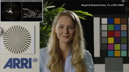
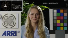
Curious about this "Venice" LUT so thought I would compare it with a number of the ARRI LUTs to see where Sony's Venice LUT inspiration was coming from. Three pics here. #1 if from the export screen of the ARRI Color Tool showing the selected "look" for export. In this case it's the X-2-ALEXA Rec 709. This was chosen as the comparison LUT to go up against the Sony Venice Rec 709 LUT. Pic #2 is the Sony Lut and pic #3 is the ALEXA LUT.
The reason for choosing the X-2-ALEXA Rec 709 LUT was because I noticed when used with ARRI's reference "Isabella" test shot (from Log C) the luminance levels between the two LUTs is amazingly close when you compare the two wave forms. Where I see the BIG difference is in the color charts and on the Vector scope. ARRI's magic has always been associated with the drop in chroma levels as luminance values go up. As I said just look how close the two waveforms are in luma levels but look how much more saturated the red, orange, pink, brown and skin tone patches are on the Venice color chart vs the ALEXA color chart. Conversely look for the opposite on the cyan, and the two darker blue chips on the ALEXA chart, much more saturated. To me the lower chroma levels on those important red, orange, pink, brown and skin tone patches, all of which contribute to skin tones, gives the ARRI skin tones a, let's say a slightly "lighter" more natural look to my eye given their lower chroma levels around that all important 50-60 IRE range.
As someone else pointed out there is a definite slight bias to yellowy-green in the Venice LUT. Study the grey patch below the Macbeth chart and i think most of you will see it. To me both are quite usable and I don't think I have any clients who could or would see the difference. Me I could go with either but having tried both out on S-LOG3 the X-2-ALEXA Rec 709 makes my smile a little wider.

I hope what I have described shows up on the uploaded files. On the originals and on the timeline all is as clear as day.
Long live our choices.
Chris Young
The reason for choosing the X-2-ALEXA Rec 709 LUT was because I noticed when used with ARRI's reference "Isabella" test shot (from Log C) the luminance levels between the two LUTs is amazingly close when you compare the two wave forms. Where I see the BIG difference is in the color charts and on the Vector scope. ARRI's magic has always been associated with the drop in chroma levels as luminance values go up. As I said just look how close the two waveforms are in luma levels but look how much more saturated the red, orange, pink, brown and skin tone patches are on the Venice color chart vs the ALEXA color chart. Conversely look for the opposite on the cyan, and the two darker blue chips on the ALEXA chart, much more saturated. To me the lower chroma levels on those important red, orange, pink, brown and skin tone patches, all of which contribute to skin tones, gives the ARRI skin tones a, let's say a slightly "lighter" more natural look to my eye given their lower chroma levels around that all important 50-60 IRE range.
As someone else pointed out there is a definite slight bias to yellowy-green in the Venice LUT. Study the grey patch below the Macbeth chart and i think most of you will see it. To me both are quite usable and I don't think I have any clients who could or would see the difference. Me I could go with either but having tried both out on S-LOG3 the X-2-ALEXA Rec 709 makes my smile a little wider.
I hope what I have described shows up on the uploaded files. On the originals and on the timeline all is as clear as day.
Long live our choices.
Chris Young


