
Navigation
Install the app
How to install the app on iOS
Follow along with the video below to see how to install our site as a web app on your home screen.
Note: This feature may not be available in some browsers.
More options
You are using an out of date browser. It may not display this or other websites correctly.
You should upgrade or use an alternative browser.
You should upgrade or use an alternative browser.
Best poster nominations - OFFICIAL THREAD
- Thread starter Jason Ramsey
- Start date


Matt Sconce
Veteran
bits and pieces for me as well.

Sprocketboy
Well-known member
Bits and Pieces is the clear winner.

Robert Eldon
Well-known member
I would have to vote for the following:
1st Bits and Pieces
2nd Trapped
3rd Sinnergy
4th StepMother
1st Bits and Pieces
2nd Trapped
3rd Sinnergy
4th StepMother
It's nice to see the posters getting some luv. I've noticed a distinct correlation between the quality of a poster and the film itself. Visually at least.
The importance of good design (or lack thereof): composition, negative space, proportion, focus, color, etc... should be a major consideration for all filmmakers. If it is missing in the poster, it most likely will be missing in the film. Not a coincidence.
A book that might be of interest is "The Visual Story" by Bruce Block.
#3) Bits n Pieces. This would have been my first pick except for the miniscule size of the tag line and title. I can barely see the name of the film. Disproportionately small, bigger (in this case at least) would be better.
#2) Sinnergy. Another great poster, but this time with nice large yet proportional size type. The flaw for me is the transition from the black on top into the photograph. It is too abrupt, and would be better with more feathering. A minor detail to some, but with a poster of this quality, little faults can be glaring.
#1) Dispatch. This is my favorite. Nice simple design. Wonderful colors. Nice font choices. Great job!
And to all the filmmakers who feel their posters are somehow lacking, the internet is a goldmine of tutorials, reference and all kinds of information. There's really no excuse, if you're willing to put in the HOURS needed to improve.
My two cents.

Susanne G.
Well-known member
Hi,
I like very much this three.
1. 'Lot 6A'
2. 'VII'
3. 'Mindy Madison and the cockroach man'
Susanne
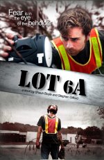
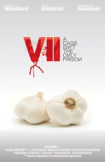
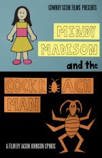
I like very much this three.
1. 'Lot 6A'
2. 'VII'
3. 'Mindy Madison and the cockroach man'
Susanne
Last edited:

Richard J. Johnson
Joystick Member
My favs are
1. The jones
2. Mindy madison
3. VII
1. The jones
2. Mindy madison
3. VII

Matt Harris
Veteran
Thanks for the props! NOBEL I was lucky to be attached to such an awesome film.
Matt Harris
Veteran
VII is an excellent poster, i took notes on that one. Nice work.
Matt Harris
Veteran
bits and pieces and the jones are also killer. hell most of the posters were just really good.

Kyle Stebbins
AD GURU
sinnergy, by far. mindy madison and VII are close seconds. not a fan of bits and pieces.


vnguyen972
Well-known member
1.Synergy
2.The Jones
3.Bits and Pieces (best image though, just thought if the title would be nicer if it's a bigger font and maybe right above the credits?)
4.Dispatch
2.The Jones
3.Bits and Pieces (best image though, just thought if the title would be nicer if it's a bigger font and maybe right above the credits?)
4.Dispatch

jasonthewho
Veteran
Thanks Susanne, Richard and Kyle for the props! I'm glad you guys liked the poster!

Chris_Keaton
ScriptFEST Mod
I love Bits and Pieces, Synnergy, and The Devil's Toy. Oh, wait of course I love The Devil's Toy.
Susanne G.
Well-known member
this will be highly informal....
not sure how the winner shall be picked as we don't have time to add it into the rating system or anything.
but, how's about post up your nominations for best poster in this thread... we'll just kinda play it by ear...
Hi Jason,
Did you find a solution how to choose the best poster? So, if you did - which poster is it?
Susanne
Kyle Stebbins
AD GURU

It truly is a stunning visual, but let's breakdown the hierarchy and reasoning behind each of the elements. For one, what is the point of inverting the text over the window? Just so we can read it?
Not a good enough reason in my book.
If it were to be titled "Night and Day", or "Inside and Outside", I could see a justification for placing the text over the window and setting it to a darker tone. Don't place things just because they look neat, legible, or shaped correctly... convey an idea to me. Great design is always about something bigger than pretty pictures.
Also, the placement of your text elements confuses me. Part of me is convinced that this film is called "Good Night. Sleep Tight." -- After all, those words aren't much smaller, and they are on top of the print. Keep going.
These are the reasons behind my choice to not nominate Bits And Pieces as #1, despite it seeming to win the audience approval in this thread.
I encourage all of you to give more consideration to your design choices. Don't make them all on a whim, and if you do, be sure you can back them up with an explanation, or some sort of reason as to why you did what you did. The more you practice this, the better your hand at design will get.
Then again, this IS a filmmaking forum not a design forum.

</rant>