Teal and orange, make it stop!

loser imitate classics, they wouldn't imitate other losers. that would be too lame.
and what's with the obsession of having only two tones.

color correction should not be obtrusive, two tones does not fit the bill.

color correction should be thought off similar to soundtrack and cinematography, it should embody feelings.
 
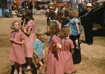
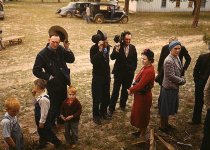
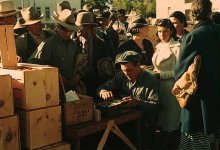
This looks like Fuji film. It has a very different feel than Kodak, it tends to have this rich green muted feel. Of course they could play on that in post but it never quite looks the same as when a film is shot with Fuji. I love that look.

I've only got one, and it's not as illustrative as it should be.

Screen-shot-2011-09-15-at-2.40.09-AM.png

Screen-shot-2011-09-15-at-2.40.32-AM.png
 
I don't see the problem with teal & orange. It is visually pleasing, which is the whole point. If it's not to you that's because you've become obsessed with it's overuse and now you're a nitpicker about it.

That said, I do have a problem with it used in extreme doses (e.g., Transformers 2 where the Alice robot chick was literally orange). But just adjusting your shadow and highlight hues a bit to create a more appealing aesthetic? I see no problem with that whatsoever.
 
Haha, I was coming here to see if anyone had mentioned this before on DVXUser and of course there is a thread. Given I am a HUGE Sci-Fi fan, I gotta say, the teal/orange is used quite a bit. And with the matrix, green. Don't get me wrong, I think there is a lot of well done versions of it, but, there are certainly bad versions as well. A lot of scifi films seem to reduce the color palette down for a lot of the film. I think it just sells a feeling more. Like Aliens or Pitch Black (which I love both of them). Or even the red/blue of Blade Runner. It's never really bothered me on good films.

The one film I HATE the colors on is Oceans 13. Maybe it's the DVD I got, but the colors are TOTALLY wacked out to me. WAY too saturated and shifted in some scenes. Is that a 70s look they were trying to go for?

But back to color palette, I like when films DON'T look like real life. I like when they are more artistic in their color choices, or lighting. To me, using all these tools to set the mood helps to sell the whole story. Like Picasso and his blue period. I love 'old man with guitar' and the fact it is all shades of blue. It's just so powerful to me.

I love the colorschemes in the film 'Sunshine' as well. Maybe others don't get affected by colors as much, but they are a big thing for me.
 
The one thing I find visually appealing is the over saturation you see on CSI Miami, specifically the landscape/cityscape shots. But I can see how it could be over done.
 
The one film I HATE the colors on is Oceans 13. Maybe it's the DVD I got, but the colors are TOTALLY wacked out to me. WAY too saturated and shifted in some scenes. Is that a 70s look they were trying to go for?

Wasn't just you, I noticed it too and it is annoying. It doesn't help that the film itself sucks hard. The first two were great (the first, incidentally, has a much moodier palette).

The only film I can remember really throwing me off from the story with the use of color is Black Hawk Down. I love that story, and I love everything about the film, but who in God's name had the idea to paint it blue and green?
 
What's REALLY messed up now is that they are going back and regrading older movies to teal and orange. I had Groundhog Day on cable the other day, and it was teal and orange! I kept thinking, maybe it was like that originally and I just wasn't educated enough to see it in the past, but when I looked up clips on Youtube, they were normal colored (not teal and orange). I have seen really old movies (like from the 60's) and they looked Teal and orange as well...

Kind of weird... movies started out in two colors (black and white), then everything went to color, and now everything is two colors again, teal and orange. In 20 years, will the kids complain when they try to colorize their teal and orange movies? :D
 
I like Postmaster's idea, going for old Kodachrome look. I also like it when people try to create their own two-strip film looks, as it doesn't happen very often with success.

If anyone wants to learn how to create the teal/orange, Stu Maschewitz has a great tutorial on Creative Cow on how to get that, and other looks.

[video]http://library.creativecow.net/articles/maschwitz_stu/red-giant-blockbuster-film-look.php[/video]

Anyone watch Flashpoint? Very teal/orange. Considering the show is Canadian, I would think lightblue to light yellow (shifting the color wheel a little counter clockwise) would be more creative. I do like the show though for the most part. Here's how it looks, and how I think it could look.
 

Attachments

  • Flashpoint-Orig.jpg
    Flashpoint-Orig.jpg
    69.4 KB · Views: 0
  • Flashpoint-CC.jpg
    Flashpoint-CC.jpg
    73.4 KB · Views: 0
Last edited:
Kind of weird... movies started out in two colors (black and white), then everything went to color,

In between that they had a magenta/cyan phase - aka two strip.

Can give some interesting results if you emulate that in post.

Frank
 
I like Postmaster's idea, going for old Kodachrome look. I also like it when people try to create their own two-strip film looks, as it doesn't happen very often with success.

If anyone wants to learn how to create the teal/orange, Stu Maschewitz has a great tutorial on Creative Cow on how to get that, and other looks.

[video]http://library.creativecow.net/articles/maschwitz_stu/red-giant-blockbuster-film-look.php[/video]

Anyone watch Flashpoint? Very teal/orange. Considering the show is Canadian, I would think lightblue to light yellow (shifting the color wheel a little counter clockwise) would be more creative. I do like the show though for the most part. Here's how it looks, and how I think it could look.

LOL, yes I watch it. For obvious reasons. And nope, don't like the shift. Like it the way it is, LOL.
 
The good news is, like fashion, as soon as everyone adopts teal and orange it will become passe and go away. So everybody do teal and orange to speed up the emergence of the new (no doubt ghastlier) trend!
 
LOL, yes I watch it. For obvious reasons. And nope, don't like the shift. Like it the way it is, LOL.
Yeah but, yeah but, it's not like Canada! Canada isn't orange and teal. They just do that to make us down here think Canada is sunny and warm. Anyone who has been there knows it's pretty much a vast, frozen wasteland. Hence, my color grading is much more accurate to the real Canada.

:happy:
 
Yeah but, yeah but, it's not like Canada! Canada isn't orange and teal. They just do that to make us down here think Canada is sunny and warm. Anyone who has been there knows it's pretty much a vast, frozen wasteland. Hence, my color grading is much more accurate to the real Canada.

:happy:
LOL, and here I had such good thoughts about retiring on a tropical beach in Canada...........
 
:p And all I did was select one of the white spots on his bandana and told PaintShop 'this is white'. It adjusted the rest to match. Hmmmm....
 
Back
Top