
Navigation
Install the app
How to install the app on iOS
Follow along with the video below to see how to install our site as a web app on your home screen.
Note: This feature may not be available in some browsers.
More options
You are using an out of date browser. It may not display this or other websites correctly.
You should upgrade or use an alternative browser.
You should upgrade or use an alternative browser.
Teal and orange, make it stop!
- Thread starter Batutta
- Start date


Batutta
Major Contributor
Funny, was just talking about this again the other day.
Considering doing it on the feature as well, because let's face it.. the look sells.
If you're doing like a sci-fi action thing I can tolerate it. But a family film?
Pietro Impagliazzo
Well-known member
Why not? :happy:

William_Robinette
Shallow Member
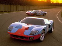
Teal and orange? Mmmmm.

Eric Boellner
Well-known member
Funny, was just talking about this again the other day.
Considering doing it on the feature as well, because let's face it.. the look sells.
Nooooooooo......

Doc Bernard
Indie Arms Member
And what is it I always say??????? Being a film-maker destroys your ability to just go out and watch a film just for entertainment like everyone else. LOL, case in point.
Trust me Battuta, I am there with you, though on different subjects. But we are forever destroyed from ever watching a film like the general public does. I bet maybe.....1-2 people, including yourself thought about that aspect during your showing. For me, it's weapons and tactics.
That's why I had to stop going to movies unless the subject really interested me. I always ended up with a bloody tongue.......from biting it so hard.
Last edited:

drapeama
Well-known member
That's a sad reality. More infos here.... let's face it.. the look sells.
Now what? People think that if they color correct their footage to something that looks like that, their short will looks more "cinematic"...
I personally color grade my shorts when I'm doing them, but as far as I know, I never did something like that. I'm no pro, but I hope I haven't fallen into that abyss...
drapeama
Well-known member
It doesn't happen often that I'm totally "in-the-movie" these days. Last ones I remmember where Inception and Memento, both from Christopher Nolan.But we are forever destroyed from ever watching a film like the general public does.
Doc Bernard
Indie Arms Member
My last one was "Saving Private Ryan". They almost got me with "Battle: LA"
drapeama
Well-known member
1) And say that Saving Private Ryan had some hard color grading in it. Nice job to Janusz Kaminski & Spielberg on that one.My last one was "Saving Private Ryan". They almost got me with "Battle: LA"
2) Why's that? I thought it wasn't "that bad" for something served so many times. Nothing new, certainly not refreshing, but quite a good guilty pleasure!

Jon Furtado
Well-known member
Certain color palettes define certain time periods in cinema. The 50's had pastels, 60's had vibrant color, 70's had earthy tones. Is this our Teal and Orange phase?

Postmaster
Dark Side of the Camera
Certain color palettes define certain time periods in cinema. ... Is this our Teal and Orange phase?
Green and Magenta - soon in your local theater. :cheesy:
drapeama
Well-known member
Ouch...Green and Magenta - soon in your local theater. :cheesy:


Whats wrong with teal orange???
it's too apparent for everyone, it gets you out of the story and doesn't add anything to it. color correction, art direction, wardrobe and location choices should make sense, add to the movie or at least not distract you from it.
skin tones are not dark orange/brown added to desaturated crushed blacks.
with only blue in the background.
if you can tell someone should look pale white, and looks almost like a tanning accident went extreme in a sitcom episode, it's jarring for anyone.
something like bay movies are excellent examples, he shifts everything to extreme levels of blue and brown. after choosing to make any location or wardrobe choice blue.
i think when comedies made by genesis go to extremes with skin tones and sharpness, it add murky gray to the orange/brown skin tones (looks like an inverted curve murkiness).
but that's different than choosing to shoot normal looking skin tones at the beach or ocean with normal looking ocean or sea colors, that's more close to vibrant 'happy' colors. something comedies could consider.
drapeama
Well-known member
As Batutta said, if skintones would look quite natural, there wouldn't be anything wrong with it. But like in most major movies, it's always exagerated, so it becomes annoying.Whats wrong with teal orange???