Teal and orange, make it stop!

Teal and Orange - Hollywood, Please Stop the Madness!

http://theabyssgazes.blogspot.com/2010/03/teal-and-orange-hollywood-please-stop.html


hwl
 
Last edited:
That's a sad reality. More infos here.
Now what? People think that if they color correct their footage to something that looks like that, their short will looks more "cinematic"...
I personally color grade my shorts when I'm doing them, but as far as I know, I never did something like that. I'm no pro, but I hope I haven't fallen into that abyss...

It really is a sad reality, but it's a reality right now. If your material lends itself to the image, it may ease the pain.

I'm already thinking about color scheme for the next feature, along with sound design and such.

It's a tough decision, though. I mean I really want a natural looking image, but it almost feels outdated in comparison to movies you see now. And, I feel like most distros are looking for something they can sell to now's audience (call it a hunch...) so what can you do? I am NOT saying that eveyrone has to grade like this, I haven't truly decided to go that way but if push comes to shove...
 
Green and Magenta - soon in your local theater. :cheesy:

And guess what color scheme I was going for next round out?

I call it Pink and Green, but you're right, it's Magenta and Green.

I saw an example of it in another movie and I LOVED the look, although I think they were forced to do it... I am going to explore it, not even kidding.


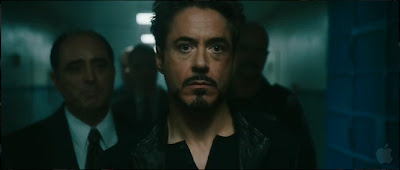
This one looks more obviously processed/graded with a fake feel to it.


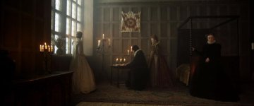
These two I don't mind too much. The Wolfman one looks kinda like it should. Candle-lit with some rainy or foggy weather outside.

The Hot Tub Time Machine one also isn't horribly offensive.

I think it comes down to the second two not being overly saturated. They certainly aren't the kind of in-your-face use of teal and orange seen in stuff like Michael Bay's films, for one extreme example.

Funny, was just talking about this again the other day.

Considering doing it on the feature as well, because let's face it.. the look sells.

Well, if you think it fits your feature's aesthetic, then it is not such a bad thing. I personally don't like overly graded films when it becomes obvious that a more natural look feels like the more logical choice. As a viewer somewhat knowledgeable of cinematic techniques, it is frustrating when the notion of "this teal and orange or overly graded film should have a more natural look" shines through the fancy digital colorist sorcery. Same goes for way too much de-saturation and bleach bypassing to force a "gritty" look on the viewer.

I suppose it is like any tool or technique. When used to tell the story, it can really be a help or, to use a cooking term, a nice spice or garnish that enhances the experience. When used only to sell the story, or as a gimmick like the attack of the anamorphic lens flares in JJ Abram's Star Trek reboot, it oftentimes might rub viewers the wrong way. Of course, there is the whole trend of when a new tool or technique is unleashed upon the film making industry, it often is abused after one or several originating films bring said tool to the table (CGI, shallow DoF on DSLR's, bullet time, teal and orange, shaky cam/faux documentary style hand-held, 3D).

I think this does open up a pathway to a larger discussion though, especially now that ARRI and Panavision are no longer manufacturing film cameras. Kodak is not experiencing good financial times, etc. Basically, film is getting dangerously close to dying, and in its place are we going to be stuck with grain-less, over-colored/over-graded films that won't have much of the analogue or organic feel that many films of the past have had in their cinematic DNA? Just look what happened with animatronic effects, prosthetics, matte paintings, and miniatures as CGI and digital effects became top dog. Not that I think digital cinematography or effects are bad, but that it shouldn't be the ONLY OPTION FOR EVERYTHING. Just as all films shouldn't now be required to be in 3D. Don't get me started on the recent developments involving the big push for 60fps as a better standard for theatrical exhibition.

Or to give you all the short and sweet version of all the stuff I typed above...
what really scares me is that accomplished film makers like Michael Mann and George Lucas both have fully embraced digital with their most recent films (Public Enemies/Star Wars prequel trilogy), and they both say that digital cinematography is better. Of course, looking at Public Enemies and Star Wars Ep. I-III, how could anyone in their right minds say that those films look better from a cinematography and effects perspective than Thief, Heat, Last of the Mohicans, or the original Star Wars trilogy? Hell, even Collateral and Miami Vice, which were both much better fits for the use of digital cinematography, still pale in comparison to Mann's earlier work.


And the irony of all this is that my Escape From New York avatar image has a bit o' the old teal n' orange.​
 
Last edited:
Wait till u get an eye full of "out of Time".

Roger deaking going to town on an alexa.
 
I think the whole teal & orange thing is blown completely out of proportion, to the point where people are seeing it when it isn't even there.

Yeah the skin tones look bad in the Zookeeper shots, and some films like Transformers are prime offenders, but not every attempt by a cinematographer to balance warm & cold color tones in a frame is an attempt to homogenize the entire cinematic color palette into one single look called teal & orange.
 
These two I don't mind too much. The Wolfman one looks kinda like it should. Candle-lit with some rainy or foggy weather outside.

Actually it´s quite perfect. In most films, especially when shot on video, they never get candles, oil lamps, fire and sometimes even practical lights right.
They are mostly way to orange. I think they really nailed it in Wolfman.

They also nailed it in Anonymus (shot on Alexa).

Anon_test_sm.jpg anonymous_still_2.JPG

Actually I don´t mind a bit of teal and orange, but don´t get me into Zookeeper.
They totally overdone it here. Sometimes you can even see the powerwindows masks.

Frank
 
Last edited:
HP 7.2 wasn't teal & orange, neither was POTC4. Though, posters for both films sold at least a slight teal/orange look. I think posters have to do that, though, to represent that the film isn't monochromatic, or to demonstrate the color range of the film. I think, Kholi, that you should definitely take care before deciding, and I wouldn't rule out giving the posters a soft teal/orange slant while the keeping the natural look for the film itself.
 
Now I´m curious Kholi, any examples of what you have in mind?

Frank

I've only got one, and it's not as illustrative as it should be.

Screen-shot-2011-09-15-at-2.40.09-AM.png

Screen-shot-2011-09-15-at-2.40.32-AM.png


So these are much more aggressive than what I'm talking about, but at a certain point in this scene it's sort of tamed and the pink and green look, once my eyes adjusted, was rather interesting. I don't think that they wanted this look initially, it looks like something they had to settle on to get the blacklight look and this is what happened in post.

It looked pretty eerie, in a "otherwordly" way and for that reason I really liked the look. So, I'm going to try to experiment with it to see what happens if you go this way instead of teal and orange. Question is, do you light for this in a different fashion as well? You could get teal and orange in a more natural way by using the right gels on lights and "enhancing" it slightly in post.

Same thing for pink and green? Using coral and magenta gels for lights?

I don't know yet, which is why experimenting before hand is necessary.

Caution should always be used when deciding how aggressive to be with a grade. As well, caution should always be used when deciding if you want to at least try to break even on something you've spent a lot of time and money on, so things have to be weighed. In the case of the feature, I've actually seen the look on the footage and I admit that when the colorist did it my brain instantly went "movie".

The grade on the trailer is much more natural, saturated, and everyone looks healthy. If I did go that way it'd be more subtle than any of the examples posted, but at the end of the day... it's not an easy choice when you've got other people on board. Not that I'm trying to justify it, I guess it's just insight as to why you would potentially "follow" a trend.

I do see it every time I watch a movie and when it's overdone, man is it annoying.
 
By the way, there's a movie called BIG BANG (antonia banderas and a few other people) on Netflix.

I haven't watched all of it just yet but that movie has so many different looks from what I've seen it's crazy. The beginning is like black and white, but the faces are roto'd so they're more "orangeish". I couldn't tell at first, but once I caught it it was quite interesting to look at.
 
just from the trailer, they cloned a film noir movie, but did it on acid.

it's a shame, the number of name actors in that movie.
 
I think the whole teal & orange thing is blown completely out of proportion, to the point where people are seeing it when it isn't even there.

Yeah the skin tones look bad in the Zookeeper shots, and some films like Transformers are prime offenders, but not every attempt by a cinematographer to balance warm & cold color tones in a frame is an attempt to homogenize the entire cinematic color palette into one single look called teal & orange.

I completely second this.

It's a simple balancing of warm tungsten lights with outdoor light (usually moonlight/night ambient light). To me, this is just a natural mix. Some films have taken it to the extreme, yes. However, IMO if it doesn't work it's not because of the color palette, it's because of HOW they use that color palette. Zoo Keeper is just poorly graded IMO.
 
That's our feature, Superseeds.

From the club location day.

Most of that's in camera, though! And, it's Matty G's shooting. RED MX, a 1K soft box on a dimmer and the backlights are Kinos or Tungsten units blued to all hell.
 
Trying not to sound too cynical here, but in 20 years EVERYBODY will be all "HOW DO I GET THAT CLASSIC 2010's TEAL & ORANGE LOOK AND WHAT'S THE BEST WAY TO FAKE ROLLING SHUTTER?!".

You know that, right?
 
Back
Top