Sony color science and shooting flat

filmguy123

Veteran
Help me understand color science here. A lot of complaints on the Sony specify the drawback to Sony (and keeping in mind that every manufacture has some downside or drawback) are

- Menu structure (fighting with camera, obtuse menu systems)
- Color science

Wondering if you shoot everything flat and then grade, how big of a deal is the color science VS offerings from Canon/Panasonic/BMD?
 
Sony has three elements of colour science..

1) Regular (custom) settings.. these have a legit reputation for looking pretty horrible.

To some extent if you shoot to protect your highlights 'pretty horrible' turns to only 'slightly horrible'

2) Painted camera. You can dial in about a billion different colour combos using the paint menu. Some people (mainly engineers on broadcast shows) seem to have got nice colour this way. (I tried for a week and failed but don't have fancy scopes and test charts to hand)

Also I take an inability blow my highlights as a personal affront to my style of image creation.. so dont really persue camera setups that will box me in to exposure at a certain IRE.

3) SLog(3). Here you are capturing enough info to make pretty pictures... but you need a fast reliable route to do this, I think the Slog3 LUT(s) has been a huge leap of making the route easy, but still that route only gets you 80% of the way.. the rest is secret sauce of top end colouring, production design, good exposure and all the usual nonsense.

S
 
I find the new colour science in Sgamut3.cine to be lovely and much improved over earlier slog and the dreadful hypergammas. The Sony luts for these give a great starting place to grade (although you need to take some magenta out of the stock 709TypeA lut)

Menu structure out of the gate can be weird but properly setting up the custom user menu has made it very usable now that I am familiar with how to get each item in the minimum amount of clicks. This is with the FS7 I'm not sure how other sony cameras behave and not sure if you had a specific model in mind.
 
S-Gamut is old sony color science found on CineAlta camera's right up until the Sony F3. On CineAlta camera's after the F3 (like the F5 & F55) they received S-Gamut3.cine in CineEI mode via firmware update from December 2013.

Sony tied the old color science (S-Gamut) to the Custom mode on these camera's, and tied the new color science (S-Gamut3.cine) to CineEI mode. If you shot in custom mode and chose slog2 or slog3, you were still using the old color science S-Gamut but if you disabled the matrix settings it helped get better color when grading later. Hand's down the best color space to shoot nowadays is S-Gamut3.cine because it grades easy and without weird color shifts due to it's alignment with REC709 primaries.

Now you have posted in the NEX section of the forums so you probably don't care about CineAlta camera's. Sony FS100 and FS700 also had the older color science (S-Gamut). The FS100 did not have any S-Log, the FS700 had S-Log2 gamma. But in reality it's the color science itself that makes the biggest difference not the gamma encoding in my opinion. The FS7 camera offers both new and old color science, and S-Log 2 and S-Log 3 gammas, but similar to the F5 and F55 it has a color science tied specifically to the Custom mode and CineEI mode.

The A7s camera has S-Log2 and uses the old color science S-Gamut. It wasn't until the A7sii came out that you got the newer color science S-Gamut3.cine and access to S-Log3.

Maybe the crazy thing about color science, is it's not an exact science. To me, I think the S-Gamut from the A7 camera's look better than the color I got from the Sony F3 which again was the same color science.
 
Last edited:
I've been shooting on the a7rii for a little over a month now and I've no issues with Sony colors- and I've
been shooting various Canon cameras for years.
if my colors suck, it's got nothing to do with the camera.....:shocked:
 
Last edited:
Previous answers already provide great info, but I'll also add my two cents: I think the reason people say Sony color sucks, or at least a7S color sucks, is because sgamut sucks. And it does. There are other color modes in there but lots of people never got to trying them, they just found sgamut on the a7S is ugly and went back to their C300 or whatever much more expensive camera they were already using.

And yes, also because blown highlights look bad, but hey, with slog2 (which is great and you can use without being forced to go with sgamut too) you have plenty of DR to protect your highlights in most situations.

Also: if you want to try one of those "engineered" settings that morgan_moore mentioned, these are mine. My aim when making these was to get accurate colors and in particular pleasing skin tones. If you're editing in Premiere you can then grade with these.
 
Sony FS100 and FS700 also had the older color science (S-Gamut). Those camera only had S-Log1 gamma, not S-Log2 and 3, but in reality it's the color science itself that makes the biggest difference not the gamma encoding in my opinion.
The FS100 don't have any SLog and the FS700 has SLog2.
I believe the FS700 has a bit of its own version of SGamut as standard Sony LUTs etc don't quite work on it.
Colour of the FS700 and the A7S seems to be quite a bit different also...
 
Thanks corrected my post.

And agreed, even though the "same" colour science is said to exist on specific models - many have found they are not the same. This can easily be seen by applying the same LUT across various camera's.. as you had noted. Strange things Sony has done.
 
If people can't get good color on a modern Sony camera, it's their fault, not the cameras. My a7s produced some of the best colors I've shot... Not because it was better than other cameras, but because I took the time to figure out slog2/sgamut. I know a lot of people think sgamut was bad, but I don't get the hate, it produced great stuff for me.
 
The A7SII color science with SGamut3.cine is much better than SGamut on the A7S. I was able to somewhat closely match the A7SII to the C300II: https://www.youtube.com/watch?v=0Ulmgc_a39Q . The reason Canon is still preferred is colors out of camera look pretty good. Sonys take a lot more work in post. I recently shot a live performance with the A7SII and the 5D3 for another view. The Canon had better color, but of course was soft 1080p and has much less DR vs. the A7SII. After a bit of grading in PP CC, the A7SII using Slog2 gamma and SGamut3.cine looks pretty nice for skintones. Will probably replace the 5D3 and A7S I & II with the 1DXII or preferably the 5D4. PDAF AF rocks for live/run&gun and fast narrative production without a focus puller.
 
I think we need to step back. There are two issues here.

There is nothing wrong with SGamut or in fact any other colorspace. All it describes are the 3 primaries that define what that gamut can hold. You can freely convert between colorspaces with simple math. The sRGB/709 colorspace matches closely to what a monitor can display and an image recorded in that colorspace will look fully saturated. The exact same image recorded in a wider colorspace will look desaturated when viewing on a 709 monitor. Some colorspaces *move* the primaries so that the colours will look wrong on an sRGB display, SGamuts green and red are quite different because they are defining a big gamut.

But if you take the same image, one stored in 709 and one in SGamut then if you convert SGamut to 709 correctly the images will look the same again. But if you do *not* convert that SGamut properly then the colours will look wrong.

So part of the issue is post workflow.

The other issue is that what does the camera do internally *before* the image gets stored.

So i think some of the Sony issues are with some odd choices that Sony have made in the past, perhaps even mistakes. Witness the FS100 reds and the original A7s colours. I think those are real problems the cameras had internally. Of course if you then record those using SGamut and don't post them right your colours will be even worse.

If you can, take RAW and the compare with movies being recorded with the same camera. The RAW is usually much much better because IMHO there's less Sony work going on in the camera and less chances for post mistakes too.

Does that makes thing clearer or less colourful?

cheers
Paul
 
The problem with SLog2+SGamut is green-magenta color shift with exposure (there's a video online which demonstrates this)...
And, just like that, there's a BertLut that does a pretty decent job fixing the magenta issue (and can be found in an adjacent thread).
 
The problem with SLog2+SGamut is green-magenta color shift with exposure (there's a video online which demonstrates this). A simple linear transform can't fix it.
Even when used 'correctly', SGamut3 has more accurate color than SGamut: http://www.dvinfo.net/article/acquisition/sonyxdcam/sony_sgamut_vs_sgamut3.html

I'd be interested in seeing that video, i'd heard of an isolated case, but wasn't aware this was a general issue.

SGamut3.cine uses primaries that are on a similar axis to Rec709. So the overall effect would be that an image looks less saturated on an sRGB/709 monitor. I believe sony did this precisely because people had issues working with Gamut, they just gave up. With SGamut3.cine you can just increase saturation to taste and you're sort of in the ballpark. Whereas the Primaries for SGamut are totally different, so looking at an SGamut image on a 709 display would look like the wrong colours.

Full details here.

https://community.sony.com/sony/att...ry_for_S-Gamut3Cine_S-Gamut3_S-Log3_V1_00.pdf

The SGamut situation is made worse because Sony also baked in white points, meaning that technically you need different conversions for different white balances. The move to SGamut3 was to remove this.

There's a real argument to say that with limited colour depth (8 bit YUV) you should use a colorspace as small as possible to fit your cameras gamut in. I was into SGamut3.cine but after ripping apart some YUV files i started wonder whether this was a good idea.

And, just like that, there's a BertLut that does a pretty decent job fixing the magenta issue (and can be found in an adjacent thread).

You need to be very careful with LUTs, there's a link in my signature at the moment which highlights some of the issues. I've not looked at the BertLUT but these kind of technical transforms are often better done without LUTs (assuming that's possible, but it usually is). Not all LUTs are equal when you look into them. I hope that BertLUT is sufficiently high enough quality to not affect footage.

cheers
Paul
 
That "skin tone goes magenta with exposure" video was very striking (you can watch it here, but you don't even have to hit play to see the issue), but I tried to replicate it and didn't get bad results. I believe it depends on which white balance setting you are using. Or maybe the tester got something wrong with his LUTs. No idea.
In any case, does anybody remember the "skin with yellow patches" issue we saw on the first a7S videos? That problem went away by leaving sgamut behind.
I (mostly) understand color spaces, and I know I'm not using the proper post workflow (I never liked LUTs, in part because they can't be tweaked and in part because I could never get good results with them), but I also think Sony did something wrong with sgamut on the a7S. No idea which other cameras have or don't have these issues.
 
Hi Samuel,

I hadn't seen that one, must have missed it way back when. There's no information whatsoever about what LUT was being used or the post workflow making the process possibly flawed. Maybe there was a thread to explain that i've not seen?

For example, was exposure adjusted before or after the LUT. Could it be the 709 LUT changing colour across the tonal range? Was the LUT being fed correct image data? Where was the LUT from? (For example: If a LUT is expecting Slog2 data, is it being fed that correctly or is it being fed 709? or sRGB? In PPro Lumetri input LUT expects 709 data, not sRGB, so even if you get the primaries right the tone curve could be a bit out of whack).

Not saying this isn't the case, as i've noticed a tendency to go magenta in the shadows on the A7s, in fact in quite a few cameras. But if you look at Arri and others, they tend to supply or allow the creation of LUTs on a per exposure level basis. Perhaps to counteract the sensors native tendency to go off in shadows.

That BertLUT would need to be created for multiple exposure levels in order to counteract something like this, but as far as i can see it's just a single LUT?

cheers
Paul
 
I wasn't even able to replicate the results, maybe because I use curves instead of LUTs, or maybe because it only appears at some WB range. So, no idea. In any case, my workflow with Cinema color doesn't use LUTs and doesn't have these problems. I'm much happier staying away from sgamut, even though, yes, a good workflow should in theory make it work properly.
 
Hey Guys,

wanted to chime in and report about my findings. I shot a lot of tests with the A7s and my color checker, to understand how the camera processes colors.

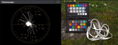
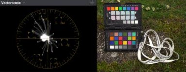
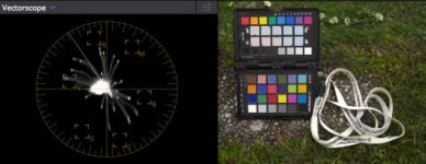
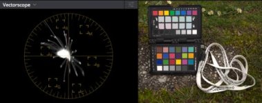
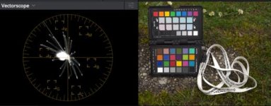
It seems that color also depends on the gamma you select on the A7s. I also shoot with specific color depth settings, to reduce the luma or certain colors. Red especially is overly bright. You can see this on the SL ITU shot below vs the 709 ITU one, which is corrected via depth. S-Gamut seems to have "deeper" colors in general but, if you look at the vectorscope, puts the colors in very weird places. Cyan is shifted more to blue, oranges get yellow etc.

I have a reference picture of a CG color checker chart, which I overlay, to have my marks on the vectorscope. I then adjust Hue and Sat to match. Usually this is quite easy, but with SG you really have to pull a few stunts.

Still undecided which one I'll stick with. It will probably be Cine1 with the ITU matrix, to have a clean colorful base. SL is much easier to linearize, but the color depth settings are not as effective as with Cine1 or the plain old vanilla 709 gamma.

Have a look at the screenshots below and let me know what you think!
Hope you can see enough!

709/ITU with color depth settings (3,0,3,1,3,0)
709 ITU.jpg

SL/ITU with 2 stop correction and SL2 => 709 LUT. Notice the slight color shift and brighter colors.
SL ITU.jpg

SL/SG with 2 stop correction, color space conversion and SL2 => 709 LUT
SL SG.jpg

SL/SG corrected with Hue/Sat Curves
SL SG Corr.jpg

709/ITU corrected with Hue/Sat Curves
709 ITU Corr.jpg
 
^ Try my Flaat settings, I made them following a similar method. They are not perfect, but they are as good as I could make them in-camera.

This is a shot of my spydercheckr, with little "correct" squares for reference:
spydercheckr_9_flaat.jpg
 
Cinema was looking also a bit odd on the vectorscope in my initial tests, but I'll give it another shot!
What I'm not sure about are saturation adjustments in S-Log gamma vs. linear gamma. There are really strange things happening on the vectorscope and with the luma values of the colors if you change saturation before linearizing or in linear gamma.
That's why I usually don't touch the saturation in camera. Except for S-Gamut, where I record with +24 to reduce noise. I then apply a saturation correction in Resolve of 30 (default 50), before further processing. This leads to identical results compared to saturation set to 0 :cool:
 
Back
Top