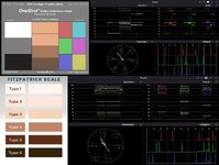
Skin Tone - What Technique to match shot to shot

@Paul F, yes snow blindness is a thing, when you look at it too long. I recheck things a day later.

I also understand and agree exactly what Norbro is saying about the contrasty lut, not for a final look but for finding a range. When struggling with WB in post, a pretty well known technique is to boost saturation levels, then find your WB and return saturation to normal afterward, or a temporary lut as Norbro said. Some of the responses have been for how to shoot the scene, while the original question I think was how to match them when you have snow blindness. I take that to mean in post, not while shooting.

At weddings, you won't have the opportunity to WB every shot. The key then in post, is that the color at the end of the 1st scene matches the color at the beginning of the 2nd. In other words, not to match the beginning of the 1st to the beginning of the 2nd, and so on. And use keyframes.

Finally, to match skin tones exactly, take a frame grab of the desired look, and split screen it next to the one you will grade to match it. It's easier to be perfect when you don't have to switch back and forth. Side by side is how.
 
Last edited:
In many pro grading suites they light the surround of the monitor and paint the surface a neutral grey.

Your eyes have an ability to auto white balance and you can’t turn it off. So staring at a deeply saturated red image for a while and you start to not see the red anymore. If you’re grading you can then end up making the wrong choices.

Having a neutral monitor surround that you can use to stare at for a few seconds as you work means you can reset your eyes auto white balance. You can do something similar by lighting a grey card and setting it in your peripheral vision. Make sure it’s not very bright though.

Another option is to take a regular 20 min break. Stand up, go outside to a differently lit area for a min or too and reset your eyes that way. Come back and look at what you’ve already done in real time. Don’t just come back and keep working. You’ll get a sense of the flow.

Typically if the skin tones aren’t matching shot to shot it’s usually because the exposure is changing. Was the DP changing exposure for each setup? This is often because they are some kind of ETTR technique. But if they are changing exposure shot to shoot it can make it very difficult to match them up again later.
 
Those are good notes about the edit room.

I didn't notice the exposure methods as I was usually doing something else while they set up shots. But I do recall that for one shot, I didn't like how bright a practical was. They didn't have a dimmer for it so they brightened up all the Aputures and closed down the lens aperture or adjusted the ND.
 
There is absolutely no way your skin colors are not what they should be, due to the fact that there is nothing objective about colors. Different genders, races, ethnicities and the influence of genetics makes different people see colors differently. Even between men and women. Your statement "...this looks right seems to change over time." Yes, of course it does. That is how your eyes work. The 'looks right' thing can change when you edit in a well lit space or a dark edit suite. In one environment, you may be happy with how your images look. In the other environment, you may think your grade looks off. Look at your skin tones on a monitor set for, CIE standard illuminant A (Tungsten). Now look at the same grade on a monitor set for CIE standard illuminant D65 (Daylight). They will look very different.

What might be a perfect skin tone to me visually may be way off to another observer. The skin tone line on the vector scope in your NLE is an electronically objectively defined vector of color based on wavelength measurements. If we all work to this vector standard, we are at least being consistent as to where we are defining where the skin tone should be. How viewers then perceive this objectively defined 'skin tone' can, subjectively, vary greatly between observers. We had to study this in the '60s when studying for what was back then a degree in photographic technology. Long before portable video and electronic editing. Obviously, all that tech has changed massively, but what hasn't changed is the physiology of human vision. So regardless of what you "think" your skin tones should be is only relevant to you in a set environment. Many others may agree with your subjective assessment of what the skin tone of a subject should be, but many others may disagree with that judgement.

Quote:
"The fact that the number of cones in our eyes varies considerably suggests that the brain must be able to automatically adjust the input from the retina. So, individual variations in color perception may not purely be a matter of the nature and number of the cones (or photoreceptors) in the retina. It can also be a result of the fact that people with different numbers of cones calibrate the input from the retina in different ways."

For the sake of consistency in grading, SMPTE decided that as the bulk of skin tones when measured electronically fell in that roughly 11 o'clock vector position where we find the skin tone indicator line on the vector scope. That vector would become the skin tone standard. So basically, if we all work to an electronically defined objective standard based off wavelength measurements, we are placing the skin tones where they should be. How viewers interpret those tones is totally up to the physiology of that individual's vision.

The Caucasian eye sees colors differently to the Asian eye. That is a measurable fact from the study of the human eye in the way eyes of people of different ethnicities interpret various wavelengths. This is why, going back some years, many photographers from the west tended to like the look of Kodak and Agfa color film as opposed to Fuji and Konica color film. To western eyes, early Fuji and Konica film stocks appeared to bias towards blue. Agfa film from Germany on the other hand tended to render warmer tones. Agfa stocks were developed to 'subjectively' satisfy the European eye as to what looked natural to Caucasian Europeans.

To that end, well done. I see the skin tones in your images to be quite pleasing and totally acceptable. We can be our own worst enemies when we start second guessing skin tones from a subjective point of view. Sure, when we are grading, most of us can't help but make some subjective tweaks to the skin tones... to satisfy our own visual whims and desires. :)

Chris Young

https://www.psychologytoday.com/au/blog/the-superhuman-mind/202006/why-we-dont-see-the-same-colors

https://cie.co.at/publications/colorimetry-part-2-cie-standard-illuminants-0

And if you really want to deep dive why, you have the battle of "What looks right". Go deeper!

https://www.ncbi.nlm.nih.gov/books/NBK538493/
 
Quote:

For the sake of consistency in grading, SMPTE decided that as the bulk of skin tones when measured electronically fell in that roughly 11 o'clock vector position where we find the skin tone indicator line on the vector scope.

The 11 o'clock line is certainly a precise definition but the light reflected back from the skin is a range of values. So you certainly covered that when you said "roughly" but even so there is variability within the same skin and lighting. You could target hue for the center of that range, or anywhere else but the degree of variability from what's reflected back is not going to be as constant as that 11 o'clock position. Arguably good enough I suppose.
 
There is absolutely no way your skin colors are not what they should be, due to the fact that there is nothing objective about colors. Different genders, races, ethnicities and the influence of genetics makes different people see colors differently. Even between men and women. Your statement "...this looks right seems to change over time." Yes, of course it does. That is how your eyes work. The 'looks right' thing can change when you edit in a well lit space or a dark edit suite. In one environment, you may be happy with how your images look. In the other environment, you may think your grade looks off. Look at your skin tones on a monitor set for, CIE standard illuminant A (Tungsten). Now look at the same grade on a monitor set for CIE standard illuminant D65 (Daylight). They will look very different.
.................
Thank you cy, your post was informative and helpful.
 
One thing that really helped me was to get the Blackmagic Micro color panel. Trying to use the screen wheels with a mouse is tedious. The slightest move of the mouse changes the image significantly. That's part of what was making the grading so frustrating. Unfortunately, I bought it when I was about 90% complete with grading. The Micro panel made things so much easier.
 
The 11 o'clock line is certainly a precise definition but the light reflected back from the skin is a range of values. So you certainly covered that when you said "roughly" but even so there is variability within the same skin and lighting. You could target hue for the center of that range, or anywhere else but the degree of variability from what's reflected back is not going to be as constant as that 11 o'clock position. Arguably good enough I suppose.
Couldn't agree more with you. TR. That is why "roughly" was the word used for the skin tone line. A rough guide was how it was first described. Because, as you state, the variability within the same skin and lighting can be quite wide. Like any guideline, it is just that, a middle of the road skin tone guideline giving editors a place to start. It is quite amazing though that right across a whole range of skin tones, light to dark, they all fall "roughly" within a 15-20 degree vector range.
:D

Chris Young
 

Attachments

  • Skin tone vectors (comp) 1280.jpg
    Skin tone vectors (comp) 1280.jpg
    465.3 KB · Views: 3
Back
Top