Skin Tone - What Technique to match shot to shot

Paul F

Veteran
I finished my short and it's just now I'm thinking I should have asked this question before struggling with skin color. I had four scenes at four locations; two outdoors, two indoors, all night scenes. All the scenes were lit with Aputure 100d with CTO and Sony FX6. Same Gaffer and DP for all shots. One actress has pale skin. I had great difficulty matching her skin color from shot to shot. In fact, I never really accomplished it. At times her face looked green, then yellow, the ok, then too tan then too light, too saturated. Oye. I became 'snow blind' not being able to figure out what I was looking at and determining how I should shade her skin. I've looked at plenty of tutorials. They helped, but I still struggled.

I would like to see if I can take another crack at it and really get it matched. Do you experience 'snow blindness' when working on skin tones? You know, not sure of what you are looking at because you looked at it so long?

Would an X-rite color checker have helped?
 
One of the easiest ways (for me) is to use a pretty contrasty and saturated LUT on a monitor and commit to a range/levels via one of the exposure tools so it's consistent.

You can do this without the LUT but when you're seeing something that already looks like a final product/movie on your monitor, it's easier to visualize the scene and make some decisions (that even the above might not tell you through data) by using your own human instinct ("Let's actually open it up a little here.", etc).

Creative LUTs are better than general conversion/transformation LUTs for this (which could still look pretty flat).
 
I finished my short and it's just now I'm thinking I should have asked this question before struggling with skin color. I had four scenes at four locations; two outdoors, two indoors, all night scenes. All the scenes were lit with Aputure 100d with CTO and Sony FX6. Same Gaffer and DP for all shots. One actress has pale skin. I had great difficulty matching her skin color from shot to shot. In fact, I never really accomplished it. At times her face looked green, then yellow, the ok, then too tan then too light, too saturated. Oye. I became 'snow blind' not being able to figure out what I was looking at and determining how I should shade her skin. I've looked at plenty of tutorials. They helped, but I still struggled.

I would like to see if I can take another crack at it and really get it matched. Do you experience 'snow blindness' when working on skin tones? You know, not sure of what you are looking at because you looked at it so long?

Would an X-rite color checker have helped?
Hmmm, no mention of your white balancing method, which is the most critical thing of all when it comes to color. What was it?
Also, what was the purpose of the CTO? Can't image that being necessary in 2024 for a shoot with a single light.
What shooting mode, S-LOG3, S-Cinetone, or other?
Was your exposure consistently right on the mark? What was your target level and how did you measure it?
 
I wasn't the DP, so I can't answer some questions. It was multiple 100ds. It was shot on S-log3. Good question about the white balance. I did not observe any white balance procedures. I did see the DP and gaffer checking exposure with false colors. I did not observe a disciplined exposure target.

You have pointed out some good issues.
 
Since you have no idea what happened I will outline the best method for avoiding this issue next time.

First do a white balance on a card then hold up a color checker chart next to the face and record it. X-Rite Passport is the most popular. https://www.bhphotovideo.com/c/product/1191324-REG/x_rite_msccppvc_color_checker_passport_video.html
The whole point of using a color chart is that it gives you a basis to correct from otherwise you're just guessing.

In editing you can mask the chart and use color tools such as the waveform and vector scope.
Caleb outlines the basics but there are many methods.


This first procedure is referred to color correcting. After you can do color grading which is when colors are changed to create a mood or be more flattering to the subject.

Note if it was filmed in mix lighting if the intensity of one of the light sources changes so will the color. A classic example is if there is a window the outdoor light intensity will be constantly changing the color throughout the shoot. Often people in a hurry when filming will assume outdoors is 5600k or their lights are accurate, or not take into account a secondary source is changing.
 
Last edited:
Many questions to ask (which not being the DP might not be available to you). If there wasn't white balancing going on, presumably they dialed in a specific color temp like 3200K and went with it. I'm assuming the CTO was to correct the 100D to 3200K (and given all night scenes, that makes sense--in as much as using daylight balanced units for a tungsten balanced project, but I have to assume that was a matter of gear availability).

So the question becomes, what would have caused the color shifts, if the formula remained the same from shot to shot, scene to scene? Were there other light sources in play--streetlights or floodlights on buildings for the night work, existing practicals for the interiors? If so, then I can see how this could be happening if those sources were having more or less impact on the scene from shot to shot (i.e. filling in wherever the 100D's weren't).

Bottom line is--if you were shooting under controlled environment where the only instruments in use were the Aputures and you still got color shifts in the skin tone, I'd wonder if the CTO cuts were possibly old and thus giving different results in color between the heads.

NorBro, my feeling about LUT's goes against what many believe. I prefer to work from 709 nearly all the time, unless the look is notably divergent AND I'm working with a DIT who can switch between the LUT we've built on set and 709 so I can be sure we are "protecting the negative". I had some bad experiences early on with introducing too much or too little fill because I didn't know exactly what the LUT was doing, and that created some difficulties in post especially for low-light scenes. If I can make it look good in 709, I know we have all the flexibility needed to take it through the grade.
 
NorBro, my feeling about LUT's goes against what many believe. I prefer to work from 709 nearly all the time, unless the look is notably divergent AND I'm working with a DIT who can switch between the LUT we've built on set and 709 so I can be sure we are "protecting the negative". I had some bad experiences early on with introducing too much or too little fill because I didn't know exactly what the LUT was doing, and that created some difficulties in post especially for low-light scenes. If I can make it look good in 709, I know we have all the flexibility needed to take it through the grade.

CP, you're using a LUT when you're viewing your footage in Rec709. A mathematical calculation has to happen for you to see 709 if you're recording with a LOG gamma, and that's what a look-up table does (whether it's in your camera, viewfinder or an external monitor/recorder, sometimes having different names like "display assist" or "look").

Now usually when you hear LUT you think of a creative one which I was actually talking about in my own post, so if you mean those aren't usually used, I would agree.

But even a regular 709 look has to produced with a LUT, a technical conversion one, if you want to see 709 while you're recording LOG.
 
Well, yes of course 709 is technically a LUT but as you surmised, I was referring to customized ones, which is what most DP's use. 709 is generally thought of as "plain vanilla".
 
There are quite a handful of creative packs out there that have LUTs which aren't harsh that could be used on top of Rec709 while monitoring.

They're only grouped into the general creative category because they aren't standard conversion ones.

But they aren't heavy or stylized [which usually affect the perception of lighting and trying to figure out white balance and skin tones], and a little bit of contrast and saturation is nice (like a Rec709 boost or plus, if you will).

I liked to worked that way because the Rec709s for the Japanese cameras I mostly used my entire life were never strong enough. I couldn't really get a good idea of the picture and I was definitely uninspired most of the time.

It wasn't until 2016 with the RED Raven when I started experimenting more and I realized I really liked to be looking at a punchy image (this was only my choice, I was never under a heavy chain of command on projects for TV or Hollywood).
 
It all makes sense. I think the key is that you have to know the parameters of a given LUT so that you can trust your ratios and not get fooled. A punchier LUT makes it pretty easy, but I have a hard time working with low contrast LUTs or anything that stretches the shadow areas/toe because you end up with less data down there to work with.

I did a commercial years ago with a DIT who I was having a hard time communicating looks to for a given scene. I thought perhaps my notes were confusing his process so finally I said, dial in something you think looks good while I'm lighting the set. I came back to the monitor and started making adjustments but after a while, I was confused by what was happening with the actor's skin tones, they looked flat and plastic-y. I kept making lighting adjustments but the image wasn't responding like I expected. After a while I said, show me 709 please. Suddenly the image exploded in contrast in all directions, the face became way overlit. He had created a low-con look that also suppressed the top end by like two stops. I was horrified. We had to adjust all of the lighting, and fast (and this was before LED and having everything on an iPad, so it was scrims, local dimmers etc). His aesthetic was, at best, different to mine...well, I'll just go ahead and say it: he sucked as a DIT.
 
lol, I wonder what would have happened if you filmed the whole thing based on that low-con look, who takes the rap
 
lol, I wonder what would have happened if you filmed the whole thing based on that low-con look, who takes the rap
That was my first time shooting for that particular production company, who I have subsequently worked with for the intervening decade. I think it entirely possible that had I turned in that footage across the whole job, it could have also been my last time.

 
I finished my short and it's just now I'm thinking I should have asked this question before struggling with skin color. I had four scenes at four locations; two outdoors, two indoors, all night scenes. All the scenes were lit with Aputure 100d with CTO and Sony FX6. Same Gaffer and DP for all shots. One actress has pale skin. I had great difficulty matching her skin color from shot to shot. In fact, I never really accomplished it. At times her face looked green, then yellow, the ok, then too tan then too light, too saturated. Oye. I became 'snow blind' not being able to figure out what I was looking at and determining how I should shade her skin. I've looked at plenty of tutorials. They helped, but I still struggled.

I would like to see if I can take another crack at it and really get it matched. Do you experience 'snow blindness' when working on skin tones? You know, not sure of what you are looking at because you looked at it so long?

Would an X-rite color checker have helped?
Any chance you can upload four reasonably high quality TIFF, TGA stills from the four scenes so we can see what you are trying to match? Always keen to look as various scenarios that need a bit of tweaking.

Chris Young
 
That was my first time shooting for that particular production company, who I have subsequently worked with for the intervening decade. I think it entirely possible that had I turned in that footage across the whole job, it could have also been my last time.

Excellent job for the cinematography but I have a difficult time relating to the characters in the commercial. They seem too much like 5% of the U.S.
 
Fun easter eggs in that spot I had forgotten about, a series of G's (for Groupon, natch) hidden throughout. I counted 6 but might have missed some.
 
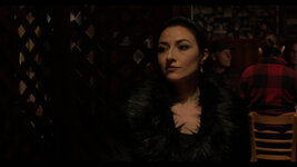
I edited and graded these scene as four separate projects. So I did not go from one scene to the other to compare skin tones. You can see it is all over the place.
I used Davinci Resolve. I've read plenty of tutorials. The problem I have is that I seem to go 'snow blind' and after staring at the screen, I no longer sure of what I'm looking at. The 'this looks right' seems to change over time. So I think the 'this looks right' changes as I am working on one scene or the other.

Since the scenes are now merged into one timeline, I could do a split screen of one clip in a scene and compare it to a clip in another scene and get them to match. But it seems there should be a way for me to look at an image and know it's right. That 'skin tone' line on the vectorscope was no help.

Dvxuser won't let me upload even 1080p nor will it take TIFF. 720 Jpeg is what it would take.

Scene 1.jpgScene 2.jpgScene 3.jpgScene 4.jpg
 
Back
Top