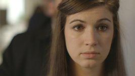
Screengrabs from Short Film Shot on C300--Baggage

ikander

Well-known member
I shot my latest short this past weekend on the c300. Haven't even started the edit yet, but I thought I'd post some screengrabs straight from the camera. My cinematographer, Nathan Golan, literally got the camera in from B&H the day before the shoot.

I really love the way this camera looks. We shot in cLog using a few different L-series primes (24mm,35mm,50mm,85mm) as well as a few shots from the good ole' 70-200mm. I have nothing but positive stuff to say about the camera.

When I get a chance, I'll string together some actual footage, but for now enjoy the grabs. These are compressed JPGs.


BusinessWoman.jpgRobSits.jpgRobChat.jpgRichWoman.jpgNervousGuy.jpgMiddleAgedMan.jpgHipster.jpgFullLine.jpgCryingGirl.jpgCollegeGirl.jpgChelsieWalkup.jpgChelseaCLose.jpgAngryGuy.jpgBaggageAttendant_CLOSE.jpgRobTalk.jpg
 
Finally managed to get some footage strung together.

About half-way through the rough cut now.
 
also for me a bit too contrasty grade. The faces are pushed too high for my taste, but that is subjective....
 
the c300 is awesome, gr8 choice. :thumbsup: thanks for sharing the grabs.

what light was available on location and what light did you use?

the ungraded and some of the main girls grade seemed warmer(i'll refer to lower kelvin as warmer) than tungsten(just a touch), which seemed better and more pleasing on the skin tones than some of your graded. too much cream, yellow, mustard, wood in wardrobe and background. and the red/orange is distracting in some shots. the hair light on some of the characters including background characters was a bit distracting.

the really strong light mix was horrible.

was there enough room to go more tele on the over the shoulder line shots.

some of the close ups were too close. and some had too many shadows on the wall.

some of the framing for the next shot and too many jib like shots including the one with too much shakiness seemed too much like cloning a technique than warranted. and were not perfected.

some of the shots looked really nice and a few looked like one of those hastily made commercials.

toooo much over-acting(more than the needed amount).

Thanks for the comments, everyone!

Definitely hear what you're saying about the current grade and how it loses warmth in the skin tones. I'll keep that in mind once I actually grade the thing instead of just messing around. Also, I agree too much contrast is bad. I definitely want to fix that!

We shot daylight using a Joker 800 HMI as our key. A kino four bank became our fill. Had a series of Arri 650 kickers as hair lights. And, a few 1Ks and Divas to fill out the line.

There were windows towards the back of the hallway and we just used that as is.

If you're interested in checking out the BTS picks, I've posted a few on facebook:
http://www.facebook.com/media/set/?set=a.376009872430798.88931.376004682431317&type=1
 
Last edited:
I'm gonna jump on the "too contrasty" bandwagon as well - but overall, nice job! That 800W Joker is fantastic, isn't it? Used one on a 3-spot commercial campaign with the C300 last week, and I can't imagine life without it now.
 
yups. contrasty bandwagon here as well. :) its to the point of clipping some of the highlights which looks really nice in C-log. With the right grade however this will look really nice :)
 
Last edited:
Well, definitely can't argue with the majority.

Thanks for the help folks! Really appreciate the constructive feedback. Great community here.
 
Looking at your screengrabs, I'm thinking that maybe the C-Log was captured a bit hotter than is normal for a log codec - so be careful when lifting those mids and especially highs! You don't have a lot of room to go.
 
I also think the faces are graded too brightly in the 'after' clips. They even look overexposed. I like some rich filmic color in faces (which I think can be easily tweaked here).
 
Back
Top