fevercity
Well-known member
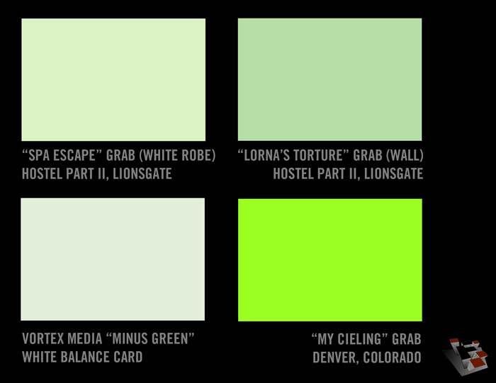
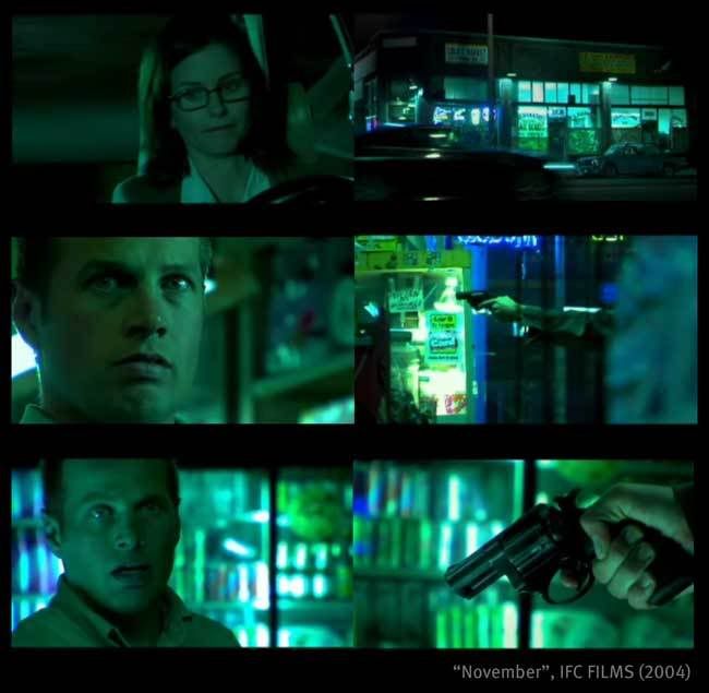
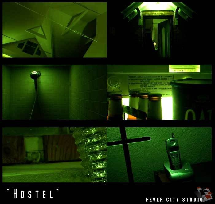
Okay, so technically it should be "Hostel 2" since that's what Eli Roth was on Conan O' Brien talking about tonight. Regardless, the 'green' look is overdone these days but it was late and scene settings have been on my mind lately (obviously). They showed an interior torture / horror scene and it was time to try and simulate that look on the DVX. The green was off the charts for a straight in-camera tweak alone. CHROMA PHASE will not take you that far green.
The 'look' needed to be a repeatable white-balance fake. It needed to be more specific than "experiment with card stock from your local printing supplier". Enter the Smead UltraColor Envelope (No. 89531 - Purple). It's a letter-sized envelope with a string thingie but you only need enough to grab white balance and it's nice to know that their 'purple' will yield this creepy green.
My contrast and details are much the same. Switched to NORMAL MATRIX to cut down on low-light noise (thanks to gco of Virginia). CHROMA LEVEL determines how green you want it. Increasing negative digits on COLOR TEMP from 0 (-1 -> -7) determines how much you want to see underlying colors. 0 COLOR TEMP leaves it really green. Blacks are solid at -10 on the PEDESTAL. Put KNEE on AUTO as fluctuating knee-protection could be interesting for a shoot that called for this effect. Or not...
When you white-balance to the envelope or any colored material, sometimes it will tell you that it's NG (NoGood, NeGative, NotGonnadoit, NoGo, etc.) but it will still take the color info. It will even hold a 'BAD' white balance in whichever A/B spot you grab it to.... even after power-down.
As always, any and all input appreciated........
"Hostel"
DETAIL LEVEL -3
V DETAIL LEVEL -1
DETAIL CORING +3
CHROMA LEVEL 0
CHROMA PHASE 0
COLOR TEMP -4
MASTER PED -10
A. IRIS LEVEL -2
GAMMA B.PRESS
KNEE AUTO
MATRIX NORMAL
SKIN TONE DTL OFF
V DETAIL FREQ THIN
PROGRESSIVE 24p
White Balance Reference:
Smead UltraColor Envelope (No. 89531 - Purple)
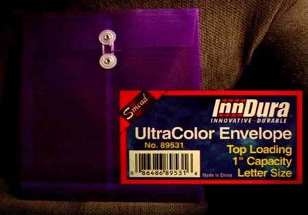
The 'look' needed to be a repeatable white-balance fake. It needed to be more specific than "experiment with card stock from your local printing supplier". Enter the Smead UltraColor Envelope (No. 89531 - Purple). It's a letter-sized envelope with a string thingie but you only need enough to grab white balance and it's nice to know that their 'purple' will yield this creepy green.
My contrast and details are much the same. Switched to NORMAL MATRIX to cut down on low-light noise (thanks to gco of Virginia). CHROMA LEVEL determines how green you want it. Increasing negative digits on COLOR TEMP from 0 (-1 -> -7) determines how much you want to see underlying colors. 0 COLOR TEMP leaves it really green. Blacks are solid at -10 on the PEDESTAL. Put KNEE on AUTO as fluctuating knee-protection could be interesting for a shoot that called for this effect. Or not...
When you white-balance to the envelope or any colored material, sometimes it will tell you that it's NG (NoGood, NeGative, NotGonnadoit, NoGo, etc.) but it will still take the color info. It will even hold a 'BAD' white balance in whichever A/B spot you grab it to.... even after power-down.
As always, any and all input appreciated........
"Hostel"
DETAIL LEVEL -3
V DETAIL LEVEL -1
DETAIL CORING +3
CHROMA LEVEL 0
CHROMA PHASE 0
COLOR TEMP -4
MASTER PED -10
A. IRIS LEVEL -2
GAMMA B.PRESS
KNEE AUTO
MATRIX NORMAL
SKIN TONE DTL OFF
V DETAIL FREQ THIN
PROGRESSIVE 24p
White Balance Reference:
Smead UltraColor Envelope (No. 89531 - Purple)