Raptors stuff.

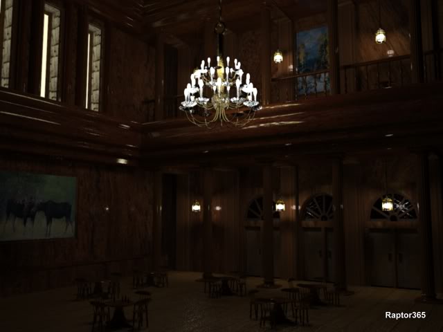
So to start I want you to tell me what you can find wrong with my last render.
I can find 5 things that can be improved or are wrong. Maybe you can find more.

frame-396.jpg
 
Last edited:
Just a glance, but your wood seems too reflective. Somebody must have been waxing their arse off to get that kind of reflection.
 
Last edited:
Yep. The only wood that should be polished is the landing , and maybe the table tops. Not the wooden walls with the style of texture on them. The floor, eh, maybe cheap wax and it's also a little too bump mapped.

There's more.
 
Thats alright. I said "like" instead of "link" in a post above. Takes on a whole new meaning.

-Well here's one I can't resist. When is the last time you saw a (wooden) chair without lower structural leg support? If you sat on these chairs they'd split apart.
I omitted the support modelling cause I was in a rush to run the lighting seq.
I figured, who'd notice. ME. And I brought it up.

That leaves at least 3 more and I think 4. Probably more.
 
Last edited:
Thanks brock. I started around Oct 2006 I think with max for a few months, went back to programming for a few then picked up C4D around March 1.
C4D gets alot of the credit for being so intuitive.

I'm getting desperate to get some quality stuff done for a demo reel but so far I have not produced anything that I'd put on one. I do like my B&W spitfire stills but not the video. I'm still rendering the original syringe shot in bits and pieces as well as a couple others at night.

-Some more things I thought were wrong with the picture...

* The 3 stone wall parts in the upper left all have the same texture coordinates. So the textures are identical and they shouldnt be.

* The lights could use some blooming I thought.

* There is no light shining through the glass above the 3 doors. Maybe there is another room behind that with the lights off. Actually it was because I used a stock mxm texture that was opaque.

* The big picture hanging on the left wall could be offset at the top a bit to give more depth.
* The wood texture on the left wall sucks.

* I'm not sure if the beer bottles are a hair too small.

I had more tables and chairs but the rendering was getting to be a pain.
I would also have liked to add some ashtrays and little table lights but didn't for the same reason.

So I think I'll try and keep the scene less complicated next time, er, smaller room and no chandalier with 36 lights on it.
 
hey Raptor, your interior is actually quite good, some tips I'd like to say are:

* I'm not sure about your dimensions, I've found that using proper dimensions is very helpful towards a visually correct looking interior

* try using GI, for added realism.

* Think about how a real photographer would frame a shot, eg look at magazines.

Hope that gives some insight, other than that your on the right track.
 
-Thanks Anhar. I had alot of problems with the camera being about 5 1/2 feet off the ground. There was no way to get everything into the shot. I tried various lens sizes and angles.
For it to work I would of had to extend the length of the left and right walls.
Next time I guess I should sketch it out or something.

-Virtual-one. Now that you mention it yes the table & chairs are too small.

-------------
Time to start another one, as soon as I come up with a scene I like.
Thanks everyone.
 
Hey, that really good, I like it alot!

The only crit (and its a small one) is one of scale and general compostion, I feel that some perspective would help give the illusion of depth on this image.

Othe than that very well executed.

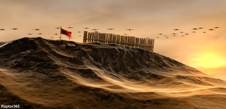
Was the flag a cloth simulation ?
 
-Anhar. Thanks and keep the crits coming. I kind of felt like something was missing and I guess it was depth although I coudln't put my finger on it. I added the fence as an after thought although I think bamboo may have been better.

The flag is something like a cloth. It's called a Bezier Nurbs which is a plane with a few handles on it. Close enough to cloth I guess.

-Jack. Thanks. I had two versions, one with & without the spits. The one without really gives a different feeling, more of isolation. Maybe some DOFed leaves in the forground would have helped too.

-Thanks again.
 
Great stuff Raptor gives me inspiration to keep on working on 3D! Hope I can do something like that someday.
 
Hey Raptor! I finally wraped up that other project I had goin' so I decided to visit the 3D section. Glad you're posting some of your stuff. It's really good work.

The interior - All in all looks good for a difficult subject. I can't agree more with Anhar about scaled modeling. I'd go a step farther and say build everything to scale, not just interiors. Even landscapes. I like the ceiling heights and window sizes for this one, so you could scale down the doors, the railing on the top floor, and the posts to match the tables. I'd approach something like this by deciding the room dimensions first and then the props, built to scale, will just fit right in.

Also I don't think the tables and chairs fit the room, stylistically. It's looks to me like some Grand Ballroom or Dining Hall. More suited to long tables where a royal family and the entire court could sit and tuck in to a good feast.

Exterior w/Spits - Love the Spitfire man! I think a bit more atmosphere here would help add just a bit more depth to the Spitfire formation. Also, and this is to any 3D exterior stuff, there's no vegitation. I don't understand why high-end 3D packages do so badly with vegitation. It's pretty much non-existant in LightWave. Is it this way with C4D as well? If it has good veg plugins/tools, use 'em. I've been all over the southwest desert here and even on the El Mirage Dry Lake Bed there's some veggies.

Also, is the material there rock transitioning into sand? Looks OK but the rock has too much specular. It's kind of making a division between the fence and the ground. Appears like the fence is floating. Almost looks like a fresnel effect.

Great work Raptor. Keep it up! :beer:
 
-triplej96. Thanks. This particular shot looks harder than it was.

-Tower. Thanks. The interior was a write-off. I've been since modeling in scale using as accurate measurements as possible and sketch stuff if I have to.
That scene was pretty much put together on the spot using imagination so that was that. I'm currently working on an interior that should be an improvement from that one. A few more models to complete yet.

I agree with the depth problem. Anhar mentioned that earlier. I looked at adding a bonzia tree but decided against it. I dont think there would be much vegetation up there on the mountain. It looked fairly bairn. Maybe in the foreground. Maybe some small growth.

I briefly did some vegetation for something I was working on last week. I'm still experimenting with that. I picked a leaf off a tree and scanned it for the leaf texture. I'm not ready to show anything yet though.

The material for the rocks are noise shaders with some falloff. So yes the texture does change with altitude. It changes to snow but it wasn't really snowy in that part. Just smoother and with the lighting it looks sandy I guess.

I noticed the division between the fence and the rock wall too. Funny, but that was how the renderer reacted using GI. I guess there was some egde reflection on the rock and/or light bouncing off the fence that caused it.
So I left it.

Congrats again on the Adfest entry. I modeled a remote a few weeks ago so when I saw your ad I immediatley thought you had modeled one too.
 
Thanks Raptor. AdFest was a lot of fun.

OK, so my brain played a trick on me. I'll probably lose any respect I might've gained on this board, but when I saw the flag I thought of the Rising Sun. Please forgive me if I'm wrong, and I'm sure I am. But I saw a Rising Sun type flag so I thought South Pacific. Then I thought island rockyness and sand, not mountain with snow. But you also mention a bonzia (bonsai?) plant so now I'm just confused I guess. So take my previous comments with a grain of salt.:Drogar-KnockedOut(D

All previous comments aside, it really is a good looking piece. Nice colors, good perspective, good camera angle. Your texture displacement looks really good too. Landscapes are among the toughest for me.

Keep on postin'!!:beer:
 
Back
Top