Poster crit

Brian_Rice

Carbonite Member
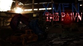
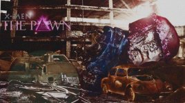
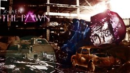
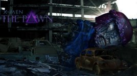
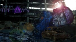
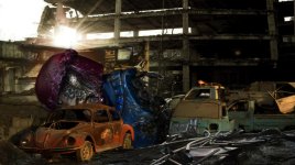
So before I put titles up I was hoping you guys could give me a general impression of my teaser poster. Let me know if it needs additional tweaking. Too dark? Light sources okay? Should I add some kind of atmospheric component (particles, mist, etc?) It's about 9 different images.


Thanks!!
SENTINEL TEASER POSTER WIP.jpg
 
Is that a Sentinel? It's a bit difficult to tell. At first I thought they were two weirdly colored cars or roller coaster cars.
 
LOL

Yeah, it's a Sentinel. Doing an X-men fan film. I wanted it to be obscured so that it would have some sense of normalcy in the scene amongst the cars.

I think it needs fog to further push the image together. I don't want to make it much darker. This is the first teaser poster, the next two will be close up head shots of the main characters and then we'll be doing more traditional full-on movie poster stuff.

But overall you thought the blending was sufficient?
 
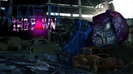
Been tweaking it. Put on the titles. Not sure if it's too dark now...lol

I have some nice fog I can put in there, but if it's this dark fog might be too much?

Again, any comments would be helpful! Thanks!

SENTINEL TEASER POSTER WIP with titles.jpg
 
Yeah, that's waaay too dark. If you're looking to darken it up, at least put a nice subtle vignette around the Sentinel's face so our eyes are drawn to it. I like the blue of 'X-Men', but I'd make it a bit less transparent, a bit less saturated, and I'd ditch the fringed edges. I think 'The Pawn' part is a bit over the top and distracting. Overall you want to draw the eye to the Sentinel's face so we know what's going on here; don't distract from it.
 
I don't want to sound like an ass but I'd scrap it all and start again. This image looks very flat being squarge on, so doesn't really have any depth and to me at least it's fairly uninteresting. If you really like this particular image you I'd reverse it so Sentinel is on the RHS so you're eyes are led to it after the cars. Also make the Sentinel much larger, maybe so just the top sun rays are shining through as a back light round it's head. De-saturate the bug. Definitely scrap those titles too.

I know you can do better mate!
 
Last edited:
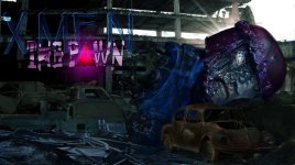
Okay, tried to use some of your guy's advice. I did a minor perspective to the Sentinel head as well as enlargening it and trying to embed it more into the dirt to give it some sense of weight. Also flipped the image so that the eye track is a bit more natural. Also lightened things up and decided that a blue correction made the Sentinel most dominent.

Since our story takes place in Bishop's time, one of the things I'm trying to convey in this first poster is that Sentinels are long since past being important. They're commonplace scrap. They appear in the film as inoperable giant relics.

Additionally, in the titles I wanted to give some nod to Apocalypse by putting the pyramid in there, and I thought that since Gambit plays a role as well in Bishop's story I should replace the non-descript red lettering with Gambit's signature pinkish aura (and it also ties into the sentinel and overall image). With regards the X-men aspect of the title, again the X-men have been gone for a lot of years. And on a more subtle note I felt that since this is a fan film centering around a more fringe character in the X-men universe, the subtitle should be out front and nearly consuming the root title.

I'd really rather not start the entire image from scratch. I like it overall and I think it gets across the tiny bit of information I want to give in a teaser poster.

SENTINEL TEASER POSTER WIP3.jpg

I could potentially soften the subtitle so that it isn't so dramatic?

SENTINEL TEASER POSTER WIP redux flip.jpg
 
Last edited:
Bishop's in it? Nice! Was just saying to a mate the other day that I wish they'd do Bishop or Cable in a film, also would love to see Colossus have a big part.

Looking a lot better, still not a fan of the titles. I'd suggest letting the audience know (and get excited about) Bishop being in this and include him in the poster. Move that sentinel over to the left just a bit and have Bishop standing on that cement slab, that'd be nice as it'd make use of that white space (do him in silhouette).
 
I think the title design (as fas the text itself) could look better. I'd check out some actual comic book movie posters and try to replicate the look of the text that you like best from that.
 
I think it's looking a lot better, and maybe it's just me, but the font has got to go. It's very distracting, and not fitting at all. It looks like a cartoon over real footage. I would personally rather see Comic Sans than that.
 
Thanks for the further suggestions --

TMNT -- We have several posters in the works. One is a headshot of Bishop, another of Cable, another of Gambit's playing card with a tag line, one with our fish-out-of-water protagonist (new character) and then we're doing the large scale Star Wars-esque poster with main tag line that will bring together Bishop, Cable, Gambit and the collection of new characters being introduced for the story.

In this first poster, though, I really want it to be completely vague. It might sound counterintuative, but I want to introduce people to just the simple dirt of it first, and then come in with the more dramatic headshots so that their imaginations can start piecing the different images together until they finally get the main poster and then film.

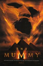
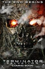
Gary -- I'll take a look at some of the posters, though I'm looking to stay away from the superhero genre of posters. If I could achieve something that blends titles from Terminator and Mummy, that would be ideal. Just not quite sure how to get there...


The Mummy movie poster.jpg

terminator4-flash-poster-full.jpg
 
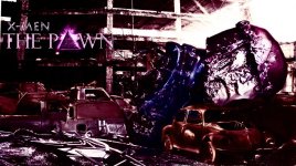
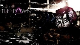
Okay -- so here's some to check out. Had a little fun with a couple of them. I tried to really marginalize the titles while still giving them some personal purpose.

In no particular order (you can cycle through them by pressing "next" in the bottom left corner FYI):


TEST SENT 3.jpgTEST SENT 1.jpgTEST SENT ART FUN 2.jpg

TEST SENT ART FUN 3.jpgTEST SENT ART FUN 1.jpgTEST SENT 2.jpg

Thanks again so much for your help with this guys!!!!
 
Out of those? I like the last one, but I feel the God rays may be a bit much. They just don't seem motivated. I don't know what image editor you're using, but if you could mask out the darker levels a bit--subtlety is key--over the Sentinel's face to brighten it up a bit, it would make more visual sense. The text is a big improvement, but try enlarging 'X-Men' while shrinking 'The Pawn'; 'X-Men' is more of the hook. Lastly, if you could just cheat over the text to the right a bit so it's more over the right third, and cheat over the Sentinel to the left a bit so that its face is over the right third, I think you may have something cool to look at going on. Oh, and brighten up the text a little along with the face so it 'pops' a bit more.
 
Out of those? I like the last one, but I feel the God rays may be a bit much. They just don't seem motivated. I don't know what image editor you're using, but if you could mask out the darker levels a bit--subtlety is key--over the Sentinel's face to brighten it up a bit, it would make more visual sense. The text is a big improvement, but try enlarging 'X-Men' while shrinking 'The Pawn'; 'X-Men' is more of the hook. Lastly, if you could just cheat over the text to the right a bit so it's more over the right third, and cheat over the Sentinel to the left a bit so that its face is over the right third, I think you may have something cool to look at going on. Oh, and brighten up the text a little along with the face so it 'pops' a bit more.

It's funny because the God rays are part of the actual picture in the background there. I just used them as the light source.

I'm hesitant to brighten up his face too much because there's no light source for it...

Also, with regards the X-men title aspect, I mentioned earlier that I really wanted that part of the title to be marginalized for the story I'm trying to tell with this first teaser poster.

Last, I can move the text, but I think that Sentinel is staying where he is. lol He's tucked between about 7 different pictures and more than a few layer masks. Inching him anywhere at this point would be a major pain in the rear, not to mention having to re-establish his weight and all the light sources.

I didn't post the lens flare one in that first group. I felt that it helped bring the image together a bit.
 
I like the last one as well (sans the lens flare) Is there any way to make the titles pop a bit more - If you did that, I think you'd have it. Looks really good!
 
The last one is the same picture as the 6th one. The lens flare is just brightening it up, I think. So probably the last image of the 6 just brightened up a bit?

I'm going to see what I can do about bringing out the titles more. Seems like there's a couple different perspectives on the title sizing issue. Obviously the original ones were too comic-booky for everyone so I might have gone too extreme in the other direction.
 
Hey, Brian, keep taking a crack at it, you're almost there! Trust the process.

Where's the image of the Sentinel taken from?
 
Sentinel head is a model.

And yeah, I'm hoping to get there tomorrow. I think I'm actually going to post the cartoony 3rd poster as well as a tightened up version of the last one. I might do it on every poster moving forward, sort of to signify that cross over from comic book to video.
 
Back
Top