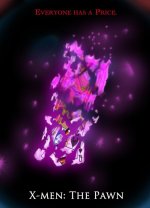
Poster crit

Okay, so drum roll --

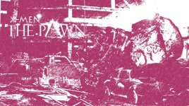
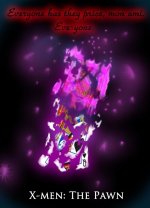
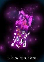
These are the final prints. I'm going to do three types. Figured people could like whichever they want. And moving forward, I think having two additional posters to go with the *real* one will have some cool significance. Obviously the "painted" image will give that comic book impression, while the one consumed in pink will lend that omnipresence of Gambit's presence in the story.

Hopefully I've been able to apply all of the suggestions here to the best of my abilities. Thanks again for all your help!
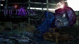
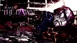
THE PAWN TEASER POSTER FINAL.jpgTHE PAWN TEASER POSTER ART2 FINAL.jpgTHE PAWN TEASER POSTER PINK FINAL.jpg
 
lol

I like all three. Posted all of them (with descriptions so that people would get the Gambit reference).
 
The first one, with a little more detail/light on the background. Otherwise, I am digging it. If you could take a little of what you did in the second one and lightly apply it to the first..........
 
Thanks Doc --

Yeah, I've come to the end editing this first Sentinel teaser poster. Already posted them.

I could go on tweaking forever, but in the end this first one is just to give a little flavor. There'll be way more in-depth images later on.

I'll definately try to make sure things are a bit *brighter* in the next posters.

Thanks again!

(and I'm working hard on those gun mods. I'll post videos once they're done!)
 
Nice, keep me in mind, if at the end of your project, you want to recoup some of your costs. I'll buy the weaps.

LOL, just got home and looked at your pics on my monitor (calibrated), the first one ain't so dark now. POS work computer.
 
lol Good to hear.

I do have another one that I do have one question on (figured I might as well just ask here instead of starting a new thread)

Tagline or no tagline? Our *real* tagline for the main poster is "How far would you go to get her back?" But I always thought that I would do this tagline on Gambit's poster as it's going to appear in the trailer.

I'm not usually a big fan of taglines, though, so...?

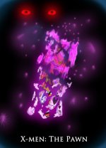
Alternatively I could also put two glowing red eyes in the background. I figured the glowing red letter with black print gave the impression of his eye color-scheme, though.

Anyway, thoughts?

Thanks again!!!!

Gambit teaser poster.jpg


Gambit teaser poster NO WORDS.jpg
 
Here's one with some eyes thrown on. I decided not to go the traditional Darth Maul route (putting the eyes in the middle of the poster). I felt the arc of the card and momentum should put him off to the side. Also, his character isn't the *looming* threat in the story. He's more of an Iago. So, tucked in shadow...

My girl said that she thought the red lettering looked kinda cheap. I kind of agree -- and I don't know if creole-speak really warrants a Lord of the Rings "One Ring to Rule Them All" kind of elegant treatment, ya know? But because it's so heavy with dialect, I think it needs to be somehow italicized.

So, maybe I shouldn't have it at all...lol

Anyway, let me know what you guys think.

Gambit teaser poster eye for an eye.jpg
 
I don't think the eyes really add anything to the design. They just take the attention off the card. I think any x-men fan will be able to understand that the glowing card is Gambit without the tag line ("mon ami").
 
Here's one with the tagline changed from an actual line to just a reference to it (sans any glow, etc). Also since I had some soft opacity blue near the titles at the bottom, I thought that some red at the top might create a more dramatic G vs E effect.

I *think* this is my favorite version so far...

Gambit teaser poster Tagline.jpg
 
I don't think the eyes really add anything to the design. They just take the attention off the card. I think any x-men fan will be able to understand that the glowing card is Gambit without the tag line ("mon ami").

I agree. Sometimes when you're conceptualizing an image (or even a line in a script) you don't realize that the image (or acting) might dictate a less is more approach. The original design for this poster was just supposed to be a card falling to the ground with some energy trailing it. But once I decided to try and really push the design, I started to see that less and less was needed to make it impactful.
 
Back
Top