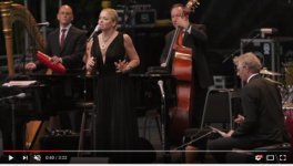
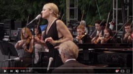
Multi-Camera Shoot - A Comparison

Well obviously B is much more unified and integrated look, whereas A is a hot mess. BUT, it is also true that the lighting conditions were much easier in B than A, so it's not a 100% fair comparison. Furthermore, while clearly B is a much better experience, it's not exactly fantastic from a framing point of view, it's somewhat mediocre - not bad for a live show, but not fantastic either.
 
Well obviously B is much more unified and integrated look, whereas A is a hot mess. BUT, it is also true that the lighting conditions were much easier in B than A, so it's not a 100% fair comparison. Furthermore, while clearly B is a much better experience, it's not exactly fantastic from a framing point of view, it's somewhat mediocre - not bad for a live show, but not fantastic either.

Whoa! To me it is quite the opposite. A is framed well, focused correctly, and features smooth and motivated camera moves. I see B as a trainwreck on all three counts. This difference of perception I find fascinating, given that I typically agree with your reads to the letter.
 
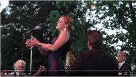
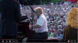
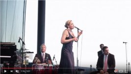
Well, fascinating! I'm sure both of us can provide reasons for our opinions. To me, the #1 problem here is orientation. Look at A - every time there is a cut to a different camera, it takes me awhile to orient myself... that's bad. Really, really bad. The first obligation of an edit is not to confuse the viewer, the viewer must at all times know where s/he is, and what the vantage point is. The OP indicated that A starts with minute 1 - fine, go from minute 1 to the first cut at 1:09... whoa! Where did that piano player pop up from? [OK, I watched it as the OP asked, from minute 1 onward, but now that I take it back further than the minute, I see that the piano player is oriented] Sure, in the 1:00 - 1:09 there's an indistinct blob on the left side that could be a piano, but are we paying attention to that indistinct blob? And why is that ugly indistinct thing in the frame in the first place - what does it add to the composition? That right there is ugly framing. And motivated? What motivated that cut to the piano player... not the music; so not exactly a strong point in motivation. The framing there is also subpar with the singer in the upper left corner a small cut off part - all so we can see the piano player doing nothing in particular that compels us to watch. Feh. Ugly framing again. Now, some of this is also down to editing, so I guess not an issue of multicam, but that blip of the piano player is super short and sort of pointless. Next we go back to the singer much tighter (and btw. totally different lighting than when we last saw her, which wouldn't be so bad except it's different in an especially uncomfortable way: we saw her before in a completely warm light, now in closeup we see her with strong bluish cold light frame left... feh). Not a very graceful cut - but I guess that's editing, not camera. Next a lame angle on her from the drummer with big sticks all around - what kind of composition is that? And that 1:34 cut to the strings - what in the world is that, where did it come from, where are those guys... out of context and disorienting. I don't have the time to go through it all, but it's a bunch of jumping around that seems utterly random, far, far from motivated - whereever we pop up never feels natural, odd heights and odd angles. Just a mess.

Now go to B - though I must emphasize again, it's hardly great framing and overall pretty mediocre, but at least it makes sense. The first bit - 0:09 - 0:17 is substandard framing, but at least you see some of the piano player, and you see the singer. The very next cut is to the piano player, and please contrast that with the A sequence, the cut here really is motivated (by the music - piano), and shows the piano player doing something interesting (and again, some of this is down to editing differences between A and B, where A sucks hard). Now we come back to the singer and now we see the piano player exactly where we expect him, we are perfectly oriented - and the cut is on something interesing with the singer (how she moves!). Now is the framing here (0:20 - 0:30) brilliant? No, but it's adequate in that it focuses on the singer and the piano player who are the two key elements at the moment, musically. We are not yanked around only to be saddled with an odd angle as in A. Now we cut to the strings - and note the difference - the strings also pop up, but they are immediatly oriented in context, as we see the piano on the right side. Much, much better than what A did. And that framing is OK - I like how we distinctly see the violin player, instead of a jumble of people as in A - and he's balanced on the right with the piano player - compositionally OK. Next cut to the guy with the rhythm instrument - and he's also immediately in context as we see him next to the piano player. And when we cut to the singer again at 0:35 we are in a very familiar position, we understand exactly where we are, and all the key people are there - very reassuring. Also, note that with that cut from 0:35, the framing and composition keeps improving as the camera moves - it's really well balanced, and we don't lose focus on the singer, while at the same time we slowly get a better look at all the players... nicely done! And so on. We never find ourselves asking "where am I and what is this angle and what am I looking at and from what position" which is the constant background hum in the A sequences.

In my opinion: no contest. Neither is a masterpiece, but A is hurl-inducing, while B is pedestrian and uninspired but doesn't give you vertigo.
 
You really doubled down and gave it a thorough treatment. I won't match you but just quickly:

a) This strikes me as adequate coverage by the venue's regular crew. Totally fine, nothing brilliant.
b) This seems to me have all the hallmarks of DSLR disaster: kids with sliders and DSLRs and lenses open to 1.4 just because they can. The sliding and panning are jerky, indecisive, and often neither start nor end on a decent framing. Within the same shot you see "pan this way, no wait, pan back the other way..."

Now I'm curious to hear which the OP thinks is the mess.
 
B looks like it was shot by a bunch of kids. Weak movements, weak framing... Now I don't know the limitations of gear and camera placement, but if we are just comparing A to B, A looks like a line cut you've seen on TV 1000's of times. B was just weak. But the worst thing of all, on both, was the damn piano player. Distracting. Unless you are THE SHOW, keep the flare down.

I did actually like the music, though. Gonna look these guys up.
 
Here's the thing. I made it half way through A, but I watched B until the end. Just sayin'.

Well, traffic can get backed up for miles because people slow down and look at a car wreck longer than they should... ; )

Neither of these are gonna win Emmy's and If you turn the volume OFF, I wouldn't watch either one. I also didn't finish A. But to me, B was worse and I didn't finish it, either.
 
I agree that A is something that follows the schematics of a million such coverage of concerts we've seen for decades now - but so what? That by itself doesn't make it good or somehow 'better' - it's just a convention we're used to, and may I add, in my opinion, very poor framing choices. In the case of B, it's just a differnt convention and it too has technical weaknesses. But the decisive question for me is what is more watchable. To me, B is far more watchable, because (1) I am never disoriented, even momentarily (2) it is a far more intimate experience compared to the slapdash alienating feel of A (3) I got much better exposure to the singer and the important elements in this musical presentation. In contrast, A struck me as random, slapdash, all over the place, meaningless in what it chooses to focus on, and ultimately alienating. I guess it really is different strokes for different folks.

I often think about how we judge convention in film, whether it is lighting, or framing, or composition or camera movement etc. It seems to me, that often times a convention is established because of technical limitations and then we accept that as "filmic" or "professional" simply because we've been exposed to that for decades. An example of that would be the lighting in films from the 30's - 40's, where because the film stock was so slow you had to have tons and tons of light in often very artificial setups. Yet, at the time we didn't "see" the artificiality, because it was the "norm", and it looked "professional". Only once we got more sensitive stocks and used more naturalistic lighting, did the old studio lighting start seeming old-fasioned and more importantly highly artificial. Back in the day nobody asked "but where is the source of that light on the actor's face?" we just took it for granted - now it looks like "where the heck is that light supposed to be coming from, how very fake". I feel it's the same with coverage as in the case of A - we are simply used to it, and so we scan it as "yeah, that's how it's always done" - but the truth is, that it's a really sh|tty, sh|tty way of doing it, quite bad. Honestly, I always hated the way live concerts were covered - hated it. By contrast, we have new technology DSLRs and so on, where we can be much more intimate in a live concert setting because the gear is smaller and more sensitive, so in the case of B it feels "unfamiliar" compared to how you are "supposed" to cover concerts, but the truth is, it's actually much better as an experience - it's more intimate and more engaging. In other words, I think A is old-fashioned and bad, like in "the bad old days when we had technological limitations". At least that's my take.
 
Well, traffic can get backed up for miles because people slow down and look at a car wreck longer than they should... ; )

Insults? A sure sign that you can't win your argument on its merits.

Getting back to the OP's topic, I agree with OldCorpse (post #9): "But the decisive question for me is what is more watchable. To me, B is far more watchable, because (1) I am never disoriented, even momentarily (2) it is a far more intimate experience compared to the slapdash alienating feel of A (3) I got much better exposure to the singer and the important elements in this musical presentation. In contrast, A struck me as random, slapdash, all over the place, meaningless in what it chooses to focus on, and ultimately alienating."
 
Insults? A sure sign that you can't win your argument on its merits.

Insults? No, pretty sure that was a playful little joke. There was a smiley, winky face at the end. I hope that no one interpreted that as just my poor punctuation. ; ) *see, I did it again*

My Intention and point wasn't to throw insults, I was just trying to convey, in a playful, funny way, that just because you watched it(or found it more watchable) than the other, it still doesn't make it "good". Neither of them are good.
 
There is much that can be discussed about these two clips. As mentioned by others, the only thing in common is the act. So discussing the merits of the overall pieces might be difficult to compare, but a fun exercise. I like that we have two very different views on which is the better clip. It shows that there is no one answer and that there is a wide difference in tastes. I guess that's why it is so difficult to predict a movies success.

The reason I posted these two clips is just to consider the framing and camera movement. If we break the discussion out to include the look, the editing/directing, it is a wider scope of discussion that I hadn't considered.

General Comments

The fact that one is indoors and one is outdoors is a distraction to the discussion. The looks are so different that they should be excluded from discussion. Secondly, the venues are so different that we don't know what limitations were put upon the productions that led them to their decisions about camera placement and number of cameras. But I will discuss this anyway. Third; we don't know what the budgets were for each (example A most likely had a bigger budget than B).

Example A: This is a higher budget shoot done what looks to be live-to-tape. It had a director calling shots. So most if not all editing decisions were done live with perhaps one or more cameras also recorded to fix any bad takes in post. It may have been broadcast live and recorded as-is. There is a world of difference in directing a live show vs recording 5 or 6 cameras and then editing in post.

Example B: This is a lower budget shoot with less experienced camera operators. They had an idea of what they wanted to do, but the execution was not ideal. Camera placement was weak for any number of reasons; it could have been the restrictions placed on them, it could have been budget or something else. This was unlikely directed live-to-tape and probably shot wild with all shots edited in post.

Specifics about Framing and Composition

Example A - As said by others, this is classic framing and moves that have been established for perhaps decades. Each shot is framed well and remains framed well during the camera movement. There are a couple of shots of the violins that I agree, are a bit jarring and framed too tight, but is done better later in the clip. The camera in the back of the stage seems to be stuck getting low shots of the drummer and the Guiro player. Was he stuck there and could not move around? Was he not allowed to stand up? Was the director in love with those shots? Who knows. There was so much more that camera could have done.

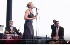
Example B - The camera positions are not ideal. The cameras in front of the stage are too low to allow for good coverage. That could have been a matter of budget, show-runner restrictions, or preference. Maybe they like that low position, but it gives us this opening shot, which has partial shots of 3 people, none of which we can determine what they are playing. The frame is filled with someone's back. It's an uncomfortable composition. Had that been from higher up, and tilted down, it could have revealed that it is the bongo player, the piano player and the guiro player.

Opening shot piano head low.jpg

The second shot also has issues. The piano player and the audience are the main part of the composition. But because of the low angle, we can't see him play. Then there is the microphone stand, which adds nothing to the composition. We have two people bookending the frame. We can tell one is the guiro player, but we don't know what the other one is doing unless we look close. They are not adding to the composition. I'd either want to see them out of the frame and see more audience (camera move further forward on stage and move stage right to get the mic out of the shot) or be more fully in the frame.

Piano player with harp and guiro.jpg

At 1:16 we have this shot. I would rather see her isolated with the white background or tighten up the frame with the conga and bongo players as shown below.
Singer with white background original.jpg

Focus on the singer with a tighter shot:

singer with white background.jpg

or tighten up the shot to get rid of the distracting things on stage:

Singer white background conga and guiro.jpg

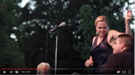
At 1:55 we have this; Is our attention supposed to be on the microphone? What's that partial head at the bottom? There's too much bongo player back without definition of who he is. I want to see him more fully in the composition or out of it. The operator is trying to get close on the singer dancing without looking at the rest of the frame to see what is in the composition. From that position, I would have had a wider shot to include the bongo player, panned further right, and tilted down.

microphone center.jpg

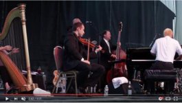
From 2:49 to 2:52, the camera operator can't decide to put the harp in the shot or not. If he was further camera left, he could have removed the gap between the harp and violin player and then composed a shot with the harp player that made sense.

harp player.jpg

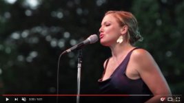
3:33 - a nice composition.

nice shot.jpg

I could go on to discuss the camera movement, but this post is too long as it is.

..........................
..........................

Two years later, there is this clip which appears to be the same crew at a similar or same venue. https://www.youtube.com/watch?v=eG2ILBRIdeI. What a difference two years made. The reason I say it is the same crew is that we have similar camera movements, but now much more sorted out. The compositions and camera movement provide us with shots like this where we see the guiro and bongo players in action instead of just heads and backs. The camera position is higher which allows better coverage and composition.

congas.jpg

There is this shot which now is in nearly the same position as the very first screenshot in the post. but now from higher up. Again this allows for better coverage and composition.

singer with violins.jpg
 
Last edited:
Back
Top