
Navigation
Install the app
How to install the app on iOS
Follow along with the video below to see how to install our site as a web app on your home screen.
Note: This feature may not be available in some browsers.
More options
You are using an out of date browser. It may not display this or other websites correctly.
You should upgrade or use an alternative browser.
You should upgrade or use an alternative browser.
FEATURE: Look for feedback
- Thread starter Indyreel
- Start date
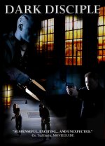
I like the colors. However I think the face on the top left is too dark. I can only see the side of his head and I can't see any details on the face. Also I don't know much about what is happening in the movie. It looks like the people with guns are chasing shadow guy but I can't figure out anything else. You may want to add a tagline.
Cool-ish, but a bit generic. I mean, there's no "hook" here or element of intrigue or the unexpected, no twist, no shiver. It's some poorly seen characters with guns and knives, some building with a fire... and um, darkness, I guess? Gotta have something going here. As a prospective viewer, my thought upon seeing this poster would be "Z grade actioner, pass". Nothing draws my attention.
I think you need to jazz it up with some kind of hook. Just my 2c.
I think you need to jazz it up with some kind of hook. Just my 2c.
Cool-ish, but a bit generic. I mean, there's no "hook" here or element of intrigue or the unexpected, no twist, no shiver. It's some poorly seen characters with guns and knives, some building with a fire... and um, darkness, I guess? Gotta have something going here. As a prospective viewer, my thought upon seeing this poster would be "Z grade actioner, pass". Nothing draws my attention.
I think you need to jazz it up with some kind of hook. Just my 2c.
With all due respect "No Hook" ? One look at the poster and you can see the first "Iconic" movie villain to emerge in a decade. I don't usually respond negatively to feedback because it makes you better if you take it into consideration. But please be accurate.

Martay
Veteran
With all due respect "No Hook" ? One look at the poster and you can see the first "Iconic" movie villain to emerge in a decade. I don't usually respond negatively to feedback because it makes you better if you take it into consideration. But please be accurate.
Opinions are subjective. Be Accurate? There isn't a right or wrong opinion per se.
I agree that the image of the bad guy is too dark. This is the Iconic Villain right? Why not play him up more?
My take, why two photos of the guy with gun? Is he a name? I have to admit I don't recognize him myself. We could probably stand just the two shot of the people with guns and not need a redundant look at the guy with a gun as well.
It might be better to reverse the villain image and make sure we see him. Keep the pursuit image and the windows but sort of reversed so the Villain takes up the Right side of the post at the top and the pursuit photo takes the bottom left side. Or see if the "pursuit" pic works on the lower right if you don't want to reverse the villain image. But definitely show us the Villain.
Also, rather than the pull quote (or in addition to it) you might want a tagline.
this is what I consider constructive criticism and I appreciate it. my response was to the comments "no hook... no twist.. no shiver... z grade actioner, pass." there's nothing constructive about that. it basically says there's no redeeming quality in this poster whatsoever.
Regarding the shadowed face; the original image showed his face and I got complaints that we're giving the villain away too soon.
what are confusing process this movie making is turned out to be :-!
Regarding the shadowed face; the original image showed his face and I got complaints that we're giving the villain away too soon.
what are confusing process this movie making is turned out to be :-!
Martay
Veteran
this is what I consider constructive criticism and I appreciate it.
what are confusing process this movie making is turned out to be :-!
Yes, it's full of contradictions.
If it is important to the story that the Villain be mysterious, maybe they shouldn't be there at all. However, if your strong suit is a killer VILLAIN, use that. Wasn't Pinhead used to market those movies? Isn't Jason the FACE of the Friday the 13th series (granted that came later). If the Villain is the cool thing about your movie. Then Go for it.
They put Zombies on the covers of Zombie flicks. Why wouldn't a movie called DARK DISCIPLE show you the Dark Disciple (unless that's not really the Dark Disciple).
Good luck with it.
-M
With all due respect "No Hook" ? One look at the poster and you can see the first "Iconic" movie villain to emerge in a decade. I don't usually respond negatively to feedback because it makes you better if you take it into consideration. But please be accurate.
"Accurate"? lol. And this is why I rarely give feedback on this board. Some people just don't have the brains to appreciate it. It's thankless. I give my time and my honest opinion and I get back hostility from those who don't have it in them. Not worth it. I worked for one of the top three talent agencies in town, for over 10 years. I've seen plenty. I know what I'm talking about. And I've seen other thin-skinned artists never amount to anything, because they can't take criticism. You'll be glad to know I'll never comment on your stuff again, so best of luck. Ciao!
It looks like a 90's book cover.
But that's just me. I have a book on my bookshelf with a title font looking just like that and with the quote at the bottom.
I guess what I'm trying to say is that it doesn't really follow the standard in terms of what movie posters tend to look like. I can't say if that's good or bad; But to me, 90's book covers look cheap and reminds me of the older versions of Photoshop.
But that's just me. I have a book on my bookshelf with a title font looking just like that and with the quote at the bottom.
I guess what I'm trying to say is that it doesn't really follow the standard in terms of what movie posters tend to look like. I can't say if that's good or bad; But to me, 90's book covers look cheap and reminds me of the older versions of Photoshop.
I was kinda thinking that too, but also got a lot of thumbs up as well. That's why I'm looking for feedback. I'm trying to do this villain justice.
I toyed around real quick in Photoshop just to see if I could change things up a little and maybe help spark some ideas. It's so hard conveying these things in words.
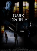
Last edited:
man, things can get hostile on here quickly. Ultimately, no one can say that a creative form of art is done the "right" or "wrong" way, obviously there are always improvements that we can make, and certain guidelines that can help. But don't let guidelines or critics constrain something that's meant to be creative and liberating. That being said, you put up the poster for critique so I'd like to throw an idea out there; minimalist design. It creates a lot of intrigue, it can be iconic, and it adds the "hook" people are searching for. http://designm.ag/graphic-design/minimalist-movie-posters/ here are some examples, I think most of them are a little too basic, but it's a jumping off point. Good luck!
Thanks GMG802. Those are quite witty. I found myself laughing at the ingenuity of some of them. now if I could get "Dark Disciple" so popular that people recognize it by a symbol, that would be awesome. maybe the Dark Disciple's tattoo or his dual blade.
Happy to give my 2 cents. I think the minimalist design, when done well, will achieve the recognition from loyal fans, but it will also get the interest of new viewers that will want to know more.
Wow Tolin! see, that's why I love this site. so many creative people. I love your design now how do I go about using it
You have the PSD file in your inbox