Improving Technicolor CineStyle?

eco_bach

Well-known member
Hi
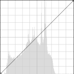
I've heard from others that the Technicolor CineStyle compresses the dynamic range of the sensor, particularly in the shadows. A quick test comparing the latest Marvels advanced and Cinestyle seems to corroborate this. In the histograms below, the Marvels is on the left, Technicolor on the right. Identical exposures using an incident light reading. Anyone else care to comment?

After a quick color luminance adjust S Curve is applied, though, I really like the flesh tone renditions of Technicolor Cinestyle.
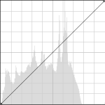
MarvelsCinestyle.pngTechnicolorCineStyle.png

Can anyone think of a way to modify-improve the Technicolor Cinestyle PictureStyle curve so it doesn't compress the sensor data as much?
 
Last edited:
it's locked, there's no way to modify it, but you can look for alternatives... like my suite of Flaat picture styles, which aim to do exactly this: improve on Technicolor CineStylel, Marvels Cine and other available options, in the following way:
* less noise in the final images than Technicolor, by using more efficiently the codec's color space (Technicolor uses just a portion of it, both in the color channels -it's overly desaturated- and in luminance, where not only does it leave 16% of the values untouched, as you posted, but it also reserves nearly 10% of the color space to the brightest third-of-a-stop of highlihts... while clipping at the same point as any other picture style)
* easier to grade (nicer skin tones in final images, even with my limited grading skills) than Marvels Cine and other similar options
* with the most extreme options, more recorded DR than any other option I know about (less DR clipped in the shadows, at cost of noise)

in-depth explanation here:
http://www.similaar.com/foto/flaat-picture-styles/index.html

and video test here:
http://vimeo.com/34943260
 
Last edited:
Norman, I shoot in a lot of very dark environments (pubs & nightclubs) and have been using Technicolor Cinestyle with pretty good results though it's a tad too noisy for my liking. The client hasn't an issue with noise though which is good.

Would you recommend using Flaat_3 or 4 instead? I'm really up against the wall with light, shooting F1.4 and as high as ISO1250. I use an LED light in some situations but for others it's not possible. I have access to Neat Video so can do some clean up in post.

I may actually shoot some test footage today if I get time, comparing technicolor vs marvels vs flaat 3 or 4, nothing too technical. I'll send a link if I post it online.

Thanks.
 
I'm not really sure... Flaat_3 and Flaat_4 are great for extending DR in lots-of-light situations, but they won't make more light hit your sensor, so noise will still be there if you shoot in low-light situations

what they do is to assign a higher portion of the codec's color space to record low-light areas, so if you're having to push-up your shadows in post, it's actually better to shoot with Flaat_3 or Flaat_4 because you'll get smoother gradients in your shadows (check the waveform in the image that gives way to the video here: http://vimeo.com/34943260), but it's a losing battle: you'll use that extra color space to better encode the noise that the sensor is outputting

I'd say: run a test and see if you like it better; and also check flaat_2 if you can (it's the one closest to Technicolor CineStyle and Marvels Cine in terms of exposure in the shadows)
in any case, it will push up the shadows, but BY NO MEANS dim your lights or lower the ISO: just let the shadows fall in higher IRE values, then run your denoiser, then push those shadows back down until you have the exposure you like and not too much noise
 
I shoot in a lot of very dark environments (pubs & nightclubs) and have been using Technicolor Cinestyle with pretty good results though it's a tad too noisy for my liking. .

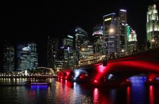
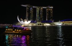
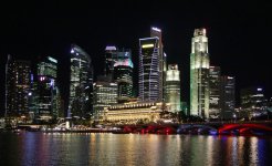
I've been shoot everything cinestyle 0,-4,-1, 0 since it was released. It works well in most situations. Some claim additional noise, but these DSLR cameras aren't perfect. I would say I have confidence that what ever I shoot, there will be enough information available when it comes to grading. The only real improvement will be a more sensitive sensor that produces less noise, faster lenses, and slower shutter speeds, and of course more light, but for now it does the dailies quite well.
These are still shots from a 60D and a Tamron 17-50 2.8. The shutter speed was a 1/15 sec so with a more sensitive 5D sensor and a faster lens such as a 1.4 I think the same image could be shot in HD video. Just waiting for that dang new 5D to arrive and it will be the step forward I'm looking for in limited light shooting.
 

Attachments

  • HARBOR-NIGHTS-4.jpg
    HARBOR-NIGHTS-4.jpg
    103.7 KB · Views: 0
  • HARBOR-NIGHTS-1.jpg
    HARBOR-NIGHTS-1.jpg
    86.5 KB · Views: 0
  • HARBOR-NIGHTS-2.jpg
    HARBOR-NIGHTS-2.jpg
    103 KB · Views: 0
  • STRATUS-SINGAPORE-3.jpg
    STRATUS-SINGAPORE-3.jpg
    114.5 KB · Views: 0
  • SINGAPORE-WATERFRONT.jpg
    SINGAPORE-WATERFRONT.jpg
    74.7 KB · Views: 0
Last edited:
Rockmore, thanks for sharing, what you want is a continuous dynamic range image with skin tones. And run a comparison test with different curves before and after grading. Yes, most of the popular pic styles do an ok job, but we're talking about maximizing the quality from the available sensor light data.

Does anyone know what makes the default picture styles different from one another other than the shape of the luminance curve?

A post by Simon over on planet5d helps me understand why Technicolor chose to compress the sensors data(or at least that seems like what they've done)?
http://blog.planet5d.com/2011/09/cinema-picture-style-a-new-option-for-canon-hdslrs/

"...it enables you to underexpose to preserve highlights while retaining shadow detail, of sorts. I say “of sorts” because all that flatness comes at a premium price. That being that compressing that contrast range comes at the expense of tonal range."

So it seems Technicolor would be most ideal for high contrast scenes with important highlite detail that you need to preserve by underexposing a stop or 2, ie wedding videos, outdoors sunny, products with reflective chrome etc.

I'll do another comparison test with flaat 2-3 and compare with both Marvels, Technicolor and Crookedpath flat.

Any reason why I shouldn't reduce the saturation and sharpness slightly with the flaat styles? Especially since most people apply some sort of color grading...
 
Last edited:
I just had a quick play with Flaat 2, 3 & 4... really liking Flaat_2 so far. I can see this taking a slot on my camera alongside CineStyle and Marvels for sure.

Good work!
 
* I don't like to shoot with sharpness=0 because it looks soft, so I have to add sharpness back in post, and when doing so I accentuate noise and codec issues - I think adding sharpness *before* the codec does its nasty job leads to cleaner images (at the cost of a bit less control in post: you can always add sharpness in post, but you can't take it away)

* I don't like to shooot with saturaion=-4 because it shrinks the color space used by the sensor: it leaves a big chunk of it untouched, and then, when you bring up saturation back in post, you increase color noise (in a very extreme example, if you shoot nearly black and white and then push up your saturation, it will look horrible) (the downside is that you have to be careful not to get clipping on any individual color channel)

if you prefer to shoot with sharpnes=0 and saturation=-4, by all means do so
changing contrast away from -4, though, is a bad idea: it will lead to funky, wiggling gamma curves
 
Does anyone know what makes the default picture styles different from one another other than the shape of the luminance curve?

I don't know exactly, but I can say: lots of things!!

look at the vectorscopes from the skin tones at the end of my page (http://www.similaar.com/foto/flaat-picture-styles/index.html) and you can easily see which picture styles are based on which original Canon picture style (Flaat is a son of Portrait, Marvels Cine and Technicolor seem to be sons of Neutral)

in particular, Portrait, which is the one I like most, seems to do some kind of "skin squeeze" and "skin smooth" (similar to what you can get with Magic Bullet Mojo and Cosmo), whereas Neutral-based profiles seem to desaturate skin tones relative to other colors (or maybe portrait does the opposite of that, but if that's so I'd say it's quite useful)

another example of weird things they do: look how much the color for the sky changes from one ps to the other (and it's not just saturation: the hue changes too):
http://www.similaar.com/foto/flaat-picture-styles/real-world-tests-1.html
 
Here's my little test, as promised. See what you think.

Thanks for sharing but a proper comparison of picture styles should involve a more controlled lighting environment ( see the Zacuto shootout to see what I mean) as well as a before and after grading (preferably split screen) comparison.

Otherwise there's nothing really useful that can be concluded, simply too many variables involved.
 
Like I said it was just a simple test in the real world. I shoot in the real world, not under controlled lighting conditions. To compare this to the Zacuto shootout is laughable at best.
 
I think it was a fine "real world" test. Most of us would have busted out a softbox and filled in that shadow area by the coals, but the test is still valid because that may not always be the option. There are deep shadows and fire in the same shot, which is exactly the kind of crap you run into in the "real world."

Flaat_2 is quite punchy, but I could see it being very useful for skin tones, Norman, like you said.

I greatly dislike Technicolor for 90% of applications - it really shines when you expose almost to the point of clipping the highlights and then add contrast in post, which pushes out most of the shadow noise. It can be useful outside, but it's hard to avoid highlight clipping with these cameras when you shoot in broad daylight without some heavy over-head diffusion.

I think Marvel's is a great all-purpose picture style, as it does a decent job of flattening the image without inducing a ton of noise, but it treats all color the same, like you said Norman - everything is desaturated, including skin tones, which can be problematic in the grade.

Good stuff here.
 
I greatly dislike Technicolor for 90% of applications
When I got my DSLR, I liked the idea of using the technicolor style, as it was giving more room for color correction in post. But, to quote a user on another forum:
heavy grading kills part of the gamut, and introduces artifacts.
As well as it introduce banding in the picture, see reference here. I've managed to get rid of it by adding a fine layer of grain over it. Check the thread linked, there's some nice infos in it.
 
heavy grading kills part of the gamut, and introduces artifacts.
That's precisely what Flaat_1 and Flaat_2 try to avoid: you have the flexibility, but these issues should be minimized :)

edit: very interesting thread, I just posted a lot of useful graphs over there
 
Last edited:
Haven't tested flaat yet, but my preferences for results i can color grade easily in terms of priority are
1-Cinestyle(Technicolor)
2-Cinegrey (very similar to technicolor, if you intend to crush(clip) blacks in your final grade may be the best option)
3-Neutral(2,-4,-2,0)

I think Technicolor should provide a 'lite' version, which isn't as agressive and doesn't lift the blacks as much, then it would be close to perfect IMHO.

If you do your CG in a higher bit depth color space, and run a noise reduction as your first pass, I'm pretty sure most of the banding issues would be resolved.
 
That's precisely what Flaat_1 and Flaat_2 try to avoid: you have the flexibility, but these issues should be minimized :)
I'll have to try these!

Edit: just watched your video, in low-light it can help, but the saturation is turned down a bit. Nice to keep details though.
 
Last edited:
I'll have to try these!

there's a post from me waiting to appear at that hv20.com thread (apparently it needs to be approved by a moderator), that starts with something like "this is exactly the kind of issues that motivated me to create the Similaar suite of Flaat picture styles" - that post is a summary of this page and I think Janke will like it: I started with very similar tools and reasonings but developed my tools farther and that allowed me to create a more advanced alternative (and I learnt a lot about other picture styles in the process)

re: saturation: I use it at -2, but you can change it to -4 or 0 if you like that better; same with sharpness: it's contrast that should not be changed, because doing so would lead to a weird, wiggling gamma response
 
Back
Top