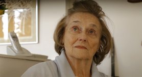
Grade this

PaPa

Major Contributor
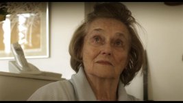
I posted this in another thread and am really curious to see how you guys would grade this. Try going for something natural, something you would see in a comedy film, so nothing matrix like or night time.

I constantly find myself trying to go for something nice, but end up either going too contrasty or too color cast'y.

Please give it a try and post your results:

babirawaf100.jpg
 
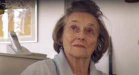
babirawaf100 warm.jpg

I just threw this in a 720p timeline. I'm just getting into color grading, I may have made it a bit too warm.
 
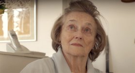
Here's my attempt, very hard to give is a bloomy comedy look without a different colored background.
 

Attachments

  • babirawaf100 (0.00.00.00).jpg
    babirawaf100 (0.00.00.00).jpg
    76.5 KB · Views: 0
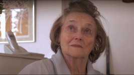
i agree. just going for something natural. nice skin tone. Nothing too contrasty but not too flat. Hard to explain i guess. I'm focusing mainly on the skin tone and hair. Obviously with lighting everything changes, but iw anted to see what could be done with something under natural conditions and no art direction.

keep em coming.
 
I actually have a standard S-Curve on all channels, but I added some blue/green in the blacks to make the hair seperate from her face. I see you have some green in your blacks too, nice!
 
You guys have to remember to preserve her skin tone, thats the most important especially for what Papa wants as a comedy look.

You guys are either going to warm or too cold, and Papa, I like your grade, but there is too much blue in her hair, I'm not saying I'm an expert, but CC is my love.


EDIT: and I now notice even mine, because I re-jpeged it, is a lot lighter than my actual grade.
 
Last edited:
What's a better way to export a jpg... I did a screenshot, never really worried about pulling jpgs from video before with any precise amount of accuracy in color.

Why is nobody else severely bother by the vignette along the top from a lens hood or something?! I tried to improve it but the color is off so now it's yellow...

2m2tdgl.jpg
 
sorry, i wrote in the other thread that the vignette is just the top of the mattebox creeping in lol. Nothing serious.
 
shitty. that's what I figured since it's flat. Have you figured out a good balance of gradient exposure to correct it? I am at +1.8 stops and with a pretty hard drop off. looks better than my screen shot up there now but still not right... OCD.
 
You guys have to remember to preserve her skin tone, thats the most important especially for what Papa wants as a comedy look.

You guys are either going to warm or too cold, and Papa, I like your grade, but there is too much blue in her hair, I'm not saying I'm an expert, but CC is my love.


EDIT: and I now notice even mine, because I re-jpeged it, is a lot lighter than my actual grade.

exactly, preserving the skin tone, going for something very naturally, pleasing, not flat, but not 2006-2009 crushed black frenzy. Something smooth, pleasing.

my curves have tended to change over time too from the left to the right. I feel it's more flatering on the skin tone and delivers a closer look for what I'm going after most of the time:

oldcurvenewcurve.jpg


I do also play around gently with the RGB curve as well.
 
Last edited:
exactly, preserving the skin tone, going for something very naturally, pleasing, not flat, but not 2006-2009 crushed black frenzy. Something smooth, pleasing.

How about some reference pictures / stills from actual movies of the look you think about?
 
Back
Top