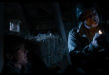
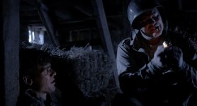
F55: Film look with the F55 on "Uncommon Enemies" film

Been thinking about this. Im not sure why it is not up there with hollywood, it could be but it is not - dont take that wrong you have down well with the elements.

Some thoughts..
Maybe some mixed colour temp lights
Diffusion on the lights
Haze

I think good colour often has a white or an off colour (eg red in this frame) to somehow build the difference between a blue scene and an image with a blue filter on it!

Certainly grain and aspect ratio help and losing your yellow logo!

its a nice file IMO - 4k yum!
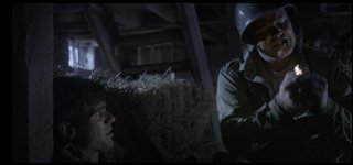
dennis1.jpg
 

You'll probably shoot me but I think the top image, which I believe is straight S-Log, looks much more realistic and life like for the night time. I might darken the entire frame a bit, maybe decrease the contrast a little more, and call it a day.
 
Last edited:
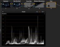
I'd say don't be afraid to be dark. Go connect some scopes to a Blu-Ray player someday and watch a some movies with night stuff. Some colorists go really dark, and it works fine. Especially modern movies/colorists.


UnCEn.jpg


UnCEnScopes.jpg
 

Attachments

  • Screen Shot 2013-07-03 at 3.45.40 PM.jpg
    Screen Shot 2013-07-03 at 3.45.40 PM.jpg
    10.8 KB · Views: 0
  • Screen Shot 2013-07-03 at 3.45.55 PM.jpg
    Screen Shot 2013-07-03 at 3.45.55 PM.jpg
    13.6 KB · Views: 0
Last edited:
I have no experience in film production so take my opinion as that of an audience. I think there's too much blue in the scene and it isn't the best color to depict the WW2 setting. Blue just seems...sterile and clean, it is more fit for a modern, futuristic setting (like Minority Report). War is dirty and gritty, I know this isn't a war movie but the scene could really use a lot more red and yellow. I think the look in Enemy At The Gates has the right balance.
 
Nate, I like what you've done. You've darkened it like I said, knocking down the window, but managed to keep warmth in the faces. I'd probably knock down the highlights on the hay a bit too, but definitely along those lines. Much better.
 
I like Morgan_moore's overall look, but Nate's is the best yet (IMO). It's probably also closer to the blue look StarCentral wants. I'd say something around Nate's grade - plus some more grain would really give a nice look.

It's not exactly day for night, but the mood works... so applying that grade style to the other shots would definitely help the stills posted originally.
 
Hi guys. Thanks to everyone for their comments, grades, and feedback.

I should clarify several things about the film. Well, here it goes... this is actually a horror movie set during world war II. The sergeant and his private are behind enemy lines when a German and French maid come into the barn for some hanky panky. As fiction would have it turn out, one of the characters is a.... (da da-da daaa...) VAMPIRE!

The motivation for the lighting is strictly moonlight. ie. there are no other lighting sources in the film (although I did consider even a few bare bulbs for some 3200k looking fill to mix temperatures) but in the end decided on 5600k all the way around to keep it cold.

Even though the muddy green/brown grade looks really awesome and more appropriate for a WWII flick, it doesn't fit the script so the final grade will have to go towards that cold/blue look and generally under moonlight warm skin tones disappear and go more pale or desaturated in color. Having said that I am inclined to bring back a little more red back in just to keep it from looking monochromatic.

My biggest concern in the end is losing that plastic video look given off by those crazy highlights so I will dull them down, darken the whole picture and I think be ok. I am thankful for everyone's perspective.


Bill - regarding ISO and lenses, I worked on a location with limited power supply so ended up using two 575w HMI's through the windows with 1/2 scrim to balance out the distance of the beam and then used various flo's for fill. Because the distances spanned from 15-30 feet and I wanted to keep my skin down in 30IRE land I ended up shooting 3200 ISO. The only three lenses used on this entire shoot were Tokina 11-16 f2.8, 16-50 f2.8 and 28-70 f2.8. Mainly for speed and ease of multiple setups and framing. Last detail on lighting and camera settings: I used all 5600-6000k lighting but left the camera set to 3200k to cool off the image in camera. Codec was 4k XAVC internal.
 
Hi guys. Thanks to everyone for their comments, grades, and feedback.

I should clarify several things about the film. Well, here it goes...

Yeah, honestly nobody here can possibly know everything that informs what this color should look like. Except you Dennis.

You're braver than me, btw, letting people play with frames. I get bent out of shape when people apply their ideas coming out of left field. :-)

I'll say it again, I think these frames you've posted look amazing.
 
Last edited:
Just my thought, of course take it or leave it!

I don't think there's a single thing wrong with any of the highlights in this image. The window's COMPLETELY tamable, clips VERY nicely when handled properly and you don't have to mute it at all.

To me, the muted highlights look is a pretty drab way to go, kind of takes away from the "fullness" of an image. Just find a curve that fits.

(I really like the base you supplied, and can't believe I havent' shot a single frame of F55 yet... it's so nice)
 
Last edited:
It's quite amazing to see how the same image can be graded in so many ways. It also remindes me how filmic the footage from the RED cameras really are. I think this is testament to the time and effort put in by RED in development of their color sciences which can offer a very good base to start with.
 
It's quite amazing to see how the same image can be graded in so many ways. It also remindes me how filmic the footage from the RED cameras really are. I think this is testament to the time and effort put in by RED in development of their color sciences which can offer a very good base to start with.

Yes, I still like the look of Red stuff (when done well) - there's another thread here (I really like the red dress saturated one) - http://www.reduser.net/forum/showthread.php?107682-GRADE-MY-R3D-FOREST-SCENES and another here http://www.reduser.net/forum/showthread.php?107137-Another-Grade-my-R3D-thread and a final one here that's on the old RED One - http://www.reduser.net/forum/showthread.php?107637-Grade-my-RED-MX-R3D-Mawla-Ali-Music-Video

Not starting any Red vs Sony stuff (at all), just interesting to see the range of looks (as Dennis mentioned) that RAW gives you.
 
In terms of image quality or "filmic" looks it makes perfect sense to compare the F55 (or any new camera) to cameras like RED or Alexa which without any doubt have set the bar in terms of a digital camera that has replaced and quite possibly even surpassed "film". There are some people who don't really care about this feat, and then others like myself who really do.

A couple things to note about the footage I shot for this film is that it was not shot in RAW but instead in 4k XAVC 10-bit 422, slog2 + sgamut and quite miraculously it holds up well in grading. Really well. Also since June when I was rushing to put a grade on the film to have it finished in time, I have spent a lot more time in Davinci to finesse the images out of the F55 and think I have gotten better at it.

Here are some newer grades using Davinci and here is the original DPX if anyone else wants a chance to play and post. :)

http://www.starcentral.ca/forums/UE/4k_UE_starcentral_1.1.1.dpx


Gold


Gold Crunch


Pastel Blue


Blue crunch
 
Last edited:
Nice stuff Dennis

I've graded two TV movies shot on F55 in the last few months, and will be starting on another next week.. i'm very impressed with the camera

I'm not on Resolve, but much the same workflow and nodebased, i use the Sony F65 LUT as a viewer LUT and grade in LOG underneath... very fast and very flexiable

any of your grades are valid, only will know once you have them in context tho!

d
 
Back
Top