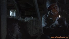
F55: Film look with the F55 on "Uncommon Enemies" film

starcentral

Veteran
Just finished working as the Director of Photography on "Uncommon Enemies" film with the Sony F55 and wrote some detail about it here: Film look with the F55 on “Uncommon Enemies” | hingsberg's blog

Enjoy

9001963522_a24e50a4e9_z.jpg
 
Last edited:
No its all good. Just a note this isn't final grade, I rushed to get something out there and did a quick grade in AE. My Davinci machine has been tied up transcoding 4k footage for several days so once its free I will apply sony LUT and post some better frames.

Cheers,
 
I think it looks fantastic. The grade, and most importantly the lighting and the shot. The skintones going magenta looks retro, I like it.

Dennis, what format is it? Assuming XAVC, Slog2 and S-gamut?
 
Yeah.. I dig it! The lighting and grade remind me of all of the 1950's WW2 movies. If you had told me it was a grab from a vintage flick I'd believe it. That's a compliment btw. "Proof' that the F's can be made to look like whatever the artist wants when done right.
 
Wow now that you mention it Nate, I didn't realize there was so much red/magenta added back in the skin tone. Yikes let me fix that. Yes it was XAVC 10-bit 422, slog2, s-gamut, straight to internal sxs pro cards in 4k (but will be edited and mastered out to HD.)

Yes Bill, the film is a horror movie set in WWII and was lit with more of a classic look. There are also plans to eventually give it more of a "night look" so I lit it with "day for night" in mind. We just have to avoid showing some of the windows you see in the frame where I'm blasting HMI's through from the outside.

The final look might be something a little more like this:
UE_001d_600.jpg


Anyway I hope to post some more frames soon, wait till you see the German soldier and French maid :cool:
 
Last edited:
I definitely like the first version. It looks really nostalgic without going overboard or "trying too hard" if that makes sense.
 
Ok so here are some newer frames processed through Davinci.

Still not the final grade but it's looking much better than the first couple attempts I had posted before I think, but let me know what you guys think from a video vs film or cinematic look.

Cheers,


let me know what you guys think from a video vs film or cinematic look.

Lighting and comp look great Dennis, but it looks Sony. Like really really good HD video but no mojo.

That said, I've always felt this way about anything shot on a Sony. To my eye, they don't produce a pleasing image. Also overall I feel like it's too bright. If it was taken down in the grade I think that would help it a bit.
 
Still not the final grade but it's looking much better than the first couple attempts I had posted before I think, but let me know what you guys think from a video vs film or cinematic look.

It's just my subjective opinion, and day for night can take a lot of tweeking to get just right, but I think you definitely have to bring down the levels of the highlights. They scream that there are movie lights on the scene.

After that reduce the contrast. Look outside at night. There's too much DR in most of these and it should be flatter. I sometimes use S-Log as is for day for night shots.

Maybe selectively desaturate a little more because some colors are still too strong. On film we could do a bleach bypass and it looked great. Try for that look.

I don't say this with any harshness at all. Keep going. You're getting there.
 
The grabs look nice, but they look very HD/Video rather than film.

Cinematic or 'film look' is one of those contentious terms that mean different things to different people - so it's always hard to canvas peoples opinions as they vary wildly :)

For me, they lack atmosphere and a sense of place/time... the current feel/look just heightens the feeling that it's a low budget movie with actors in costumes.

Did you shoot with any haze/fog (particulates etc)? I can't see much, but this may be lost in the grade - as that would be a good way of getting some life in it (apart from the obvious routes of film grain etc).

Some of your issues may be down to art direction (etc) as I (personally) am seeing something very clean... from costumes through to location/dressing... and the lack of a granular 'reality' is making the images look crisp/HD.

Can you do a before/after grade pic? It would be interesting to see you raw/source footage.

Personally, I'd try and push the grade a lot more :)
 
Ok so here are some newer frames processed through Davinci.

Still not the final grade but it's looking much better than the first couple attempts I had posted before I think, but let me know what you guys think from a video vs film or cinematic look.

I think colorwise you have almost nailed the 5579 plus ENR emulation, but I think the texture (in lack of a better word) needs some more attention, like blooming the highlights a bit and maybe adding some grain. The whole thing looks so dammed bloody clean and supersharp (yeah, it's a Sony), it's almost sterile.

Having shot quite some WWII stuff myself, I must say framing and light is excellent and very period.

my ct 2

Frank
 
Hey guys, thanks for all your comments.

After looking at something for so long it starts to look "good" like it doesn't need any further tweaking - but it does so the feedback is great. I took a break from looking at it for a while so I can come at it again with a fresh perspective for the second pass. If I go for more of that moon look I think I'm going to have to desaturate it and go more blue with the grade, kill overall brightness levels, tame out those highlights, then selectively bring the skin tones back from blue a tad. But I'm not there yet. I spent most of my time evening out the grade from shot to shot and putting in a hint of the direction I wanted to go as far as an overall look.

The intro and wider shots (which I haven't posted any of) give a better sense of the location and texture which is there, but maybe not visible from the frames I selected to post. The location was a beautiful old barn built in the late 1800's with a foundation built out of piled stones and an old decreped ceiling that was ready to collapse on us at any moment.

I did have a hazer but a draft at the location sucked it all out most of the time so I didn't get that atmosphere I was going for you'd see in Blade Runner, Citizen Kane, etc.. I haven't strongly considered adding grain to it but it might actually help in this case to fight that HD look.

I also notice that my PC shows these images brighter than when viewing the single frames (or edited film) on my MAC. So it might look brighter than it is depending on what you are viewing it on. I have a tablet and when I watch it there the highlights are very nicely rolling off and I nothing appears to be clipping, etc..

I posted an original frame in another thread but here you can see a frame in slog2 without any grading at all. Funny enough I left the proxy files for editing in slog2 and we got quite use to seeing the edit all washed out and old looking and started to like it as well.


Last edited:
Wow, I found a discrepancy in the brightness between how the stills appear on my local machine and after they are uploaded to flickr and displayed in my browser. They are brighter on flickr for some reason which is causing the highlights on all my stills to look "plasticy". I triple checked and I am converting the color space of the jpg to sRGB before uploading.

Here's one of the stills before uploading to flickr if you want to compare them side by side on your computer. Its the exact same file uploaded to flickr. http://www.starcentral.ca/forums/UE_frame009_sRGB.jpg (don't open it with your browser, try saving it to desktop and opening with image previewer)

Now below is the frame adjusted to reduce the highlights a bit so once uploaded to web and displayed in my browser at least, the highlights look a little better. Look at the left side of his face then go look at the flickr image. The flickr one wreaks white highlights / plastic look.

 
Hi Frank, no problem by all means feel free to play. The final look we will be going for is more like a "moonlight / blue".

Here is the original frame 4k in DPX or OpenEXR formats if anyone wants to play.
 
Last edited:
Back
Top