FEATURE: DEUCE OF SPADES - How I made a period full feature film all by myself on ZERO budget

Yes that is a good pointer, but not always the case in all DVD covers, again showing FLYBOYS as an exemple. Most elements are about the same size ...

Hmmmm (Scratching my head LOL) I think making the poster is harder than making the darn film !!

flyboys07.jpg


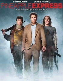
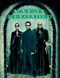
here are some more posters where elements are of about the same size.

60027695.jpg
70098329.jpg
 
And I would make the same criticism of all of those as well, assuming they're posters. DVD cover art is another story since the physical size of the medium is so small.

Ask yourself: which poster is more 'visually arresting' (another term drilled into me by my design professors)? The Star Wars ones or the two you showed?

Lots of examples of mediocre work can be cited. It doesn't make them less so. I say if you're creating from whole cloth, go for greatness. Other people doing less than great work should never be a justification for your doing so.

FWIW...
 
Last edited:
The only issue I had was the car facing front. Had the car been a bit further behind him and angled, I think it would have added some energy -- and on a more "impressionistic" note, with him standing side by side with the car, they look like partners, which they're not. The car is his weapon, his machine. This poster gives the impression that they're equals. And if the car is equal to the main actor, you're making Transformers. This would work if the car were Bumblebee or Kit. But right now it feels like it's detracting from the main actor.

Even in films like Serenity (named after the ship in the movie), the actors were still the focus. All of the Fast and the Furious posters had massive mug shots of the main cast with the car at a much smaller scale.

I'd also tell you to not be afraid of dynamic angles overall. Your vanishing point(s) can really be anywhere you want them to be on the page.

The poster you have here is an extremely basic, sort of a Driving Miss Daisy/October Skies kind of melodrama poster.

It might be worth considering going to the source of your movie's own era. Why not look into some of the old car movies from the 50s? You might find some inspiration there and then it would exist as a kind of transitional piece for the moviegoer. Heck, if you used a kind of Technicolor faux-colorized kind of pallette, that too might be really bizarre and awesome.
 
And I would make the same criticism of all of those as well, assuming they're posters. DVD cover art is another story since the physical size of the medium is so small.

Ask yourself: which poster is more 'visually arresting' (another term drilled into me by my design professors)? The Star Wars ones or the two you showed?

Lots of examples of mediocre work can be cited. It doesn't make them less so. I say if you're creating from whole cloth, go for greatness. Other people doing less than great work should never be a justification for your doing so.

FWIW...

Also those posters aren't even in the same genre and, more importantly, they're displaying famous people. They're saying "See our movie because it has these people in it and, remember, you like them?"
 
Yes, star-driven films, especially ones with two or more of them, usually feature the stars likenesses very large for obvious reasons. In that regard, the two Star Wars posters are exemplary. The original featured Darth's mask most prominently, but the later special edition version, after the main actors had become huge stars, featured Luke, Han and Leia.

The quantity contrast thing is just a basic design philosophy though. It works well in almost any genre or graphic medium. Graphic novels and comic books use it in almost every panel. You could probably even find lots of postage stamps that illustrate it, despite their tiny size.
 
The Poster Is REALLY cool. Definitely an attention grabber. I think browsers would def. pause to look that one over. Congrats.
 
Movieposter

Movieposter

Hi, looking at the poster one thing is disturbing: you main actor is looking away from the main subject, the hotrod and he seems to look at something that is outside the frame. What I learned about photographic framing was always let a picture be a circle of elements, so your eyes never ever get a chance to leave the frame. So no element should guide your look outside and as important use diagonal structures to get the vision wander around the frame.
So I would suggest:
Put the actor on the left side of the D.o.S. and find a picture of it that is slightly diagonally oriented, with the drivers side at the front. Then use the opening gap between actor and car for lowering the lovers scene a bit. So you end with a triangle of car and lovers and actor.
Et comment on dit en France :happy:: quand c'est bon c'est trois !
Et pour les posters c'est la chose qui ce trouve partout parce que chaque bonne histoire est une histoire de deux personnages et un truc-machin ou un troisiemme ou du probleme des heros. C'est le premier secret du storytelling en tout cas...

Salut de la Baviere Matthias
 
Well, I'm sure out of these 119 pages of comments, this has been said 100's of time, but AMAZING WORK. I honestly feel that this alone is inspiring for someone who is as new as it gets, yet shares similar dreams. I've only watched the trailer, but still couldn't imagine it being done with no budget, etc. Similar to how Paranormal Activity was for only $15,000 .. yet I think you have them beat :P .. anyways, great work, and I hope to own a copy of the dvd soon
 
And I would make the same criticism of all of those as well, assuming they're posters. DVD cover art is another story since the physical size of the medium is so small.

Ask yourself: which poster is more 'visually arresting' (another term drilled into me by my design professors)? The Star Wars ones or the two you showed?

Lots of examples of mediocre work can be cited. It doesn't make them less so. I say if you're creating from whole cloth, go for greatness. Other people doing less than great work should never be a justification for your doing so.

FWIW...

Maybe... but I happen to really LOVe the FLyboy cover, and don't care for the Star wars one... So I guess it's a matter of taste. That said I do agree with having one dominant element in the design. Eye catching part.
 
So I would suggest:
Put the actor on the left side of the D.o.S. and find a picture of it that is slightly diagonally oriented, with the drivers side at the front. Then use the opening gap between actor and car for lowering the lovers scene a bit. So you end with a triangle of car and lovers and actor.

No I tried, while back to place Johnny on the other side of the car and that positively does not work. A pilot, especially a hotrodder will always be standing next to the driver's door. In this case, it looks like Johnny stepped out of the deuec and is standingm there waiting for something to come. His looking somewhat down and away woks great with the storyline and the meaning of the film. It evoque something in me when I look at it. There is a certain sadness, but also he seems noble in his body posture. Seems like he got something on his mind, so it is a bit mysterious to me like I want to know "What's wrong" or What is he thinking about?

if he is looking at his car, then you lose all of this.
 
Well, I'm sure out of these 119 pages of comments, this has been said 100's of time, but AMAZING WORK. I honestly feel that this alone is inspiring for someone who is as new as it gets, yet shares similar dreams. I've only watched the trailer, but still couldn't imagine it being done with no budget, etc. Similar to how Paranormal Activity was for only $15,000 .. yet I think you have them beat :P .. anyways, great work, and I hope to own a copy of the dvd soon


Thank you so much :)... I haven't seen Paranormal Actibity but I believe it's shot mostly inside the house (or is it all shot inside the one room) so it seems I could have filmed that one with $1,500 LOL.

Doing a period film with over 200 classic cars and many locations on zero budget was another ballgame altogether. Talk about challenging!
 
For those who you are new here, I wanted to post this cute video showing what it was like making this film myself. Footage was gathered by my lead actor on a SD small comsumer $200 camera (complete, with chip in the lense LOLOL), but you'll get the point all the same :)

IMPORTANT NOTICE: No media files are hosted on these forums. By clicking the link below you agree to view content from an external website. We can not be held responsible for the suitability or legality of this material. If the video does not play, wait a minute or try again later.
I AGREE
 
Trial

Trial

Hi Faith,
just a very rough manipulation so you can see what I meant...of course the lights in his face are all from the wrong side now and I would pose him more next to his car and make him a bit taller etc. but the image is not that much falling apart, maybe just reshoot your main actor on bluescreen ?
by request removed the altered poster

salut Matthias
 
Last edited:
A picture of him running towards his car or jumping into his car would look more dynamic. Just my 2cents. I really like the tone and texture of the poster.
 
Maybe... but I happen to really LOVe the FLyboy cover, and don't care for the Star wars one... So I guess it's a matter of taste.

Of course, as in all things. And my point wasn't to posit the SW poster(s) as definitive examples of the craft in all respects. Just to illustrate the contrast of scale concept.

That said I do agree with having one dominant element in the design. Eye catching part.

And that *is* the point, along with certain other elements being hyper-minimized for contrast. Visual dynamics is the result, and that's a good thing.
 
RED ALERT!!!!

WOOOOOOOOOOWWWWWWWWWWWWWWWWWWW !!!

Netflix just added my film to their list!!!!!!!!!!!!!!!!!!!!!!!!

Please add it to your queue by clicking here:

http://www.netflix.com/WiMovie/Deuce_of_Spades/70122712?strackid=5a1afffeceff05ee_0_srl&strkid=1337348022_0_0&trkid=438381


I was rather disturbed today when I saw a post from a fan on my facebook page stating that he just found my film on Netflix. I thought he was crazy, but surely enough when I logged in, there it was.

I was in total shock.

Especially since I never submitted my film nor talked to Netflix, ever.

For a moment there I thought someone had stolen my film and my identity and I was stressing BIG TIME! I was about to dial my attorney (who is one of the top Copyright lawyers in LA) when I got a call back from the Netflix Corporate office.

False alarm. They did not receive a fake submission for my film, and do not have a pirated copy of it, or any copy of it period for that matter. But what happened is that they actually decided, on their own, to add it to their Library. Meaning Netflix actually decided they wanted to offer it to their subscribers, even though I have never talked to them. Guess the buzz continues to grow.

What a relief!! So I guess all is well.. In fact, better than well :).
They do have the release date wrong and a very very old poster but the lady said they will fix that.

I was told if enough people show interest in the film (by adding it to their queue as a "save") netflix will pick it up for good when it is released and when I am ready for Netflix.

So I say, to anyone interested in this film, add it to your queue now!!!

http://www.netflix.com/WiMovie/Deuce_of_Spades/70122712?strackid=5a1afffeceff05ee_0_srl&strkid=1337348022_0_0&trkid=438381

:2vrolijk_08:
 
What a cool story! Sorry it gave you a case of the jitters at first, but all's well that ends well, right?

Just added it to my queue : )
 
RED ALERT!!!!

WOOOOOOOOOOWWWWWWWWWWWWWWWWWWW !!!

Netflix just added my film to their list!!!!!!!!!!!!!!!!!!!!!!!!

Please add it to your queue by clicking here:

http://www.netflix.com/WiMovie/Deuce_of_Spades/70122712?strackid=5a1afffeceff05ee_0_srl&strkid=1337348022_0_0&trkid=438381


I was rather disturbed today when I saw a post from a fan on my facebook page stating that he just found my film on Netflix. I thought he was crazy, but surely enough when I logged in, there it was.

I was in total shock.

Especially since I never submitted my film nor talked to Netflix, ever.

For a moment there I thought someone had stolen my film and my identity and I was stressing BIG TIME! I was about to dial my attorney (who is one of the top Copyright lawyers in LA) when I got a call back from the Netflix Corporate office.

False alarm. They did not receive a fake submission for my film, and do not have a pirated copy of it, or any copy of it period for that matter. But what happened is that they actually decided, on their own, to add it to their Library. Meaning Netflix actually decided they wanted to offer it to their subscribers, even though I have never talked to them. Guess the buzz continues to grow.

What a relief!! So I guess all is well.. In fact, better than well :).
They do have the release date wrong and a very very old poster but the lady said they will fix that.

I was told if enough people show interest in the film (by adding it to their queue as a "save") netflix will pick it up for good when it is released and when I am ready for Netflix.

So I say, to anyone interested in this film, add it to your queue now!!!

http://www.netflix.com/WiMovie/Deuce_of_Spades/70122712?strackid=5a1afffeceff05ee_0_srl&strkid=1337348022_0_0&trkid=438381

:2vrolijk_08:

Got some good netfilx stories, you'll have to email me. A friend just sold them 250,000 dvd's for his indie movie. They are doing pre market research right now so everyone in this thread needs to make sure they add it to there que.
 
Back
Top