FEATURE: DEUCE OF SPADES - How I made a period full feature film all by myself on ZERO budget

Nice second meeting with post production house yesterday, they were very patient and took the time to cover in details everything with me and we picked brains about the best way to approach the whole authoring thing, how much we will be able to fit on one DVD, going single or dual layer, subtitles, director's commentaries (two of them) etc...

I now finally have a very clear mental picture of exactely how everything is going to go down and how the pieces of the puzzle all fit.

Now that I have a plan of attack, I am pedal to the metal again :)

Completed ALL FOLEYS on my film and delivered the added foleys tracks from the first 4 reels.

Next I prepare the last 4 reels (which already have all their foleys done) for export out of vegas. I now really have the hang of the exporting sound out of Vegas thing and it has become a piece of cake. The files the studio is getting include all the sound files, all the edit decision list, including pans, volume curves and handles, plus they get an extra 30 second head and tail for each clip.

As you see getting out of Vegas is afterall, VERY doable and you can do it the right way.

As far as image goes, looks like the color correction will be done on each reel, so we will export each reel as one big lossless quicktime file. I don't think there is an easy, cost effective way around it, but would like to pick brains some more with the convertion people to see if there is. Cause if you can export sound... Then technically you shoud be able to export image the same way :)


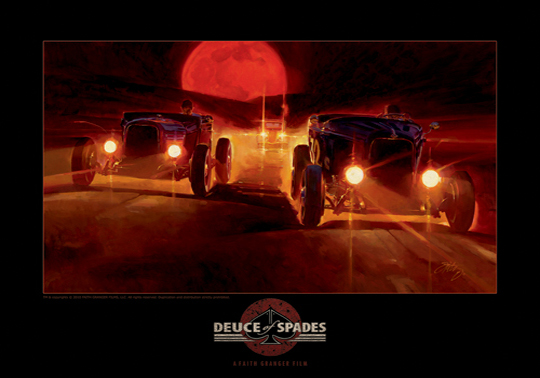
Below: A painting from Tom Fritz depicting the last race of Johnny Callaway, as seen in the film (well.. minus the big moon - that is LOL). The painting is selling as a promotional 18 X 24 poster to help raise more funds for post production work.

read more about this and see the second poster here: http://www.deuceofspadesmovie.com/TOM_FRITZ_poster_collection.htm


POSTER%20ONE%20last%20race%20WEB.jpg
 
Last edited:
You can download and install the free AVID DNxHD quicktime codec, Vegas will render out to it.
There are people over at the SCS VegasPro forum who can answer you questions about it.
It's free as in beer. Since you shot with 8bit 4:2:2 24/23.98p, DNxHD supports that.
Vegas does not support audio time code in QuickTime, but since you already exported your audio files seperately, that won't be an issue for you.

I am a bit lost. Above would still produce one big rendered file per reel, correct? I guess what we would have liked to have is each clip and decision list, so it is more flexible, to work with. Although post house said they can work with one big file even though there are dissolve from one scene to the next. Sure woudl be better to have all the inidivudual clips, like I do on my timeline...
 
Yesterday I completed my entire French translation. :2vrolijk_08:

One down, two zillions to go HA!

Today I made a new scene list, as the one I have dates back from 2 years ago and no longer reflect the final format of the film.

Looks like we have about 105 scenes in the film (including end credits).

So today I tackled a fun project: To identify key scenes, where my chapter markers will be placed, for the SCENES SELECTION menu work :).

I then gave each a caption :) - that was really a lot of fun.

Next I pick a screengrab for each.

Looks like the DVd will have 10 sets of 4 scenes each = total of 40 markers points.
 
I am a bit lost. Above would still produce one big rendered file per reel, correct? I guess what we would have liked to have is each clip and decision list, so it is more flexible, to work with. Although post house said they can work with one big file even though there are dissolve from one scene to the next. Sure woudl be better to have all the inidivudual clips, like I do on my timeline...

The compression used in DNxHD would significantly reduce file size while maintaining quality. DNxHD is designed for editing multi generational.
 
And if you would consider Dutch subtitles, I am volunteering. Not kidding.


Special thanks to fellow dvxuser ANOMIE for jioning the team and tackling the Dutch translation of the dialogue transcript for subtitles in Dutch :)

So currently Dos is being translated in 8 languages !!!!!!!!!!

Dang.
 
Dived into subtitle work. Only one word to describe it: TEDIOUS! Very very tedious. Currently doing the preliminary timing of subtitles. This will take longest. Then it will just be a matter of replacing english with the other 8 languages... I love how I said "Just a matter of" LOL.

End result??? Thousands and thousands of fans across the world, able to actually UNDERSTAND what's going on when they watch the film :). And that is well worth all the freakin work, which , needless to say YOURS TRULY has to do herself...

Sigh...

But it is actually a fun task, a needed break from the audio work, which has been also very very very tedious.
 
Will the English version work in North Carolina?

Faith, thank you for keeping us updated on your film! You're a real inspiration to the forum.

e
 
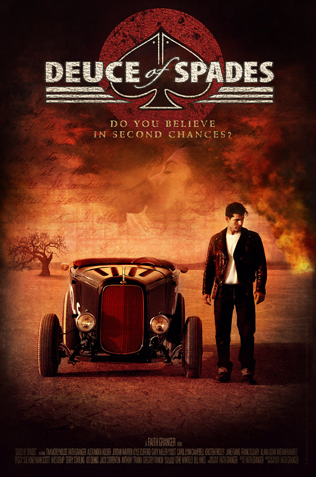
LATEST (AND I THINK AT THIS POINT - FINAL!) FILM POSTER!!!!!!!!!

Please let me know if you approve and any comments you may have. Your input is greatly valued and appreciated.

NOte: This is a MOCK of the final product. Angela is now starting to work on the full size, high res version of this, which will be even more dialed in. We are still toying with title letter color (debating on whether it should be more beige or keep it white, like the deuce's racing numbers). Is the title too large?


I would also like to know if the tag line is readable and if you approve of location. We just couldn't seem to fit it anywhere else on the poster...


I hope you like this new poster version.


FINAL%20poster8.jpg
 
I like it. I liked most of the earlier versions (with the letter as a road, so to speak), but this feels even better. Tagline is readable.

Groetjes,
Jasper
 
A nice look in many ways, but still not enough "quantity contrast" for me (see my previous posts in this thread for details if anyone's curious what I mean by that). So it lacks 'visual dynamics', a key element in almost all great movie posters. FWIW, as a former college graphic design major, who had these kinds of concepts pounded into him day after day...

And the actor's stance still looks awkward to me...

Apologies for my brutal honesty...

No need to apologize :) feedback is what we need here :). I am now OK with body language of JOhnny and like the fact he is looking a bit downwards, as opposed to straight on into the camera. I do agree to some extent about the visual dynamics comment, as I wanted the poster to be as agressive as possible, but we could not find a way to do it. We experimented a lot with having it back lit, but it didn't quite seem to work.

So here's the question, how would you, who was a design major, alter this poster (if it was yours) light wise, to make it more dramatic?
 
Very nice work Faith. Glad to see you're still slugging it out....I'm sure it will all pay off (if it hasn't already).

As for the poster, it's very nice, but is missing some impact. The body language of the main character is very off-putting and staged, but you've said that you're OK with it. However, I would think about a bit of trickery. Not only does he look "posed", but he looks a bit short and uninspiring. Maybe if you could stretch him just a little to make him feel a bit taller and then enlarge him just a small bit over the scale of the car????? May or may not work, but it might be worth a try as you've come this far as it is :)

As for the overall impact of the poster, I do think the tagline is too small for starters, but not by much (as has been mentioned above). Also, when I look at the poster my eyes are drawn to the red and then directly to the brightness of the fire. Maybe that gives some sort of hint as to what can be done with the title to give it more of a punch.

These are just my opinions and an attempt to be constructive in my criticism. I apologize if any of this has been covered, but I have read many or your pages over time, but have not been able to keep up with 116 pages :)

Great work and best of luck,

Jason
 
Hi

My son - also a former graphic design student just had a quick look at the poster. His instincts were that any females glancing at the poster might bypass this - because they only see the guy with the car.

He says that if you are going with the guy's pose then perhaps you should centralise the car - but have him standing directly in front of it. He said that he would also bring the kissing couple down a little and change the opacity so that they are more prominent.

Good luck!
 
Back
Top