Desaturated Picture

Kenneth Lau

Active member
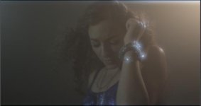
Just did a music video and realized the shot I got was very desaturated. Tried boosting up a little in post but doesn't help that much.

Here is the lighting and camera setup I had.
Was wondering if any of you have experienced similar situation.


Camera

RED Scarlet
Compression rate 12:1
Zeiss CP2 25mm + 1/8 Promist filter


Lighting
650 Lowel light for back light on camera right
LED Backlight on camera left
Another LED light on her face


I actually shot this in someone's room, so because of the tight space, I smoked the room up pretty bad so that the backdrop doesn't look like bedroom's wall.
I have doubt because of the smoke that makes it so desaturated. Or cuz of the compression?

hmm...
 

Attachments

  • screenshot.jpg
    screenshot.jpg
    8.1 KB · Views: 0
I actually shot this in someone's room, so because of the tight space, I smoked the room up pretty bad so that the backdrop doesn't look like bedroom's wall.
I have doubt because of the smoke that makes it so desaturated. Or cuz of the compression?
I'm by no mean a professional, but here's what I think:
It's because the smoke is a volumetric element lit by the light. Similar to flares in the lens: without the flares, you would have a nice contrast, but the flares add some "layer" of luminosity on top of the picture in a way.
Using Levels and Hue/Saturation might help, but I doubt you'll get a clean shot, even processed through color correction.
 
Agreed, there's so much haze that it's going to be difficult. What you could try doing is isolating the skin tones that are lit by that LED and warm them up, but even that's going to be difficult since it's so desaturated. What would probably have helped quite a bit would be to use a tungsten unit for her key. LED's, particularly cheap ones, are known for not being capable of bringing out all the color of an object the way tungsten or daylight can.
 
I'd just bump up the contrast. I had a very similar situation recent - had to shoot in a godawful storeroom that was filthy, beige and disgusting. Blasted a daylight and tungsten balance source at the talent from behind (giving us some funky flairs and separate colours on both sides of the frame) and then underexposure took care of the rest to black out the environment - the end result actually looks pretty cool and classy. It's damn near a miracle. Crunch down your blacks and I think you'll get a very similar image to one I got.
 
Looks awesome. Why not leave it the way it is?

Because shots exist in the context of the project... And I'm not trying to be a condescending smart-ass, just maybe open the discussion up to the fact that a cinematographer's job isn't to create a beautiful image, it's to create a beautiful movie, which sometimes means sacrificing particular details in a given image for the sake of retaining context in the overall project.

Had a dp argue with me once for ages that he hated the shot I picked out because it "doesn't look good from this angle" and I couldn't get across to him that the angle mattered more in CONTEXT of the movie
 
I also like how it looks, but if you want more color in there, here's what I would do: add the usual teal/porange thing (with Colorista free, with MB Mojo, or with a more powerful package). What the shot lacks most is not saturation, but color contrast: the background is the same tone as her. Push the shadows towards blue and the mids/highlights towards skin color and you'll get a more colorful image that doesn't look overly saturated.
 
Agreed, there's so much haze that it's going to be difficult. What you could try doing is isolating the skin tones that are lit by that LED and warm them up, but even that's going to be difficult since it's so desaturated. What would probably have helped quite a bit would be to use a tungsten unit for her key. LED's, particularly cheap ones, are known for not being capable of bringing out all the color of an object the way tungsten or daylight can.


Moseph, a tungsten unit for her key to warm up the skintone is a good idea.
I am still thinking will a haze machine be better than a fog because the fog machine I used was very smoky and have very thick layer of smoke.
By the way, this kind of lighting is what we were originally aiming for.
It is obvious that they fogged the scene as well but maybe they only fogged the area around the light and not have fog close to the artist ?
 

Attachments

  • Screen shot 2014-06-11 at 2.45.40 PM.jpg
    Screen shot 2014-06-11 at 2.45.40 PM.jpg
    11.1 KB · Views: 0
  • Screen shot 2014-06-11 at 2.45.31 PM.jpg
    Screen shot 2014-06-11 at 2.45.31 PM.jpg
    11.7 KB · Views: 0
Moseph, a tungsten unit for her key to warm up the skintone is a good idea.
I am still thinking will a haze machine be better than a fog because the fog machine I used was very smoky and have very thick layer of smoke.
By the way, this kind of lighting is what we were originally aiming for.
It is obvious that they fogged the scene as well but maybe they only fogged the area around the light and not have fog close to the artist ?

If these were the shots you were aiming for... you placed one of your lights in the 'wrong' place. These images have a key next to, or just off the left of the camera, and a 'sharp' light from the distant background, to get the rim effect.

In your shot it looks like your using a reflector to fill, from a large light in the background...
 
If these were the shots you were aiming for... you placed one of your lights in the 'wrong' place. These images have a key next to, or just off the left of the camera, and a 'sharp' light from the distant background, to get the rim effect.

In your shot it looks like your using a reflector to fill, from a large light in the background...

My key light on her face was a pretty weak and soft LED light. My concern in this post is more about the desaturated picture. We are ok if the result is not exactly same as the picture above.
 
I'd just bump up the contrast. I had a very similar situation recent - had to shoot in a godawful storeroom that was filthy, beige and disgusting. Blasted a daylight and tungsten balance source at the talent from behind (giving us some funky flairs and separate colours on both sides of the frame) and then underexposure took care of the rest to black out the environment - the end result actually looks pretty cool and classy. It's damn near a miracle. Crunch down your blacks and I think you'll get a very similar image to one I got.

Cool !

Thanks for sharing your situation
 
I smoked the room up pretty bad so that the backdrop doesn't look like bedroom's wall
you shot yourself in the foot there- you basically washed out the whole image

you probably learned a big important lesson here

decide what look you want ahead of time and then use all available tools at your disposal (from whatever control you have over costume, to set, to camera settings and post) to reach it. And remember that one thing that you do effects the other things you do (again, you washed out/desaturated the image with the smoke!)

but also:

a problem is people try too hard to get a (supposed) "film look" and so they get away from the basics of cinematography and of image-making/design in general:


---- a big set with lots of stuff in it is not your only tool for depth or interest in an image


--dont be afraid of simple backgrounds, a simple background can make for a clean, strong composition


--small rooms arent as bad as people make them out-- you can get depth alot of ways- low camera angle, shooting through foreground objects, etc.


--- study ALL KINDS of movies (more avant-garde/experimental, etc) and ALL KINDS of images (painting, design, photography) and dont think that the only way to make something interesting is to copy hollywood/high budget technique


your unnecessary FEAR of your small simple set did you in


watch this- tons of blank backrounds, but camera angles and composition make it interesting:


http://www.youtube.com/watch?v=CQj_3AY-E1g


THINK and BE CREATIVE
 
thank god for the ignore list. for anyone wondering, turns out you can click a user's profile name, click "view profile" and there's a button to add them to the ignore list.

no idea why i thought that was relevant. hm. well maybe some of you can find a use for it.
 
Back
Top