Commercial Shot on 7D

Hello All,

Here is a commercial I shot for an awesome company out of Toronto called "Hooligans United T-Shirt Firm", I'd love some feedback as this is one of the first "real" commercials I've filmed.

http://www.youtube.com/watch?v=siZuVIpdv7k

Before you say "It's dark" - It was a concious decision, maybe its a tad *too* dark - but I really wanted to convety solitude with an underlying tone of almost..anger for lack of a better term. In any case, it was a creative move that I stand by, but interms of cuts, composition, music, etc - I'd love to hear what you guys have to say.

Cheers,
Josh
 
Conscious decisions can be wrong. Dark is fine. Looking into a bright hard light, and having it dulled is not natural and becomes a distraction.

Now, when I say dark is fine, I mean, I love Godfather and There Will Be Blood. The scene being dark when shooting in a mine shaft or in by fire light is natural. A gray spotlight is not natural. You can keep it dark, but don't make a bright light source gray. It's so unnatural, it looks like an accident and amateurish.
 
Thanks? lol. I do see your point about the colour of the light and your examples of 'good' dark - especially Godfather. Though, I have to say - to say it looks like an accident or amateurish is a stretch in my opinion, while I agree 100% that grey isn't a natural colour I don't see it and think amateur. That said, your comment will likely sit in the back of my head on my next shoot lol. Thanks for the feedback! :)
 
Seriously? That bad? lol. I've re-watched it 6 times now - I see the 'dull colour' argument, would a better choice have been to go with a more natural light tone? If there's a way to make this look better in a broader audiences mind, I'm open to suggestions.
 
If there's a way to make this look better in a broader audiences mind, I'm open to suggestions.

Usually when a DOP shoots "dark" the shot becomes dependent on highlights and edge-lighting to illustrate what is actually happening in the frame. Think of really dark film noire or some of the sports/athletic ads where the lighting is defining the shape of what is being shot without actually lighting it directly. Black is still black and highlights are close to being white.

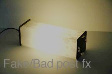
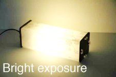
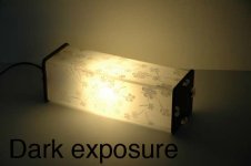
Grey hilights = Underexposed Image by 2+ stops
 
Aaaaaaah...See - That look you mention is more or less what I'm trying to achieve. What you said about blacks being blacks and highlights remaining white pretty much made everything that's been said click. I'm going to go back and see if I can bring it up to where it should be. I really appreciate the feedback, this was the first time I've shot a video like this so I don't mind getting torn down and told what I should avoid doing in the future - even if I like the look I achieved lol, you guys have been at this much longer than I.
 
I do not mind exposing so that everything is dark (from a strictly artistic expression pov, which doesn't always apply to the 'industry' which has standards). It is the fact that you made the lights darker in post that is killing it. An underexposed light is not flat gray with no detail. Don't do that to light bulbs in post.

badFX.jpgbrightexposure.jpgexposure.jpg
 
Last edited:
The footage is too dark. If this is for a commercial for television , They would not accept the delivered product because of the exposure for one and also the length of your footage. They are usually pretty strict on that but I am assuming this is for a webmercial.
Good Luck and I am sure you will figure it out. Take Care
 
Another vote for way to dark. I just took a quick peek and my first reaction was the footage looks like a mistake.
 
I'm glad I'm open to constructive critisism otherwise I think I'd be putting my gear up for sale right now lol - I'm going to make adjustments to the footage this evening to see what difference I can make based on what everyones said - which again, I really appreciate and I can definately say I'll think twice next time I say - "I think this will look cool". By desaturating it as much as I did, pretty much killed the light, I see that now.

I honestly don't know why I never really thought about how it looks under exposed - its funny, I've been a photographer for years and if any of those shots we're stills, I'd never post them looking like that - Why I didn't apply that logic to video is beyond me. The diagram really put it into persepective for me, thank you. As much as I hate to read that my video is below professional standard, I'd rather find out now from you guys and fix it than remain in the dark over the issues....pun intended. lol
 
I've been a photographer for years and if any of those shots we're stills, I'd never post them looking like that

I started out as a professional studio photographer ( medium format / view camera ) for 10 years, before I ever touched video. Much of what works for photography can be applied to video work.

I strongly recommend using your still photo camera to pre-visualize your video shoots, where you can create a photo-storyboard that will help you focus on the framing and style of what you are going to shoot. If the shot doesn't work as a still photo, it will NEVER work as a video clip.
 
Hey dude, don't let these guys get you down. I definitely saw what you were going for with the blacks, and how I do agree that there were some issues with underexposure, I can't say that their "mistakes" were as bad as they are bringing them out to be. The only thing I noticed with your footage (I watched it at full res, and I'm assuming you compressed this for YouTube), is that the colors (what few there were), were pixelated and very noisy. I think that's where the underexposure comes into play. If you were shooting this on RED maybe you would be able to get away with it the way you shot it, but at full screen it looks grainy and pixelated. Nice work though. Stylistically I think it's great, however fine tuning your craft is why places like dvxuser exist.

Cheers
 
You can keep things dark, but pockets of light need to be somewhere. In no film, video, lighting class etc. have I ever seen a whole scene dar and it work, it just does not look pleasant to the eye. It needs some back lighting or rim lighting to sell the shot.
 
Back
Top