Better LUT for good skin tones - for Odyssey 7Q+ & FS700 ?

Thanks Jonathan. I have only applied your newest LUTs to some footage I shot recently using the -2 CD LUT, so it has not been an exhaustive test of different lighting situations, but so far it is looking good. The blues definitely looked more blue using your original color-only, low-contrast LUTs, but the newest -2 LUT you provided is nice in that it maintains the contrast of the CD LUT but with improved colors. From my minimal testing the blues still look a tad turquoise/teal, but I'm going to do some tests now to see how it looks in a different lighting scenario with some known blue objects. Thanks for all the hard work. This could really improve the possibilities of this camera setup.

This addresses the need that I'd hoped CD would address, which is to provide a LUT that is easily supplied to clients with footage without having to explain that Hue vs Hue shifts are going to be needed and "don't worry, this is probably going to look bad when you first apply the LUT but I promise it's a good starting point as long as you have the budget for a knowledgeable and talented colorist." It's one thing to learn the limitations of the setup and tweak my own footage if my company is hired to also do the editing, but to be useful in most professional environments for many shooters, the 7Q/7Q+ need a LUT that looks good immediately without having to explain how to deal with bad colors to our clients. Making gamma/contrast corrections is expected using this type of workflow, but colors should at least be accurate and not require heavy correction. That's not very professional.

Anyway, again I send out a heartfelt thank you to CD for making this amazing product and allowing us to create these custom LUTs ourselves to solve these issues. The 7Q has truly given a new life to my FS700. It would have been nice (and I think it should be expected) for the included 709A LUTs to be color-accurate, but I am happy that we can solve these issues ourselves.
 
What an awesome idea you had about just correcting the colours of the CD SLOG2 LUTS.
Exactly. That is what I was suggesting in post #10. Using Resolve's colour match is a useful tool for doing this, but you can go further and tweak the results using the hue curves to desaturate the cyans, and push the hue back towards blue, as required.

It would have been nice (and I think it should be expected) for the included 709A LUTs to be color-accurate
Convergent Design made a deliberate decision to only supply manufacturers' LUTs. As I mentioned in post #10, the S-Log2 LUT is colour accurate on material from the F55 and F65, for which it was designed. It is not colour accurate for the FS700, because that does not properly match the S-Gamut colour space of those two cameras.
 
Last edited:
Thank you Jon. I look forward to seeing if you can come up with some better LUT. I'm very new to using Resolve, so this is all experimenting on my part.

Thanks Nick, sorry hadn't realised that was also your suggestion earlier. But on the point you make about CD deciding not to provide a colour accurate LUT for the FS700 I also find that odd and unfortunate. The Odyssey has been heavily marketed towards the FS700 amongst other cameras, and if CD are fully aware of this issue then why not address it? I for one would even pay for a near perfect FS700 SLog2 designed LUT for the Odyssey. I'm not an expert at grading so this would be very helpful.
 
But on the point you make about CD deciding not to provide a colour accurate LUT for the FS700 I also find that odd and unfortunate.
CD did not "decide not to provide a LUT for the FS700". They decided to only provide LUTs derived from official manufacturers' LUTs. Sony do not provide a LUT for the FS700, so CD cannot provide an official LUT for it. The LUTs Sony published here are the only official Sony LUTs I am aware of for S-Log2.

I would like to emphasise that no camera is completely "colour accurate", and nor is any film stock. The colour reproduction of any system is always a compromise based on what the manufacturer of that system considers to be the priority, and accuracy in one part of the colour spectrum will always come at the expense of inaccuracy in another part. An image on a monitor will never be a "window" onto the scene the camera was pointed at it. The intent is normally to create an image which evokes the photographed scene in the mind of the viewer, but there will always be creative choices made in terms of how to do that.

If Sony provided details of what processing is done to the image to create the various in-camera presets, it might be possible to create LUTs to replicate those looks from the S-Log2. But Sony do not provide this information.
 
Thanks Jonathan for sharing your LUTs, I just got a OneShot, so I ran some quick tests. The materials that came with it said the printing is at 50% saturation, which is why the colors don't hit the boxes on the vectroscope. What you're looking for is if the colors are pointing in the right direction. As you can see from the attached images, with the CD supplied LUT Green Blue and Magenta look significantly off. Green is showing up closer to Cyan than Green. Jonathan's LUT fixes the colors somewhat, with Green and Magenta looking much better.

For reference I also tested some other cameras I had around, a Sony a6000, a GoPro Hero 4 Black, and an iPhone 5s. (video and stills with all of them.) All were more accurate than the FS700 + 7Q, their colors point pretty much straight at the boxes on the vectroscope. I'm no colorist (Never so much as opened Resolve) so there may be issues with how I tested, but this OneShot seems to back up what I've been seeing with my eye--many other cameras are more color accurate that the FS700+7Q. Hopefully this helps Jonathan or others develop better LUTs. I really do love so much about my Odyssey and the picture I get with it, but I haven't always loved the colors.

The waveform and vectroscope are from Premiere CC. The OneShot was lit with an Arri 650. WB set to 3200.
CDSuppliedLUT.jpgNewJWLUT.jpg
 
I tested pythonman's newest LUTs on a bunch of my older footage and both the color and contrast look fantastic. Thanks for taking the time to make these. And thanks for the clarification Nick.
 
Vinnie, that's great, thanks for sharing the scopes.

Jon, glad it's looking good on your work, good to hear!

I still think it needs more work. The reds are still not perfect and the blues also. But much better than the original slog2 luts I agree. I tried doing a hue vs hue in Resolve on both of these colours but it started to get messed up so I left it purely with the Resolve auto colour match adjustment on the colour card. I'm sure there are experienced people out there, or between us, that can refine it further.

Nick, I meant no offence with my words, merely questioning the reasoning behind the provided luts. Thanks for the explanation.
 
Roger Deakins for example uses the same LUT or a slight variation of it for most of his recent films while shooting.
"the LUT that E Film developed for me is the most 'pleasing' in terms of colour and tonal values. For 'Skyfall' we added a little saturation and for 'Prisoners' we took away saturation and added a little contrast. Very insignificant changes in each case as I like to start my DI with what I consider a 'normal' image that reflects the way I am lighting."

So it's not really about a grade or a look so much, but about representing a "normal" image on-set. I feel the current LUT's fall short here.

Roger shoots digitally on the Alexa. He's created a LUT that suits his style that works on set. I'd suggest creating your own from scratch. Easy to do these days.
 
Thanks for the LUTs!

So I've been messing around in resolve and I tried some stuff.

I set my cinemaDNG settings to BMD Film Colorspace and BMD Film Gamma.
Then I use Nick's BMFilmtoS-Log2 LUT from C-D on the media page.
Then in the color page I use the Resolve IO VFX LUT S-log2toLinear LUT.
Then u gotta really bring down the gain and mess around with the levels.

But I'm getting what appear to be some nice skin tones doing this. I'm not sure if there is any logic to this other than getting the signal back to linear which is how it comes in raw but give it a try. You'd think u could just use 709toLinear or BMDtoLinear LUTs but you get weird colors doing this.
 
Hmmmmm, I guess if you were just working with Raw files you could just set your colorspace to linear in Resolve instead of going through all those LUTs...
 
Jon

Just caught up on this thread.

Have you considered using a gregtag card.. more colours.

also you could import a tiff of the card into resolve and then match your video image to the tiff

S
 
Here is my newest LUT for FS700/Odyssey. I would love some feedback. I tested this last night against a friends F5 in Hypergamma 3 and the results seemed very comparable in the monitor, both in terms of color, contrast, and dynamic range.

https://www.dropbox.com/s/6te941cm0dx2u5z/Betz_v14_FS7Q0-2.cube?dl=0
(I have never posted a link to a file in a forum before so please let me know if there is a better way to get this file out there)

This is an exposure compensation (-2 stops) and color correction LUT. I ended up straying from the gamma/contrast adjustment in CD's SL2709A LUTs since these were direct ports of Sony's F5/F55 LUTs and are not specifically designed for the color coming out of the FS700's sensor in SLog-2.

Some notes on how I generated this LUT:

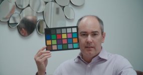
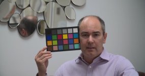
- created using pythonman's tiff frame grab of an interview setup that includes the Spydercheckr 24 color card
- first node translates the exposure down by 2 stops
- second node corrects color and gamma using Resolve's color checker functionality on the Spydercheckr portion of pythonman's frame (I set input gamma to Slog-2 and target gamma and color space to 709). I think Resolve did a great job of generating a pleasing contrast curve for the Slog-2 and an initial improvement on the color.
- third node was for a manual Hue vs Hue (and a small amount of Hue vs Saturation) correction to adjust colors using the targets on the vectorscope. I pulled a bunch of images of the Spydercheckr card from Google Images and tweaked the colors to match what seemed to be the target marks on the vectorscope for that color checker (I know this is not the most scientific method but it seems to have worked pretty well, and again I would love suggestions on how to improve). The original automated correction in the second node helped the colors but there were still issues (with red/blue hues, for example) which needed to be addressed with a bit of manual grading.
- fourth node: saturation roll-off using the Saturation vs Luma tool in Resolve, starting at 100% saturation at 75% luma and curving down to zero saturation at 100% luma. This was to protect against "video" type highlight fall-off with super-saturated colors in over-exposed areas. I find this to be specifically useful especially using an exposure compensation LUT.
- the LUT crushes the blacks a bit too much, which is something I may adjust in a future revision, but this information is all still there in the original Slog-2 ProRes file and can be brought back in post. The LUT does a great job of minimizing noise by pushing down the shadows, and then you can decide how much to bring back later in post. So if you protect the highlights you have a bit of flexibility in bringing back the shadows (but because this is an ETTR LUT, if you lose highlights they are gone, so there is no highlight protection to bring back in post).
- because of the noise reduction consequence of using an exposure compensation my setup greatly exceeded the F5's (in a very rudimentary test) usability in high ISO's, creating a usable image at high ISO's without a lot of noise as long as the scene was fairly low contrast. Of course I had to push my ISO higher to get the same exposure because my LUT takes away 2 stops, but I could push the ISO farther with minimal noise, allowing the FS700/Odyssey setup to achieve a brighter usable image than the F5 for a given low-light scene even though I was at a far higher ISO.

I would love to know what everyone thinks, including suggestions on how to improve.

Does anyone have specific recommendations for color charts? I am about to purchase one of these Spydercheckr cards myself after my experiences using pythonman's test frame with Resolve, and am wondering if I should instead opt for another manufacturer's card (like an X-Rite which is also compatible with Resolve's auto color checker functionality). Any insights? If there is one thing that this process has taught me (other than that I should have done this a lot sooner), is that I should always flash a color chart in front of all of my interviews and at the start of most if not all scenes. Even with a better LUT it's nice to have the reference to finely tune colors in post, especially when matching cameras.
 
Last edited:
I forgot to mention that I also had a final node in Resolve for the Betz_v14_FS7Q0-2 LUT in which I adjusted the contrast of the final image to more closely resemble the range of the CD SL2709A-2 LUT. I adjusted the contrast and gamma curve to protect highlights a bit and generally decrease the contrast from what Resolve produced in the auto color checker node (which targeted a 709 gamma curve). Although the range of levels is similar, the distribution of contrast is a bit different in my LUT, and there is a bit more overall color saturation. My goal was to create a LUT that looks good without requiring further tweaks while protecting the camera's dynamic range as much as possible, not over oversaturating the colors and leaving enough room for a creative grade or contrast tweaking in post.

I made the contrast in the Betz_v14_FS7Q0-2 LUT match CD's -2 translation of Sony's LUT so that I can apply my LUT to footage I previously shot using the stock -2 LUT, and so that I can always go back to CD's previous LUT (or anyone else's LUT using this -2 standard) if needed for comparison or if my new LUT doesn't work for a given lighting situation.
 
Jon. Thank you for taking the time to making this LUT.

My very unscientific findings so far is that - even at default settings - the contrast and saturation is a bit on the heavy/warm side compared to Jonathan Warner (pythonman's) LUTs. I hope to find time to do more tests with a color chart over the weekend.

I forgot to mention that I also had a final node in Resolve for the Betz_v14_FS7Q0-2 LUT in which I adjusted the contrast of the final image to more closely resemble the range of the CD SL2709A-2 LUT. I adjusted the contrast and gamma curve to protect highlights a bit and generally decrease the contrast from what Resolve produced in the auto color checker node (which targeted a 709 gamma curve). Although the range of levels is similar, the distribution of contrast is a bit different in my LUT, and there is a bit more overall color saturation. My goal was to create a LUT that looks good without requiring further tweaks while protecting the camera's dynamic range as much as possible, not over oversaturating the colors and leaving enough room for a creative grade or contrast tweaking in post.

I made the contrast in the Betz_v14_FS7Q0-2 LUT match CD's -2 translation of Sony's LUT so that I can apply my LUT to footage I previously shot using the stock -2 LUT, and so that I can always go back to CD's previous LUT (or anyone else's LUT using this -2 standard) if needed for comparison or if my new LUT doesn't work for a given lighting situation.
 
A quick reference comparison of the LUTs in this thread so far. Keep in mind that these are JPEGs from Premiere, so are a tad washed out and desaturated.

No LUT
1 No LUT.jpg

CD SONY709A-2 LUT
2 CD 709A-2 LUT.jpg

JW-2 LUT
3 JW-2 LUT.jpg

BETZ-2 v14 LUT
4 BETZ-2.jpg
 
Last edited:
Thanks for these LUTs. So nice to not see that weird aqua thing creeping in from CD's LUTs.
I'm shooting a crime action drama this weekend and JW's LUT with it's slightly desaturated look is perfect for on-set monitoring.
I like the contrast and saturation in Jon's too. Both look miles better!

Cheers guys :)
 
Jon - thanks so much for continuing the progress to a more accurate LUT, even if you have posted pictures of my scary face!!

I've just downloaded and experimented using your LUT and I have to say you have got the colours more accurate than my LUTs. This is based on me judging the image on the Odyssey by eye when pointing the camera at my Datacolor SypderChekr24 card, using your LUT, in comparison to looking at the actual card by my own eye. In particular my LUTs hadn't quite accurately got the colour of the bottom-right blue (5 across, 3 down, on the test image of me you posted above), whereas with your LUT it looks pretty spot-on.

The only thing I'd say is I think you have the exposure just a tad too dark (in comparison to the equivalent exposure setting of the CD SONY709A-2 LUT) not much, just a little. Also perhaps a little too much saturation, again not much, but particularly the yellow looks a little over saturated by my eye. But overall I'd say it's very good.

Thanks to Kyron and seanmc for trying out my LUTs - appreciate it.

Sam - thanks for the suggestion. I did initially look at all the colour cards available to purchase, including the X-Rite cards, but many are a lot more expensive than the Datacolor SpyderChekr24 (which is currently £34 on Amazon), and as Resolve had its infomation built-in I thought I'd try it.

By the way you can download the exact specs (RGB and Lab) of the colour patches on the Datacolor SpyderChekr24 card here (it's actually only the colours in columns E-H, as the other columns are for the extra colours in the bigger SpyderCheckr card):

http://cdn.spyder.datacolor.eu/wp-content/uploads/2014/08/SpyderCheckr-Color-Data.pdf
 
Last edited:
Back
Top