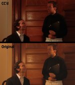
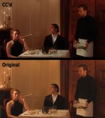
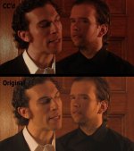
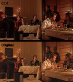
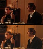
Hey everyone. Just had a chance to shoot a little short the other day with my A1 for a friend. It was a small production, involving converting the friend's parent's kitchen into a restaurant. For light, I had a Lowel kit; 2 Omnis, a Tota (didn't really get used much), and 1 Pro light.
The shots included cc'd and original versions, since the original versions look kind of nasty on their own. Tried shooting with CC in mind, which I don't usually do (I usually try to get it right in camera) -- "exposing to the right" and shooting with the camera's sharpness turned substantially down to see what that looked like. From these stills, I feel like I might prefer sharpening in post to what I usually get from the camera setting; I'll have to look into it.
They're not full res, unfortunately, but I think they're high enough to get the idea. I could try to get some footage up if anyone is interested.