OTHER: WEBSERIES: Pirate Birthday Party

Doc Peter

Member
Hello -- I use these forums a lot and want to share some of my process as a way of giving back. I like that the sticky at the top of this thread recommends starting with the poster - because that's really the first visual an audience will get of the movie, right? So here's my poster process: My webseries has pirate themes throughout so I wanted the poster to reference that -- (i'm not a designer, I just threw stuff into photoshop as a reference for my wife, who is a designer.) This pirate guy toy is in the movie and I wanted him to be central somehow...


but it's not an action movie, it's talky and contemporary and because I didn't want to mislead the viewer, I also wanted glimpses of the movie in the poster... So I added screenshots from the movie of the main actors in moments that seemed the most dramatic or interesting...


But it's a family comedy and that wasn't coming through. There needed to be a lighter tone to it. My wife came back with this:


Which you can tell was designed by someone who knows what they're doing...It's definitely friendlier, and says family really well. I really like this one now but at the time, I was afraid that it was too... Disney, I guess. And would imply that the movie was plucky and sanitized and wholesome -- which it isn't, there are definitely some rough edges to it...


so we did a final version that looks a lot like this one (sorry this one is a mock up -- I can't find the file with the final on it...) Instead of using a still from the movie of the pirate toy, I reshot it in a studio situation by candlelight.
 
Hysterical!

I really like:
The audio.
The edit style...but some passages whipped by too quickly.
The deadpan dialog.

I think you're on to something.
 
Thank you -- I really am just a hack and a hobby-ist as a filmmaker - I am so impressed by the tech skills of most of you on this board, and that is not my strength as a filmmaker. You can see in the trailer that I can barely keep things in focus and the color is all over the place. But I appreciate that you noticed the audio. I had my start in radio plays and love a textured sound design. I used cheap microphones and zoom recorders but tried to mic each actor separately where I could for the best possible sound.
 
Here's the first chapter. Everything in this one is shot with a single GH2 (not hacked) and audio is recorded sometimes with a RODE videopro shotgun on the top of the camera and sometimes with really cheap pearstone lavs connected to a zoom recorder. (some of the later episodes have 2 cameras.) Thanks for taking a look -- let me know what you think!

 
PRODUCTION NOTE In the kitchen scene I hope you won't notice the clocks. I should have pulled the batteries out so the time stayed the same but didn't and when I was cutting it would go from 7:15 to 7:00 to 7:20. Normally I just let those mistakes live there -- if someone is distracted by minor continuity issues then the problem is the story -- but in this case the clocks were so prominent in the background, I couldn't let it go. My fix for it was clumsy and imperfect - I made a clock face layer to keep all the shots consistent and then had to manually motion track them around to match the hand held. When you examine it, it's pretty terrible -- once you know to look for it, you can't un-see it -- but no one has mentioned it so maybe it's just passable enough to get by... The lesson is - avoid clocks. I'm sure there's a smoother way in aftereffects but I don't know AE...
 
I cut my own head off at the top a lot -- not on purpose, usually it because I couldn't grab a camera operator in that moment. I would set up a shot, turn the camera on and then move in front to act in it -- badly estimating how tall I am. A few shots were unusable because of this (glad I checked and we could reshoot in the moment) most of them were close enough. We usually only did 2-3 takes.
There was a bank of recessed can lights over the sink and I put in daylight balanced bulbs to make the window feel like the only light source. I like the natural look -- some shots work better than others. Is any of this interesting?
 
I would appreciate feedback on these episodes, if anyone has anything to say -- specifically observations about the way it was shot or moments that particularly stand out (for good or bad) -- or ways that it could have been done better. There is a wealth of critical knowledge here and I would benefit from your perspective. Thanks. -- Peter
 
I just watched a couple minutes of episode 2. Strictly on visuals:

-Try fitting your practical lights with 5500k CFL bulbs. That way when you white balance, you don't get that blue tint from the windows.
-It looks like you're using a high shutter speed. Shutter speed should be 2x your frame rate, i.e. 1/60 if you're shooting 30p, unless you want it to look like Saving Private Ryan.
-Why is that clock face wobbling around at 2:37? If you overlaid a clock face for time continuity, you should use motion tracking as well. Better yet, take the battery out of the clock so you don't have to worry about it. {EDIT: I see you addressed this.}
-There are some small continuity glitches...e.g. if she has her hand near her mouth at the end of one cut, it should still be there at the beginning of the next cut. Small timing adjustments can fix this.
-Jump cuts. Generally it's less palatable to cut from shot to shot without a shift in angle. One, because it's jarring to the viewer, and two, because the angle shift helps hide continuity issues.

Good luck, hope this is helpful.
 
Last edited:
Thank you Mr. McDanger -- for most of the shoot I did put in 5000K CFL and they looked good to me -- though not for the bit you saw, which happened to be the first day of shooting...
- I shot 24p and left the shutter at 1/50 -- I'm not sure where the Saving Private Ryan part is you mention. (I'm not saying it's not there, just surprised I don't know what you're talking about...)
- Yes, the clocks. The continuity shift is worse than the floating clock faces but both are bad. I can only play the "homemade" card so many times.
- Jump cuts at the same angle? Do you mean at the end of the kitchen scene when it goes from close-ish to wide? That didn't occur to me to be a jump cut, but I see how changing the angle would have helped. Of course none of this was storyboarded, it was all done on the fly. (Never again) But that is very interesting, I'll keep that in mind next time. THANK YOU!!
 
- I shot 24p and left the shutter at 1/50 -- I'm not sure where the Saving Private Ryan part is you mention. (I'm not saying it's not there, just surprised I don't know what you're talking about...)
Maybe it's some other element of compression or playback, but the motion in the shot at 1:00, for example, looks to my eye too crisp for 1/50th. Maybe the kid just has lightning-quick moves; I remember those days.
 
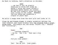
I'm pretty happy with the way this section turned out -- but I wanted to draw attention to how it was scripted and what it eventually became. On the page it was a good idea, I thought, to have a plant guide book appear to help with the reveal what the plant was. But I could never get it right, it was too hard to see on the screen what was happening. The eye had to move around too much to take in all the new visual information -- so the ornamentation of a plant guide book -- though graphically appealing -- just confused the issue and ruined the joke. After a couple of days of playing with different versions of typefaces, and fake book pages, I kept having to go simpler and simpler with it -- finally isolating the leaf from a still, blurring out the background at the sound of a cello sting, and adding big red letters to make it perfectly clear. Simpler is always better. When will I learn this?
 
For the claymation I used an old picture frame as a glass table to animate on, and put greeenscreen paper on the ground below it. Of course it was a little tricky lighting the clay and not reflecting on the glass -- similarly having enough separation between the green and the glass for the effect to work without reflections or spill... In the story it is the claymation of a highschool kid so I didn't need it to be Aardman quality. I'll try to find the picture I took of the set-up...
 
Also there are a few places where I used audio of different types of birds for different moods. When the teacher is around, because I wanted to depict her as having a sinister-ish quality (or at least be a not-soothing presence) I use the squawking sound of alarming bluejays. It starts around 9:25 in chapter 5.. It's subtle but effective, I think. Later on I use it again and it's really noticeable. Also there are these really beautiful woodthrush songs that (in later chapters) I lay under scenes where I'm trying to create a calmness and serenity.
 
Back
Top