War Horse=Bad Cinematography

dvbrother

Well-known member
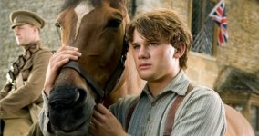
I got to see a sneak preview of Steven Spielberg's "War Horse" last night and was stunned by the approach to much of the cinematography. The film's trailer, which you can see online, has a parade of stunning images, so I expected to be visually dazzled. But the first act of the film, set on a farm in Ireland, is bizarrely overlit. Let me back up to say that I've been a working cinematographer for about ten years now, and a Spielberg fan since the 1970s.
I wanted to bring up the topic of the film's lighting in this thread because this is really the first time I've ever been completely taken out of a movie because of its phony, unmotivated lighting. I have nothing against unrealistic, unmotivated light, but that approach needs to be organic to the story, and in the case of "War Horse", I just don't get it. In every exterior scene in the film's first act, there seem to be two suns. There's the real sun, and then an ever-present hard kicker light for every close-up. Or the entire scene will be overcast, and yet there's a warm hard keylight from eye-level hitting the actor just perfectly. And the direction of the keylight changes in every shot, making sure there's always a perfect off-side key, plenty of fill, and a nice kicker. This approach makes for great images in the trailer, but when you're watching the film, it's distracting as hell!
Contrast this with Robert Richardson's lighting in "Hugo", which I thought was wonderful. It's just as artificial, but somehow it complements the story. The characters in "Hugo" are in a constant state of beautiful backlight with a low frontal fill bounced upward into their faces. On reverse shots, the backs of the actors (now facing the camera) are magically in the same lighting, as if the keylight flipped 180 degrees. But it looks beautiful, and it doesn't seem distracting for some reason. The cinematographer in me noticed it as I watched the film, but I just shrugged, smiled and kept on admiring and loving the movie.
The lighting in "War Horse", however, just puzzled me, and as I began losing interest in the film's story (hint: I didn't like it), I began to get angry at the approach to the film's lighting. As more people get to see the film, I'd be interested to hear other people's opinions of the film's cinematography.
warhorse.jpg
 
You said the first half of the film had the lighting problem, but what about the second half? Was it any better? Did it become more natural?
 
It became somewhat more natural by necessity as it moves into World War I. Much more of the film takes place in the woods or on overcast battlefields. But even then, there are moments which look too slick and postcard perfect. The film's last act returns to the unrealistic lighting, but this time more actively recalls imagery from films of the 1930's to 1950's. There's a strong John Ford vibe and a "Gone With The Wind" vibe in this movie. The problem is that this is not a "movie about movies". It's not a film that really needs to tip its hat to films of yore. So the stylized lighting that worked in 1939 feels strangely wrong for a film made in 2011.
 
Having not seen the film, I'm somewhat talking blindly, but could it be the desire to contrast and almost nostalgic/fairy tale feeling with the more realistic lighter of a darker period?
 
That's probably how Spielberg and Janusz Kaminski would rationalize it. But the entire screenplay is nostaglic/melodramatic/corny. Our main character is ostensibly a horse with preternatural human emotions and morals. And just as much conflict and antagonism happens in the first act, so I can't really say the lighting changes because the mood darkens. There's just more peril for the horse when he goes to war. I think it was a choice to emulate films of the past, and perhaps it'll work for some, but there are lighting conventions you can't get away with anymore unless you're doing parody or an outright homage. But "War Horse" is supposed to be a heartwarming drama. I will say I think the artificiality of the movie also extends to the contrived sequences, bland characterizations, and overt schmaltz. The film will likely get glowing reviews, but I think it's the worst Spielberg film since "Amistad".
 
Yeah, I guess just listen more closely to yourself. You recognized the same artificial lighting in Hugo. It happens all the time. "Two suns" is kind of an inside joke with DPs but remember, the average audience member won't know about that and they'll just appreciate the striking imagery even if it doesn't really make sense. This falls under artistic license. It applies to the plot, direction, the edit and cinematography. Regarding Spielberg, schmaltz truly applies.
 
I haven't seen it, but I'd agree I wonder how many people who aren't weirdos like us (who can't watch films without thinking about technical things we are seeing) would notice it.
 
I did recognize the same artificial lighting in Hugo, but it didn't bother me. In fact, I filed it away in my mind as something I'd like to include in the films I shoot. You are correct in that the average viewer won't consciously notice the artificial, unmotivated lighting, but they may think "wow, this doesn't seem to look like real life at all". Or "there's something kinda weird about how this movie looks". I could be wrong. This conversation will best be served when you've seen the movie. I've jumped the gun in posting this thread. When you see just HOW artificial the lighting looks...the degree of artifice compared to previous Spielberg films and other films out there, then a more fruitful discussion about lighting can follow.
 
Kaminski (the DP) has done it all, so most likely the cinematography came from a very conscious choice. He knew the "right" way to do it but didn't stop at just proving "proper" solutions but asked himself if he can take those ideas further in potentially uncharted territory and when you make that bold move you start going into the realm of experimentation which as you probably know often fails. But instead of condemning it we should applaud it as it's way more bold move than going the "proper" route. Moreover, it's the experimentation that pushes the boundaries of the medium and thus expands our language.

(BTW, above is said out of respect for his constant search for new rather then on seeing the film as i have no interest in Hollywood fare)

Kaminski is normally excellent. And certainly, reactions to art are subjective, so I admit my opinion is just that...an opinion. But as you suggested, going into the realm of experimentation often fails. And I do think he failed. At least in the approach to the first 30 minutes of the movie. And I'm not so sure I would applaud it as a "bold move" as you suggest. I think it was a simplistic, bone-headed idea to mimic the look of 1950's films. The approach is too overt. But again, so is the whole film. It's interesting that you can applaud Kaminski for "seeking out the new" but then have no interest in actually seeing the movie. I don't think Kaminski would see that as a compliment. :-)
 
No matter how great the DP the film is a work of the director - and here it's a very boring director we are dealing with. Even though i can appreciate the DP's body of work, it can't be seen in the vacum taken out of context of the film (as it's not meant to).

Also the preference for experimentation over properness or vice versa is very personal issues. For you it seems you would be happier with proper good looking lighting/shots, for me the experimentation is more important.
 
Last edited:
No matter how great the DP the film is a work of the director - and here it's a very boring director we are dealing with. Even though i can appreciate the DP's body of work, it can't be seen in the vacum taken out of context of the film (as it's not meant to).

Also the preference for experimentation over properness or vice versa is very personal issues. For you it seems you would be happier with proper good looking lighting/shots, for me the experimentation is more important.

Just got back from a screening of it, and while there were a few shots that I felt were very distracting, I loved the cinematography overall.
 
Even though i can appreciate the DP's body of work, it can't be seen in the vacum taken out of context of the film (as it's not meant to).

For you it seems you would be happier with proper good looking lighting/shots, for me the experimentation is more important.

I would not be happier with good looking shots. My complaint is that the shots were TOO good-looking. They were not appropriate. I would be happier with lighting that was appropriate. Regarding experimentation's priority in cinematography, we have a philosophical difference of opinion. That is good. These are interesting discussions. My opinion is that the cinematography should first and foremost help tell the story...if it's a traditional narrative, as basically all Hollywood films are. Experimentation that pays no attention to the needs of the film's story is arrogant on the part of the DP and is bound to compromise the quality of the movie. There are exceptions to this, usually when the screenplay is already bad and therefore visual experimentation provides the film's only real pleasure. But I feel to give experimentation priority over serving the story is ultimately irresponsible on the part of the DP.
 
I think the middle of the movie, everything that took place in World War I, basically looked fine. The first 30 minutes and the final scenes in Ireland I really thought were wrong-headed in their approach. Not to say they weren't beautiful. Just disjointed and not the best way to visually present the story. Ironically, the best cinematography is during the middle, which I felt to be the most boring portion of the movie. I almost fell asleep.
 
Patryk,

For what it's worth, I just checked out some of your work on your website. It's very, very good. Your talent definitely gives your opinion credibility. In fact, it probably trumps my opinion. When "War Horse" comes out, I would love to get your take on the lighting in the first 30 minutes if you ever decide to see it.
 
No matter how great the DP the film is a work of the director - and here it's a very boring director we are dealing with.

Spielberg? Boring?

Were "Saving Private Ryan" and "Schindler's List" boring? "Munich" "Jaws" "Indiana Jones" Patryk you should re-phrase that comment lol.
 
Cliched, predictable, sentimenta,l and intermittently entertaining. Always a little wink and nod to make you feel like you're in on something. Spielberg wallows in Hollywoodana. Compare with LA Confidential, Green Zone, or Memento, two traditional narratives and one not so much, all superior to any Spielberg film.
 
Well....there's a good reason why many folks flock to see his films. Those reasons might not be the same for some of you. But he's anything but boring. I have not seen this movie as yet but I do expect to be entertained based on the fact that I think he's a great story teller..
 
Back
Top