

ahalpert
Major Contributor
Ah. Just from that menu item I can see their new menus are more intuitive...
The really nice thing about the menus (aside from the fact that all the photo menu options are absent in video mode) -
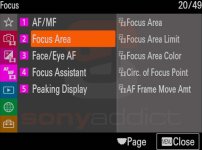
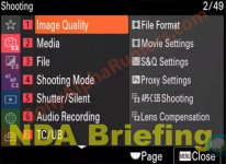
The starting menu orientation is a list of icons on the left (representing image quality, exposure settings, autofocus settings...), a list of categories within each section in the middle, and then on the right a list of parameters within each of those categories. So you're looking at 3 levels of menu options at a time instead of 2.
Comparing it to the GH5 menu now, I see that the GH5 options are sprawled out on a longer list. The A7SIII has that additional layer of sub categorization. And you peek inside it without clicking through.
It's a little thing, but the main reason I've had such an easy time navigating a menu that's new to me.
Last edited:


