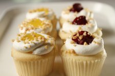
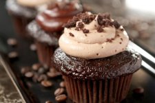
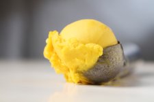
OTHER: (photoshoot) food photography

This is one of my first photoshoots. I've done almost 200 projects in motion but this is one of the first times i have to deal with still images (which definitely changes your process of thinking about lighting framing etc).


Here are the results:
1.jpg

2.jpg

16.jpg

15.jpg

14.jpg

13.jpg

3.jpg

4.jpg

5.jpg

6.jpg

7.jpg

8.jpg

9.jpg

10.jpg

11.jpg

12.jpg

17.jpg
 
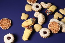
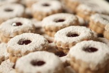
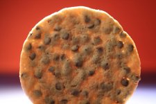
please remove the very first cookie :/ I read your description bout how "this is my first. . ." and when seeing the cookie i was like hmm :/ but then i saw the other pictures and was like "O_o this really looks great!" Your other pictures look like you have been doin this for a long time! But that first cookie? Dont know what it is, cant put a finger on it but it just doesnt fit with the rest :/
The rest? DAMN U i feel hungry now. . . really makes the food looks even more delicious!
keep up the good work!
 
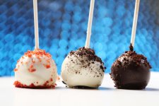
personally those primary colours backgrounds - 1985 burger king - yuk - especially blue - blue tells you poison - when did you last eat blue food?

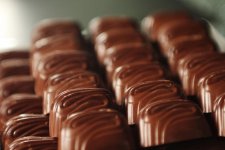
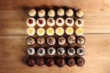
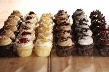
The brown and the cream ones near the bottom are so much nicer
S
 
please remove the very first cookie :/ I read your description bout how "this is my first. . ." and when seeing the cookie i was like hmm :/ but then i saw the other pictures and was like "O_o this really looks great!" Your other pictures look like you have been doin this for a long time! But that first cookie? Dont know what it is, cant put a finger on it but it just doesnt fit with the rest :/
The rest? DAMN U i feel hungry now. . . really makes the food looks even more delicious!
keep up the good work!

That's the reason why this is the first shot! Cause the rest just looks good.
 
personally those primary colours backgrounds - 1985 burger king - yuk - especially blue - blue tells you poison - when did you last eat blue food?

The brown and the cream ones near the bottom are so much nicer
S

Haven't watched BK commercials in 1985 so i don't have this connotation.

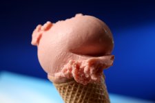
As for the blue - i think you are projecting something cause at least 1/4 of the food ref images i put together for this shoot has blue as its bg.
 
Yes you are right - you know all about food photography on your first food shoot - whats the point of posting if you dont want to discuss you work?

Id love to see some of those reference images BTW

"blue is an appetite suppressant" for example http://www.colormatters.com/color-and-the-body/color-and-appetite-matters

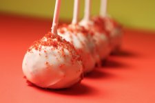
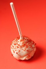
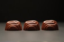
As for the other primary colours, I tell you really they dont go with out of focus images - thats my opinion - also the grey, Id skip that

Really primary colours are the colours of fast food advertising - McDs red and yellow, Costa, Starbucks, burgundy brown and cream.

The beiges and creams are really natural, the wood, very good, appetising, for bright cakes and the like Id be looking for backgrounds that are a little more subtle than the item itself

Im not the best food 'tog but have some track record.. http://www.sammorganmoore.com/by-subject/food

S
 
Last edited:
Yes you are right - you know all about food photography on your first food shoot - whats the point of posting if you dont want to discuss you work?

I've done almost a dozen food commercials - it's wrong for you to assume that because it's my first food "photo" shoot and thus i don't know about how to photograph food. The "first" comment was about that sometimes when you deal with motion for really long time then certain tricks of the trade don't apply when you go static.


Id love to see some of those reference images BTW

"blue is an appetite suppressant" for example http://www.colormatters.com/color-and-the-body/color-and-appetite-matters

As for the other primary colours, I tell you really they dont go with out of focus images - thats my opinion - also the grey, Id skip that

Really primary colours are the colours of fast food advertising - McDs red and yellow, Costa, Starbucks, burgundy brown and cream.

The beiges and creams are really natural, the wood, very good, appetising,

Blue is also color of cold - thus appropriate for cold/frozen foods for example - so for you to dismiss it based on 101 color theory probably more applicable to office squares trying to justify color selection for their next McDonald logo is a bit off.
The comment about the wood - yes and no - i live in Williamsburg where EVERY restaurant uses the rustic wood theme - it's almost becoming (if already hasn't) a cliche in itself - not that it doesn't work (i use it a few times) but also has certain connotation.

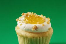
for bright cakes and the like Id be looking for backgrounds that are a little more subtle than the item itself

I might try it next time.
 
Last edited:
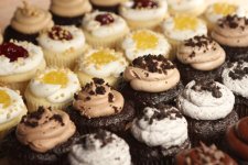
Interesting background effect in #5. Do you apply any sharpening to your stills? Everything seems to have a soft look; in the zone of focus nothing really pops.
 
Interesting background effect in #5. Do you apply any sharpening to your stills? Everything seems to have a soft look; in the zone of focus nothing really pops.

No sharpening - besides some minor PS work those are straight from the camera.

And the BG you ares asking about is 2x3 reflective sticky paper with 500w light with blue shining on it.
 
Back
Top