Need Color Grading Help

LynchMob

Active member
I am working on a mock PSA. It involves the effects kids could suffer from taking drugs. Basically a say no to drugs type thing. I have completed my edit and I'm trying to color grade the project. My skills are super weak. I'm hoping someone here can take a shot at it and give me some sample looks. I want a look that is dark. You know that "drugs are bad" feel... I couldn't find the preset in magic bullet. Please also comment on my lighting setup, framing, and other things you can rip me on. I did this project as the learning experience so fire away.


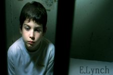
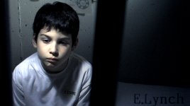
Here is the original and my attempt.

Original
1173461644.jpg


My Attempt
1173461682.jpg
 
your attempt is great
this is just what i would do, its just me though
just a touch in after effects

mytouchup.jpg
 
yuujinlee said:
your attempt is great
this is just what i would do, its just me though
just a touch in after effects

yuujinlee, I really like this look. I am also using After Effects... Can you tell me how you this did or send me the After Effects project file so I can check it out?

Thanks.
 
Number one = not too extreme, but I think it works.

Testing1.jpg


Number two = more extreme "DRUGS ARE BAD"

TEST2.jpg


Lemme know if you dig either, I'll pass along the workflow (all Final Cut Pro, by the way)

-brown
 
Brown,
Good look, pass it on anyway for the others like myself who always have a hard time deciding on a 'look'
 
rcbrown23 said:
Number one = not too extreme, but I think it works.

Testing1.jpg


Number two = more extreme "DRUGS ARE BAD"

TEST2.jpg


Lemme know if you dig either, I'll pass along the workflow (all Final Cut Pro, by the way)

-brown

Brown,
Wow, these are both awesome. For this project the first one works for me, but I can see using the second one on another project I'm working on. The only problem is that I don't have Final Cut Pro. Is their any way you can tell me what you did and I can try to simulate in After Effects.

Thanks.
 
Dammit!!!! I just wrote up a whole freakin "tutorial" and I accidentally deleted it!!

Well... I guess it wasn't a "tutorial", as I only spent about two minutes a piece on those pics, but it's still a pain.

Gotta run.. give me a few hours and I'll redo it.
 
all of them look really good, but i really depends on the mood you want to create?

caution to all who did a color correction job. Watch your whites, they almost blow out on the shoulder. video signature, bring the whites a bit down more towards grey, more film like.
 
PaPa said:
caution to all who did a color correction job. Watch your whites, they almost blow out on the shoulder. video signature, bring the whites a bit down more towards grey, more film like.


I'll take this point back to the original image. My lighting setup was bad. The shoulder was hot to begin with. I should have checked the a waveform to see that I need to move the light, flag it , or something to cut down the light on both shoulders. Lesson learned.


Brown,
That sucks about the tutorial. Can't wait to see the it when you chance.
 
Here's a go at it.

Here's a go at it.

Here's a go at it.
 

Attachments

  • 1173461644i.jpg
    1173461644i.jpg
    189.4 KB · Views: 0
rcbrown23 said:
Number one = not too extreme, but I think it works.

Testing1.jpg


Number two = more extreme "DRUGS ARE BAD"

TEST2.jpg


Lemme know if you dig either, I'll pass along the workflow (all Final Cut Pro, by the way)

-brown

Alright, lets try this again...

FIrst, I applied a "Levels" filter (G levels from nattress, to be exact, but every NLE has a levels filter, I believe)

In the levels> brought my black level from 0 to 38. I usually bring the blacks down to where I ALMOST lose detail in the blacks, but just enough to not crush out all the detail in the dark areas of the subject (in this case I focused on his hair, taking it down to where I still had detail in the highlights)

Next, took the "Gamma" up to 0.79. Yes, it's extreme, but bear with me...

Now we have a fairly dark image, and need to bring up the lights to find a nice contrast.

I took the white curve (still under the levels filter) from 0 up to 8-10. Now we've got a nice contrast all around...

Next I brought up the "3-way color corrector" in FCP (again, you should have something similar in whichever NLE you're using).

I started with the mids and shot them over a bit towards the yellow/red side. This brought out a nice "gold" color and got rid of the blue's that were already there. Did the same thing with the whites (highlights), but not quite as extreme. Just to bring out the "gold" a bit more in the skintone's.

Finally, I brought the saturation down about 20 percent (from 100 to 81).

There ya go. That's the first image.

Second image:

Basically the same as the first to start, except not as extreme in all cases, except the saturation.

Added "magic bullet's 'LS Curahee'", and opened up the filter.

Unchecked the "do lens" to rid of all the diffusion. Scrolled down to "post" and took the "warm/cool" from -4 to -2 just to ease up the extreme "golds".

Done.

I really only spent maybe one minute a piece on the initial grading, so you can always play around with things/tweak things till you find exactly what you're after.

Good luck.

-brown

p.s. I see it was a LITTLE hot on his shoulder there, but all around, I think this is PERFECTLY exposed for post production color grading. These are the image's I love to play around with, cause you have the option to do just about anything.
 
Last edited:
Brown, Thanks man! I have nattress filters but never really messed with combining his with the fcp's 3 way. It's awesome...
 
Lake Films said:
Brown, Thanks man! I have nattress filters but never really messed with combining his with the fcp's 3 way. It's awesome...

Yup... invaluable when worked properly together!

no prob
 
rcbrown23 said:
Alright, lets try this again...

FIrst, I applied a "Levels" filter (G levels from nattress, to be exact, but every NLE has a levels filter, I believe)

In the levels> brought my black level from 0 to 38. I usually bring the blacks down to where I ALMOST lose detail in the blacks, but just enough to not crush out all the detail in the dark areas of the subject (in this case I focused on his hair, taking it down to where I still had detail in the highlights)

Next, took the "Gamma" up to 0.79. Yes, it's extreme, but bear with me...

Now we have a fairly dark image, and need to bring up the lights to find a nice contrast.

I took the white curve (still under the levels filter) from 0 up to 8-10. Now we've got a nice contrast all around...

Next I brought up the "3-way color corrector" in FCP (again, you should have something similar in whichever NLE you're using).

I started with the mids and shot them over a bit towards the yellow/red side. This brought out a nice "gold" color and got rid of the blue's that were already there. Did the same thing with the whites (highlights), but not quite as extreme. Just to bring out the "gold" a bit more in the skintone's.

Finally, I brought the saturation down about 20 percent (from 100 to 81).

There ya go. That's the first image.

Second image:

Basically the same as the first to start, except not as extreme in all cases, except the saturation.

Added "magic bullet's 'LS Curahee'", and opened up the filter.

Unchecked the "do lens" to rid of all the diffusion. Scrolled down to "post" and took the "warm/cool" from -4 to -2 just to ease up the extreme "golds".

Done.

I really only spent maybe one minute a piece on the initial grading, so you can always play around with things/tweak things till you find exactly what you're after.

Good luck.

-brown


Thanks for the detailed write up. I was at work eariler and didn't get a chance to look at these images on a real monitor until now. They still look really good. Now I'll take a shot at this in my NLE.

p.s. I see it was a LITTLE hot on his shoulder there, but all around, I think this is PERFECTLY exposed for post production color grading. These are the image's I love to play around with, cause you have the option to do just about anything.

Thanks, I'm really focusing my time now on building my lighting skills.
 
how about you try some color balance and then check the preserve luminosity.. then you add some shadow: cyan and blue.. not much.. then duplicate the layer and set it to multiply but bring the opacity of that layer down to where it feels right and then maybe add a brightness and decrease the brightness and contrast a bit..

I mean.. you don't always have to do that much..

heres what I got... (I also gave the boy a bit better skin color)

helpcolorrs0.jpg
 
Back
Top