My First Short film Common Grounds

sonuxxx

Well-known member
THis is my first short film, gathered some local actors and friends and got some help from friends for the bar scene.

profile.php


http://www.youtube.com/watch?v=GmbpJSdK3Wk


http://www.vimeo.com/12339577
 
Last edited:
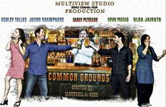
Poster fpr the movie

Poster fpr the movie

figured out how to put images here
 

Attachments

  • common ground poster colored.jpg
    common ground poster colored.jpg
    125 KB · Views: 0
Well the image quality is nice.

I'll be honest though, I have absolutely no idea what this movie is supposed to be about. The purpose of a trailer is to entice the audience into seeing your movie. I'd go through your footage and redo the whole trailer, cuz you're not doing yourself or your film any favors with what you currently have. I'd also ditch the cheesy transitions between shots. You've clearly spent some money on a camera, but throwing in a cheap-looking zoom in-out transition just cheapens things.

There are some jarring cuts to the music as well here. Now that we can all afford to use nonlinear editors, this should basically never happen. You have complete control over these transitions. I'd get in there and clean it up.

Also, what did you use to record sound? From the little we see and hear here, it sounds like your audio is gonna be all over the place. The acting is... ungood? Which is understandable if you're working with friends, but if you're actually finding local actors... wow.

I'd look harder next time and raise your standards a bit. Acting well on screen isn't easy, and it can absolutely kill your movie, no matter how high the rest of the production values are.

Having said all that though, you do have some nicely framed shots in there. I'd do another edit and try to tell the audience what this movie is about and why they should watch it.

Oh, and I'd shorten the logo at the beginning by a LOT. It's currently almost half the video...
 
Last edited:
Oh, and I'd shorten the logo at the beginning by a LOT. It's currently almost half the video...

agreed. toward the end of the logo i wondered if it actually WAS part of the movie...

i kind of checked out before the logo was done. as in im my experience, a hacky or overwrought logo presentation almost always = a hacky or overwrought film.
 
agreed. toward the end of the logo i wondered if it actually WAS part of the movie...

i kind of checked out before the logo was done. as in im my experience, a hacky or overwrought logo presentation almost always = a hacky or overwrought film.

I agree on the Logo. Almost looks like a stock effect from some stock footage place.

Otherwise I think the trailer didn't show what the film was about. Just a bunch of actors giving lines.

For inspiration check out the trailers on the Quicktime website and draw some ideas from there.
 
Why is the phone cord going through the one guy's b@lls?

Also, I echo the other posters thoughts on the opening logo being too long.
 
Back
Top