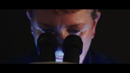
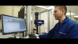
FS7: Industrial - lens factory

morgan_moore

Major Contributor
been in bonnie Scotland at a place they make lenses.

Lots of shots to do and a base of puke green flouro made for a challenging environment

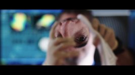
I used 1 tungsten dedo (sometimes with a CTB and or green) and a very blue LED torch.. first rough looksee grades..
gooch_1.182.1.jpg
gooch_1.186.1.jpg
gooch_1.209.1.jpg
gooch_1.276.1.jpg
 
Last edited:
Good to hear a harsh (therefore honest) critique.

Are you talking colour? Or showing imperfections?

colour wise there is a lot of flex as there is in the steepness of the s curve which can bring out macro detail or not..
 
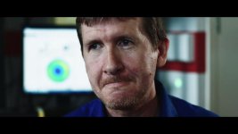
To expand a little the two heads I switched off the puke and placed the subject by large north light windows, which are actually large soft sources of excellent colour.

So if the colour is off then it is the colour of the rooms or an error in post, the one thing that concerns me is the guy has a red neck which seems to be a classic digital problem of rendering dark skin areas as magenta.

Culturally they might look better in context of other shots and .. maybe the USA/other shooters wants to present a slightly less doco feel and haze everything up a bit or get a MUA onboard.

Also davinci/jpg/dvx complession seems to do bad things..

S
 
Here are two different approaches to puke green..

no lighting and correct in post or shade/relight the face and then allow the green to really shine behind for a kind of 'interesting/scifi' look..

I feel the first is not visually interesting..

green_1.196.1.jpg
green_1.198.1.jpg
 
Yikes, that looks like a horror job.

Your skin tones of the grey haired gent were better before, the second image makes him look close to death.

White pallid Brit skin is a far cry from the sun drenched liver failure look that most US video types see as normal.

Green is not as good a colour as blue psychologically speaking so you may find it better to send it blue also I think your subjects will pop out better. Blue = clinical, green = ill.

Quick dirty example, no changes to skin. You'll do a much better job with a few more seconds effort.
 

Attachments

  • Pop.jpg
    Pop.jpg
    33.8 KB · Views: 0
Last edited:
Interesting to see perspectives.

You mean add a little blue to his skin, or make the BG blue.. as you did?

In terms of getting the skin tone here is a thing..

Im finding the curves a little over sensitive as I have a lut on the timeline, I need to go back to my normal correct before the LUT method.

S
 
in terms of that actual interview location it had a big north light which was good, but the beige walls were horrid.

It was the only place I could find that was quiet and had a simple background.

Thinking on I could have considered hitting the back wall with something ie a blue gelled light maybe.

I tried to flag off the BG with a white board but the windows had such wrap it was innefectual.

S
 
I think a blue wash over the backgrounds would help, they're wearing blue uniforms so it's in the company colour scheme and easier to argue for artistic reasons.

Interesting to see perspectives.

You mean add a little blue to his skin, or make the BG blue.. as you did?

That beige/green wash is ruining everyone's skin when it's probably not far away from a minor correction. Separating the subject from the background first priority then gauge the skin tones again. Probably not going to be far off from where you are,
 
Last edited:
I face this type of thing every week Sam. The simplest solution is switch the overheads off and use a proper key light with good colour output. If you can't switch the overheads off then you have to flag them off or over-power them.

Also, your key is too low - look at the nose shadow.
 
The bright green backgrojnd is a look I went for - overheads near him were off.

It is not wrong - but you are if course free not to like it :)
 
The bright green backgrojnd is a look I went for - overheads near him were off.

It is not wrong - but you are if course free not to like it :)

Yeah, I appreciate that. I had no issue with the green in that last one, just the key. To be fair, there's only so much you can do, even with a full lighting kit. In those situations, shoot wide:-)
 
Color correction can only ever do so much if the original squinting was lit by non-continuous sources. Bad color hitting the skin will make it look more splotchy, and subsequent color correction can make it appear plastic or waxy.

I prefer the variant Nirv showed of the white-haired man, because the color contrast subconsciously improved the look of his skin. Even though the skin tone was not changed from your original shot, it actually appears more saturated and healthy due to the contrasting color.

I think the wide shots in an industrial space will always just have to fall where they fall unless you have an enormous budget and time to deal with the lighting. But closeups & interviews can be more easily controlled. I think you're on the right track with the interview shot where you lit the subject tungsten and let the background go green, however my personal preference sees that as a bit too harsh & dramatic lighting. I would prefer a larger soft source with more wrap unless the subject matter really called for this sort of look.

It's really two things: personal preference and time/money constraints. That and maybe a little makeup powder to even out their skin (it can do wonders).

Two of the heads are lit north light with large windows that both wrap and also have full spectrum (the third is a harsh dedo spot.. something I would never usually choose)

The skin tones should, therefore be hittable?

S
 
The skin tones should, therefore be hittable?

S

I'm not sure what that means but there's loads of gags that are used when grading skin. Overlaying a blurred lightened copy of the skin will reduce the appearance of blemishes for example.

What's your time budget? What are your expectations?
 
I was referring to the fact that the keylight in the two talking heads (not the dedo one) was a northlight window with the puke lights off .. so excluding ambient reflections from the room colour the quality of the light source should have been 'good' - contrary to Mitches correct concept that filtration cannot bring back missing spectral elements.

S

Nothing wrong with the light quality at all but I find it futile trying to discuss skin tones because everyone has their own preference and 'cultural' reference. Some people just have disgusting skin especially smokers and heavy drinkers and there's some I've met who appear to have never met a photon of sunlight who won't look good in any light source without the assistance of a TV makeup artist. (Not saying any of your subjects are any BTW.)

The job is to make the subjects look as aesthetically pleasing as possible without embarrassing them by doing a full digital makeup job. Separating the beige subjects from the beige background would be where I would start and then set about lowering the contrast of the blemishes and skin texture.
 
Here is another pop that is not crazy to replicate on budget..

Desat the background, skin is sort of balanced to patch 2 on getag card and shadow skin has a bit of red removed..

ligher02_1.276.5.jpg
 
Last edited:
Back
Top