How do I develop an eye for "good" color?

Pascal Parvex

Well-known member
What I have heard is that Arri has the best color science, with Canon coming in second. And contrary to this, Sony, RED, Panasonic, Blackmagic and others have "bad" colors.

Well, okay, but how can I spot good colors? When I watch footage (on the net), I cannot discern if it is "Sony color" or let's say "Canon color".

What do you think? Do you have an eye for good color? Can I teach myself how to detect good color?
 
People in this business that frequently work with footage (camera ops, editors, directors, etc.) can usually spot various color sciences by using a lot of different cameras over time. Then they eventually develop a personal preference from their experience.

I think all cameras can have a unique and beautiful look in their own way.
 
Probably watch some films that you like, grab some stills and put them against your work in a Resolve timeline asses viusally and with scopes.

Good colour is like good art. There is no correct good colour. Only colour that engages your audience.

--

But things that are often considered to be good and using scopes to analyse a shot will really help.
(usining 0-black 255 = white, other scales may apply)

Grey greys.
So a grey item in shot would have a value in RGB such as 100-100-100 .. better than 100-120-100 which is a green tint

Accurate colour.
Correct gretag card values. If you google the macbeth chart you can find a load of RGB values for the individual patches, does a card in your shot match this?

Accurate contrast. Does your scene, maybe a sidelit cylinder show a good tonal range from 000-000-000 to 2500-250-250

Are there black and whites in your scene? (000-000-000, 255-255-255)

Clipping

Are there areas of the scene that present large zones of 000-000-000 or 255-255-255

Colour clipping.. more of an art see..

Are there zones where one channel is clipped..

233-255-222
234-255-201
244-255-205

See the green chan is cliped?

====

Visually typically one might look for..

Good contrast and colour
Non saturated highlights
Some dark zones and close to black blacks.

--

Sony are considered bad for long historical reasons (IMO to do with cramming a lot of DR into a 709 broadcastable space.. handy if you are 'going live')

If you shot 10bit Slog sony should be fine.
Most 709 shooting the camera (any brand) can be dialed to look OK
One should question (IMO) shooting log profiles with 8bit cameras.

Many people are shooting 8bit log on sony cameras or dodgy old profiles suitable for CRT broadcast... and gettting bad results.. really however this is operator error!
 
Last edited:
Visit art museums. Study with the masters, try to figure out why they used the colors they did. It wasn't an accident. The impressionists in particular were color experts and had a full spectrum of color to use (including blues).
 
Birren - Principles of Color is a great elementary book on color theories. It will teach you how to recognize what you are looking at.
 
I don't get the talk of cameras' color out of the box, when you can change it so handily in post. (And I don't get why everyone is calling it "color science" instead of "color." Or why people say "price point" instead of "price.") People can't tell which brand of camera was used just by looking at videos. I'll believe it when I see them spot several in a test that is blind.

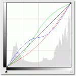
One way I've gotten a little better with color is just hands-on practice, particularly with the tool called Curves (all image-editing programs should have it: Photoshop, GIMP, Premiere, Resolve, etc.).

curves-channel-overlays.gif

Especially if you fiddle with the lines for each primary color: red, blue, and green, instead of the master line, which changes them in unison. I find that most cameras' default color has too much red. So I bring that line lower than blue and green.

I also find that their default contrast is too low. So I apply an S-shaped curve. The steeper the line, the higher the contrast. (This screenshot that I pulled off the net is much less severe than my work. I make much stronger S-curves. Where you bend it makes a big difference though. Usually it's not right in the middle.)

But just fiddle with it on different images and see what looks good. Then try to make the image look like real life (much harder).

Another unrealistic default in cameras is oversaturation. People are not that orange. So I often turn saturation down a notch or so afterward.
 
Last edited:
What I have heard is that Arri has the best color science, with Canon coming in second. And contrary to this, Sony, RED, Panasonic, Blackmagic and others have "bad" colors.

Well, okay, but how can I spot good colors? When I watch footage (on the net), I cannot discern if it is "Sony color" or let's say "Canon color".

What do you think? Do you have an eye for good color? Can I teach myself how to detect good color?

It seems you are not talking on a general level of creating color palettes or understanding color theory as much as you are talking about the color profiles that come out of a camera. Am I understanding you correctly?

If so, do you have an opinion based on your experience? I just ask because it may help ground the conversation, and ultimately that is what matters.

You can detect accurate colors by using a chart and looking at a vectorscope. You can also look for the way a camera reproduces skin-tones. You can also judge by what camera gives you the best ability to alter and achieve color profiles in post. But defining what "good" color or "bad" color is can be highly unproductive. But my answer is yes, you can learn to develop a sense for color on your own...through experience and second-hand through films and tutorials. But it is really just developing your own taste.
 
I don't get the talk of cameras' color out of the box....

Another unrealistic default in cameras is oversaturation. People are not that orange. So I often turn saturation down a notch or so afterward.

Out of the box nice colour is about a repeatable economic workflow.

You mention your camera being too orange.. well would you pay a few $ more for a camera that is not too orange.

To me cameras should be..

'baked'.. nice colour instantly

'log'.. nice colour instantly once a manufacturer issued default LUT is applied

If a camera does not offer one of these things then the camera does not offer a repeatable economic workflow.


Tinkering with curves as per your image should only be needed when one wants to add an artistic 'look' of some nature.

Arri, Panny and even to some extent BMC have this down, Canon have baked down.

Sony FS7/5/55 have this pretty down too on the Slog side.

Sony pricture profiles or 8bit+LUT tend not to have this at all.. even if you can slowly wrangle nice colours.

Sony Slog is clearly not consistent between the 7/5/55 and the 8bit horros that are the A7/Fs5 this throws another spanner in the works because cameras touting the same profile from the same manufac should match.

I sold my PMW F3 not becuase it could not make a pretty picture.. I sold it because it could not make a pretty picture quickly.

S
 
With the right LUT, any camera can make a pretty picture quickly. You can find a LUT you like. Or you can fiddle for a while and then save these as a preset or LUT.

When I told him to fiddle, it was for a completely different situation. He is trying to learn. You are talking about an efficient, repeatable workflow.
 
Absolutely.

Fiddling is wonderful, fiddling with bad cameras is also very educational (ive had some really bad cameras!)

But IMO cameras looking good out of the box is also very helpful

Also building ones own luts tends not to fully deal with different 'thickness' of negative.. if you check sony luts the are pretty whacky - not something oyu want to build - most homebuild LUTs do strange things when pushed about.
 
Last edited:
Can I teach myself how to detect good color?
It is an acquirable skill. Subtle differences in color are imperceptible to most people. In your own work, examine the effect of small changes. I think many people tend to make drastic changes until they see a difference, but they haven't trained their eyes to see nuances in color.
 
There's already some fantastic and very detailed responses here, all of which I would second.

Without retreading any of the excellent advice already given, I'll just add some basic and a bit more broad in sense:

EFFORT.

You really have to try. Throw your mind into.

I know this seems super basic and obvious, but it's a key distinguishing factor and in so many fields and skill sets. "How do I be a good cinematographer?" I always tell people, treat every single shot as if it needs to be your best and most impressive shot ever. Obviously in one sense this isn't reasonable or sustainable, but in a philosphical sense that key mental state of effort changes everything. No longer is this shot a throw-away, it's a chance to evaluate, analyze, and take an extra minute of effort to make the lighting and framing better, to add compelling camera movement with purpose, etc.

Take that effort into your analysis and approach to color. Just TRY, with all your energy and mental resource, at least on a weekly basis, to look at what is being done color wise in any given scene or frame of your work, a professional film's work, a good looking image on TV or the web, etc. That mental effort and the time investment to really pour into things (using some of the more practical, specific feedback already given here) is what will make all the difference.

And it's something surprisingly few people genuinely do.

Don't let it be a passive process, engage, and you'll be surprised how fast you start seeing things you never noticed before. Genuine effort is the key to much of acquiring any good skillset.

It's like eating a good sandwich or good food. Exposure is obviously key to developing taste, but developing discernment takes a mental awareness that a chef cultivates (wait... what am I tasting here? what is making it good? There's a hint of fennel... right? how much? What is contrasting with? Why? What is causing this pop of flavor? etc.) vs the minimal effort approach of "mmm tasty!"
 
It also fairly important that you have a calibrated monitor with decent contrast and color. All of the subtleties you are looking for may be hard to see, otherwise.
 
(And I don't get why everyone is calling it "color science" instead of "color." Or why people say "price point" instead of "price.") P

Haha agreed. I wonder what the camera engineers call it?

So many NAB videos asking the price point - nearly unbearable. It's not so much the actual terms, it's the habit of accepting and latching onto these poor terms then spreading them like zombies; some sort of groupthink?
 
Fiddling is wonderful, fiddling with bad cameras is also very educational (ive had some really bad cameras!)

But IMO cameras looking good out of the box is also very helpful

Also building ones own luts tends not to fully deal with different 'thickness' of negative.. if you check sony luts the are pretty whacky - not something oyu want to build - most homebuild LUTs do strange things when pushed about.

Point taken. Thank you.
 
It also fairly important that you have a calibrated monitor with decent contrast and color. All of the subtleties you are looking for may be hard to see, otherwise.

In the main I dont really agree with this.. if you are delivering for computer based clients (web etc) .. one should use monitors that represent what they use. I dumped my Eizo and now flip between a mac and a dell screen!.

Using scopes also is hugely important and they dont rely on a great monitor.
--

I would consider colour science to be the numeric system that delivers colour to the viewer??

For example I mentioned above the 0-255 RGB system. A system that delivers black a 0 and white at 255, a 'broadcast safe' colour science has black at 16 and white at 235 or suchlike. A 10 bit system has white at 1024 or suchlike.

Obviously colour science is more in depth with gamut and gamma coming in to play too. To some extent colour science is beyond us mortals unless we build cameras or whatever. The only way we interface with it is on occasion to perform various transforms. EG RGB->709 or ACES->RGB etc.
 
Haha agreed. I wonder what the camera engineers call it?

So many NAB videos asking the price point - nearly unbearable. It's not so much the actual terms, it's the habit of accepting and latching onto these poor terms then spreading them like zombies; some sort of groupthink?

Kind of like how everyone incorrectly says "I could care less" instead of "I couldn't care less"...
 
Kind of like how everyone incorrectly says "I could care less" instead of "I couldn't care less"...

To be fair though they pretty much mean the same thing. You could care even less than you, which already isn't much. Or you've reached your limit of not caring and can't care any less. Both mean you don't give a $h!t.

OK back to work..
 
According to MIT linguist Steven Pinker, I could care less was originally said with a sarcastic tone. "I could care less" (not). Over time it caught on. But when words or phrases catch on, they don't preserve the original tone. It doesn't matter, though, because by then the phrase was a cliche. A cliche is no longer parsed into discrete words to be understood but instead taken as a unit: I-could-care-less. --- The Language Instinct

"Color science" and "price point" are just bluster. When two people are trying to share information with each other as honestly as possible, more syllables mean more substance. Dishonest speakers hack that naive assumption. Through redundancy ("price point") and a greater use of words from Latin ("more extensive utilization of Latinate terminology") they can make trite statements sound transcendent.

Camera engineers likely don't say "color science" (which literally means the study of color? a class in college?). Again, it's like how some people talk about the "methodology" (the study of methods?) that they "utilized" instead of the "methods" they "used." Science doesn't really add anything, and when it comes down to getting work done, you're wasting your own time and energy if you beat around the bush.

Likely they use specific words that add meaning. The numbers that morgan_moore mentioned I think is called gamut. Engineers might use that, or hue, LUT, bit depth, knee, toe, clip-point, or something very specific. If they're talking about the overall effect of these ingredients, they probably put us all to shame and say the look.
 
Last edited:
In the main I dont really agree with this.. if you are delivering for computer based clients (web etc) .. one should use monitors that represent what they use. I dumped my Eizo and now flip between a mac and a dell screen!.

Using scopes also is hugely important and they dont rely on a great monitor.

I do agree that viewing how web content will look on a consumer device is important, although I think that seeing the final grade on a calibrated monitor is also important, as every screen is going to be a little bit off from ideal, but there is an ideal.

That is why scopes are so helpful, because they show you what that ideal is, bypassing the monitor entirely.

His question, though, was not about delivery, but more about how to see what good color looks like coming from a camera. "Good" color is subjective, but accurate color is not. Having a baseline of accuracy can help you discern the subtleties in each manufacturer's attempt at delivering good color.

For instance, Arri's approach in developing "good" color was to limit color saturation (http://www.dvinfo.net/article/production/camgear/what-alexa-and-watercolors-have-in-common.html). If the monitor you were using was overly saturated across the board, you might miss that subtlety when trying to visually compare footage to another camera.

Scopes could help tell the picture, but I think it really helps to see it with your own eyes, especially since that is what Pascal is trying to do. For instance, when reading lens reviews, I will pore over the technical details, and see how one lens stacks up against another in sharpness, chromatic aberration, etc. Those things are not in dispute. However, seeing how those technical details add up to the overall image can be much more helpful in comparison.

In this case, I really think that seeing color as correct as possible on a monitor will help develop that eye for color.
 
Back
Top