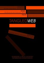
tmnt
King of Australia
Excellent points. First thing I thought was the webcam overlay was bad/old and I'd hate to be staring at it for most the movie. Overlay should maybe be black border, 50% opacity and maybe 'recording' or 'cam 1' or whatever in the same or 50% white or grey with a diff colour for each webcam as Derek pointed out.I've just watched the trailer.
First thoughts is that the footage doesn't feel like it's from webcams... it looks like we're seeing overly lit video footage and hastily built sets... as it stands now, I wouldn't impulse purchase it.
My thoughts would be to do a couple of things (if you can), change the GUI/onscreen graphics to look a bit more modern/designed and (importantly) degrade and give a 'look' to the webcam footage... even if that's crushing the blacks and adding noise/grain etc. Really try and spruce up the visual side of things.
I'd also look to give each person's web-cam footage a unique style... so, as the viewer watches the story progress, he'she will start to identify the various people's webcams.
It's surprising what some art direction can do to shots - even if it's all post work. Plus (as tmnt says) a much better logo treatment and poster is needed.
I don't know if you have the time to make the changes I'm suggesting... but this might certainly help drive a few more sales.
Poster: All very clean, stylised, white. ECU on a white round webcam which has a lipstick kiss mark on it. Around it we make (barely) out a white desk and chair, black lace panties (mpaa?) hang over the chair, and a knife or something else has to be on desk too that'l explain we're watching a suspense flick.
The poster in my head looks great, so if someone could go ahead and photoshop it, that'd be great.