
Navigation
Install the app
How to install the app on iOS
Follow along with the video below to see how to install our site as a web app on your home screen.
Note: This feature may not be available in some browsers.
More options
You are using an out of date browser. It may not display this or other websites correctly.
You should upgrade or use an alternative browser.
You should upgrade or use an alternative browser.
Help grading image
- Thread starter PaPa
- Start date


Shooter
Veteran
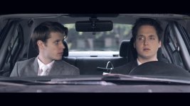
Was this shot with the "Flat" set up that we often read about in these circles? ie. de chroma, flat contrast etc..
Wondering if this is what makes it so hard to pull a decent grade from it. ( I tried btw).
There is just nothing (image data-wise) to work with and none of the attampts really succeed strikingly. IMHO
Maybe the" flat" myth has been debunked!
Wondering if this is what makes it so hard to pull a decent grade from it. ( I tried btw).
There is just nothing (image data-wise) to work with and none of the attampts really succeed strikingly. IMHO
Maybe the" flat" myth has been debunked!

dustylense
Veteran
+1Was this shot with the "Flat" set up that we often read about in these circles? ie. de chroma, flat contrast etc..
Wondering if this is what makes it so hard to pull a decent grade from it. ( I tried btw).
There is just nothing (image data-wise) to work with and none of the attampts really succeed strikingly. IMHO
Maybe the" flat" myth has been debunked!
Was this shot with the "Flat" set up that we often read about in these circles? ie. de chroma, flat contrast etc..
Wondering if this is what makes it so hard to pull a decent grade from it. ( I tried btw).
There is just nothing (image data-wise) to work with and none of the attampts really succeed strikingly. IMHO
Maybe the" flat" myth has been debunked!
This is an interesting question.
I'm really inclined to bump up the chroma if I shoot with the AF100 again. The whole reason I knocked it down to -7 was because of the ugly yellow highlights. But considering that you have to underexpose the highlights no matter what, might as well get some more color in the image.
What settings was this image shot with Papas?
By the way, I agree the filmconvert looks the best. The Michael Bay one looks the worst in my opinion. Too many indies try to get that look nowadays. Even if not done in Magic Bullet it screams Preset.

Erik Naso
Veteran
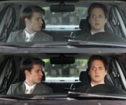
I took a swing at it tonight. Used Colorista II. The image was very flat so I just tried to make it look natural instead of with a "Look". Punched up the green to get the trees in the back window to show up more. Helps add a little color.
Added two secondaries to the guys to brighten them up and pull them foward a little. I spent about ten mniutes on the grade.
Not sure why the image is so small. Added a link to larger pic.
http://www.flickr.com/photos/61097486@N06/8105857411/
Added two secondaries to the guys to brighten them up and pull them foward a little. I spent about ten mniutes on the grade.
Not sure why the image is so small. Added a link to larger pic.
http://www.flickr.com/photos/61097486@N06/8105857411/
Attachments
Last edited:

Hunter Hampton
Carbonite Member
Papa- I'm on a PC and using cs6 with the plug-in. What are you editing in?
Oh and for the question someone asked about what film convert is, it's a program/plug-in that has realistic film like gamma/color/grain presets based on real film stocks, works great as an addition to your color pipeline- you can get a trial version to try at filmconvert.com (it's the same guy who made the rubber monkey program for round tripping red footage before red had a solution- he is also a really good DP) and just incase- I'm not a paid endorser or anything, I just tried the program and liked it so I bought it.
Oh and for the question someone asked about what film convert is, it's a program/plug-in that has realistic film like gamma/color/grain presets based on real film stocks, works great as an addition to your color pipeline- you can get a trial version to try at filmconvert.com (it's the same guy who made the rubber monkey program for round tripping red footage before red had a solution- he is also a really good DP) and just incase- I'm not a paid endorser or anything, I just tried the program and liked it so I bought it.