
Navigation
Install the app
How to install the app on iOS
Follow along with the video below to see how to install our site as a web app on your home screen.
Note: This feature may not be available in some browsers.
More options
You are using an out of date browser. It may not display this or other websites correctly.
You should upgrade or use an alternative browser.
You should upgrade or use an alternative browser.
DVXuser Forum Upgrade: Feedback, Questions, Answers...
- Thread starter Jason Ramsey
- Start date


AwakenedFilms
Veteran
Not bad. Thanks for working hard on the upgrade. In addition to the existing comments, I'm not a fan of the huge white box used for the quick reply. Its almost painful at night when my eyes get used to a darkerscreen in dim light. Browsing with Safari 5.0.2, Snow Leopard 10.6.4
Jason
Jason
Richard Crowley
Veteran
Very nice! I like the cleaner, more modern design, and I like the more efficient font better, also.

Jason Adams
Section Moderator
This is great. Even has that new forum smell. Thanks Mods

BrianMurphy
Veteran
Love it!
Love it!
No complaints, just compliments! Well done and my sincere thanks to the mods and folks who make this community possible. dvxuser has had and continues to have a significant impact on my work and attitude. I learn something every day and usually I learn it first here!
Cheers
Brian
Love it!
No complaints, just compliments! Well done and my sincere thanks to the mods and folks who make this community possible. dvxuser has had and continues to have a significant impact on my work and attitude. I learn something every day and usually I learn it first here!
Cheers
Brian
Jason Adams
Section Moderator
Wow this is zippy. Seems to run much cleaner. Now my favorite web distraction is faster.

Jason Ramsey
Admin
Not feelin' that new banner pic up there....
The header background? think of the current one as a stand in...
 I'm accepting submissions, too :evil:
Jason Ramsey
Admin
smaller font on the threadlists better for you guys now? still want the data after "started by" removed?
Phil Seastrand
Active member
Looks good to me with one minor exception. On the subscribed forums page, the icons for forums with unread threads and forums without unread threads are too close in looks. It's very hard to detect which forums have new threads.
Looks good to me with one minor exception. On the subscribed forums page, the icons for forums with unread threads and forums without unread threads are too close in looks. It's very hard to detect which forums have new threads.
+1

Vitaliy Kiselev
Carbonite Member
One small addition.
Typing dvxuser,com you now end up on home page and not on actual forum. You need to click tab to get here.
I think it is wrong, as this is not very intuitive, especially considering message at home page.
Small redirect or forum settings change will fix it.
Typing dvxuser,com you now end up on home page and not on actual forum. You need to click tab to get here.
I think it is wrong, as this is not very intuitive, especially considering message at home page.
Small redirect or forum settings change will fix it.

Tomas Riuka
Well-known member
smaller font on the threadlists better for you guys now? still want the data after "started by" removed?
muuch better though the text could be 1 tone darker, just a tad. Also it's a bit hard to notice which forums have new post, the blue round bubble indicating
new posts could brighter, so the difference between two of them would be more clear.

TwistedLincoln
Veteran
Is there a way to set a fixed width viewing mode? On my monitor's 1920x1600 resolution, DVXUser has always been a bit tough to read since the fluid width makes posts so wide... Having a fixed width option would be a great new feature!
Jason Ramsey
Admin
Twisted, in the near future, I will work on a "fixed" version of the style that will be selectable from drop down box if that will help you...
---
Thanks everyone for your feedback, and please keep it coming... I'll be spending the next couple of days refining the skinning of things, fixing some things here and there, etc. I've made a few changes since sending the site live, and will continue the rest in a separate 1.1 version of this style, and will send it live for feedback maybe in a few days or so...
From there, I'll start working on some layout changes, etc. and, then onto some modifications, and new feature additions, etc.
Later,
jason


polfilmblog
Well-known member
Predictably, most web designers completely ignore the readers who need to make fonts larger in order to see the content at all (on the homepage anyway):
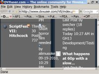
Ironically, the layout on the actual posts is BETTER than before, because the columns don't spread out horizontally all over the place and past the right edge of the screen. Go figure.
Ironically, the layout on the actual posts is BETTER than before, because the columns don't spread out horizontally all over the place and past the right edge of the screen. Go figure.
Jason Ramsey
Admin
Polfilm... I'll work on that... looks like from your grab there, that it's the sidebar on the main page that is causing that when you blow up the text... I just tested it myself and it gets funky when the sidebar is open...
In the meantime, it appears that if you collapse that sidebar, you wont' get that overlapping when blowing up text on the main page.
Thanks for bringing it to my attention. I'll put it on the list to improve browsing for those using larger format
In the meantime, it appears that if you collapse that sidebar, you wont' get that overlapping when blowing up text on the main page.
Thanks for bringing it to my attention. I'll put it on the list to improve browsing for those using larger format

Alvise Tedesco
Well-known member
Hi Jason.
There's a problem when switching from normal to hybrid mode display. Where I would normally see names of posters I now see small icons over pure white (safari)
There's a problem when switching from normal to hybrid mode display. Where I would normally see names of posters I now see small icons over pure white (safari)
Jason Ramsey
Admin
Hi Jason.
There's a problem when switching from normal to hybrid mode display. Where I would normally see names of posters I now see small icons over pure white (safari)
thanks. just an oversight... I'll fix it...