
Navigation
Install the app
How to install the app on iOS
Follow along with the video below to see how to install our site as a web app on your home screen.
Note: This feature may not be available in some browsers.
More options
You are using an out of date browser. It may not display this or other websites correctly.
You should upgrade or use an alternative browser.
You should upgrade or use an alternative browser.
Does Promo Give Away Too Much?
- Thread starter ministerfortson
- Start date
ministerfortson
Member
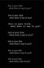
I guess I could use basic font but they seem so boring to me. That and I don't like the basic fonts. I actually wrote all of my books in Trebuchet and they look very good in print. That's probably why I'm partial to it.

wgzn
Veteran
trebuchet is NOT a basic font? designed BY microsoft specifically for web browsing?
"Trebuchet MS has been released with the Microsoft Windows operating system since Microsoft Windows 2000. The typeface has been released with Internet Explorer since version 4.0"
in my book, it doesnt get any more "basic" that that ; )
there is a very broad line between a classic font and a basic font.
Last edited:
ministerfortson
Member
OK, changed to Courier New. Thanks for all the help everyone. It does look a little more professional in the Courier font. Now I just need to get to work on what I want the inserts to say.

ministerfortson
Member
Alright I changed it... feedback would be awesome. You guys have helped me out a lot http://youtu.be/bXO13KpO2Ko