Dilemma with the client

Real_Rudi

Member
Hi guys,

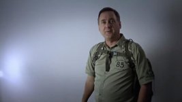
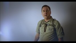
I really need your help! I shoot the video for a client using three lights setup, soft boxes, and etc. Idea was to introduce some shaky camera to introduce the tension, since the guy is talking about end of the world. Lighting was set to separate him from the background and give a texture to his face. Basically, my idea was let's make something more cinematic than just a talking head youtube video. Here is the result:


Response of the client was: Terrible lighting. No depth of field. Poor quality. Not in focus. My wife makes better videos with no lights. Lining is terrible.

Guys, am I crazy? Poor quality on full HD 60 fps, progressive scan.

Do I have "Gordon Willis on Godfather shoot" shoot syndrome? Is that really terrible?
Does subscription to "American Cinematographer" took its toll? Don't we really need a filmic look in instructional youtube videos?

As usual, any response is greatly appreciated.

Cheers,
Rudi
 
I'm going to break down the client's comments.

Terrible lighting: I think the biggest problem is that we can see the lights in the frame. Your key light is way too low, so his body is bright but the top of his face is way too dark. It looks like your key (frame left) is also just a bare bulb with no directionality. That makes it spill onto the background. He seems to move in and out of his fill light as he sways back and forth. In the show-and-tell section, it looks like the light is coming from directly next to the lens, which makes the shadows fall directly behind the subject. This makes it feel like the light is attached to the camera and flattens everything out.

No depth of field. You have no depth because he's standing with his back against a wall. A blank white wall at that.

Poor quality. All of the above contributes to this.

Not in focus. Yes, it is in focus.

The problem is you shot in a very boring-looking room. There's no texture to the wall, so it's just a big white void. The lighting is too soft. You didn't create depth with a backlight, and the "texture" on his face is hidden by the soft lighting. Everything also seems 1 or 2 stops under.

Personally, I absolutely hate the out-of-focus vignette.
 
Thanks a lot! He is right then.

No.
Not entirely, no.

First - it's NOT out of focus. I just watched it on a CRAPPY soft monitor and it still looked plenty sharp.

Second - like edinc90 said - you CAN'T have any depth of field if there's nothing behind you. Even if he was 10-feet in front of the white wall there would still be no shallow depth of field because a white wall will look the same if it is IN focus or OUT.

OK...the lighting didn't work. But I think you can see that too now.

His body is brighter than his face - yeah.
And you can see the light fixture off to the left.

OK- fair enough. Live and learn.

Tip #1 from me to you: Get the subject AS FAR AWAY from the back walls as you can in MOST situations. Especially talking person type stuff.

Tip #2 from me to you: Try to have at least a tad MORE light on your subject than anything else. And if they are speaking then make sure their face is either brighter or the same as the rest of their body. This rule almost always applies to talking person videos like these. Not as much in movies though. So trying to get a "cinematic" effect actually worked AGAINST you in this particular instance. But the idea was nice.

If in this video you had just had him stand 5-feet farther away from the wall than he did, and if you pulled your key light more to the center and higher up to match his face level - then this video might have still looked a little boring - but all the "problems" would have been solved.

If you may be doing more videos of this type, then it's good to invest in a backdrop stand kit and a few different backdrop pattern cloths. That can go a long way to making these kinds of videos look way better - and it's quick and you can bring it with you.
 
The video was very boring. Why not just film outside? Plenty of things to film outside instead of a boring white wall.
 
Definitely have to be careful when shooting for a client vs doing your own thing. Most clients, unless otherwise stated, tend to want trendy, clean, hip&happening videos. I would recommend doing the experiments on your own and then you can show it to a client as a "what if we did something like this?" kind of thing.

And as others stated, so much light spilling on the walls that it makes his skin tones seem very dark which draws attention away from him. You could always shoot things still and then add a bit of camera shake in post via After Effects or a similar project. That way there is no risk but you can test some more crazier things still.
 
I'm not sure how you guys are seeing "body is bright but the top of his face is way too dark" in this. The levels seem pretty even to me.

I'd concur that yes, it's sharp. As for the lighting, it looks fine (although moody) to me. I can see why a client might not appreciate "moody" lighting, but then that's why they should be looking at a monitor when the footage is being shot.

As for the light in the frame, that should be a fairly easy fix (just defocus it or reframe) and you have room to print up the footage if it would help make the client happier.


Attachments

  • screengrab.jpg
    screengrab.jpg
    10.6 KB · Views: 0
I think the important points have already been made, but:
1) visible wall outlets, cords, and CFL are unacceptable
2) is that low light really the key light? This is lit like a campfire horror story.
3) brutal audio clipping
4) I, too, despise the fuzzy vignette, and also 60p. 60p is useful for sports, slo-mo, and Spanish soap operas; otherwise it looks bush league.
 
I hate to say it, but it really looks like "found" lighting as opposed to something that was intentionally lit this way.
 
What I don;t get is the need for the word cinematic in this. The content doesn't lend itself to any clever style - it's a dull talking head in content. Shot against a wall with carpet and skirting board. Why on earth do handheld, and have his head vanish and sudden jerky and and tilts. It does look like a just pass first time student video. Your style injection failed because of what it is. I have to go with everyone's comments - it was a mistake to generate bad technique on purpose, because the client would not see the difference. Sorry.
 
what was said before, but in addition, there are multiple technical problems which make it look a bit amateur - for example, in the upper right hand corner, it looks like a mic boom dips in and out of frame; for that matter, the framing is annoying, in that you have the top of his head appear and disappear - not good... make up your mind - it's OK to cut off someone if it's done consistently, f.ex., he's bending over something and it's more important to show what he's pointing to, than the top of his head, but you can't keep popping in and out like that because it looks like you have no control over your framing, the light fixture reflections in his glasses are distracting, and unless the guy is walking the use of handheld to introduce tension is misguided - if he's walking, OK, use handheld, but if he's just standing there bouncing a bit, use other techniques, like a different angle (further below) to introduce tension... but to be honest, I don't think using the camera to introduce tension here makes much sense in any case, YMMV.
 
That doesn't look at all like "end of the world" handheld, it just looks good grief plain bad. It has weirdly erratic jerkiness rather than the kind you'd associate with "end of the world" shakiness (not that I think this is appropriate form this video anyway)
 
If I were going to do a program foretelling the end of civilization, I would want to do it with an older, distinguished professorial type sitting at a desk in an office surrounded by books and dark wood ... well but naturally lit and exposed ... with crystal clear audio, a steady camera, and a conservative medium closeup. Make them seem like a calm and rational authority figure delivering seriously bad news on TV. For me, that would have a lot more emotional weight than lighting a crazy person like the killer in a horror movie and shaking the camera around.

Lots of movies like "When Worlds Collide" and "The Day the Earth Stood Still" have used this kind of delivery to great effect.

- Greg
 
Cinematic+60P=Oxymoron! Out of curiosity how much did you charge for this? From a client perspective, I would be a bit upset if this was delivered to me. But then again, the client has a responsibility to convey their vision. I always ask, how they see the finished product, then take notes. After all their paying the bill. If I were you, I would crop in, stabilize, warm up the image, it's very cold, and uninviting now. Add some graphics, music and some b-roll, No one wants to watch pathetically fake enthusiasm from a guy that has a terrible delivery. He's just as guilty to the overall amateurish aesthetic of this video, When he jumped up and spun around I bust out laughing, couldn't be any more corny LOL.
 
I have to ask. What level are you at as far as corporate / video in general?

The reason I ask is you say the client is upset, however from where I stand Im not seeing that a lot of dollars would have exchanged hands for producing this piece. Forgive me if I wrong there, its just my perception of it.

It seems your still in your early stages of development and when a client hires you from that place, especially if its because they're trying to save a few $$, Im not sure why they'd be expecting a lot. You took this as a chance to experiment.

I do corporates, and whilst I take risks, especially in the concept development stage, I never experiment on shoot day. Those tests are done prior. An easy way around this would have been to describe to him the style you wanted to shoot and do a little test. He would have seen that's not what he's looking for and you could have come up with a plan together.

FWIW, I've just finished shooting a 6 minute piece and some of the shots I did handheld - rather steady handheld, however I wanted to give the piece an underlying feeling of being there, so mixed in amongst ronin, long tracking shots etc etc there's a few of these in there.

Anyhow tough image to fix there. I added some light leak over your hotspot and tried to pull it back, warmed up skin, added vignette, readjusted levels with a curve. Still not great, I think you could do a bit extra to improve it though.

DUDE.jpg
 
It definitely looks better now. I think some B-roll would help immensely. In the future stay away from that fuzzy vignette, it's no substitute for shooting with a shallow dof. In a year you will look back and realize it was just a learning experience, this is how we grow as artists, if you didn't make mistakes you wouldn't improve. At least your willing to listen and take input, that's half the battle. Be open to criticism even if it does hit at the ego. shoot on!
 
Back
Top