FEATURE: DEUCE OF SPADES - How I made a period full feature film all by myself on ZERO budget

Hi

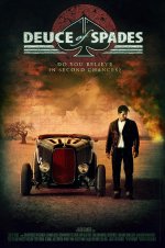
My son - also a former graphic design student just had a quick look at the poster. His instincts were that any females glancing at the poster might bypass this - because they only see the guy with the car.

He says that if you are going with the guy's pose then perhaps you should centralise the car - but have him standing directly in front of it. He said that he would also bring the kissing couple down a little and change the opacity so that they are more prominent.

Good luck!

What did you mean by "Bypass This" "This" being what? I am lost :)

I don't want to make the kiss more prominent, because it will take edge away from poster. The hotrodders may be turned off by the poster if it starts to look more romantic. Lowering the kiss a tad might be worth experimenting with though.

Johnny standing in front of the car? Definitely no. For two reasons: A- the star of the film is the car and the hotrodders want to see the car first and foremost. Also B- the hotrodder standing next to his rod is a very traditional hotrod vintage photo, one that speaks to the heart of all those who know the era. The guys always posed standing next to their hotrods / race cars. So this, I feel strongly about.

I also took many photos of Tim running and walking and we tried them, but they did not work. This is not an action film. A hotrodder running away from his car makes no sense at all. Walking away maybe, if it was on fire LOL but it is not. So i think standing next to his deuce is the best hotrod statement JOhnny can make, short of being IN his car (we tried that too, and that has no impact at all, cause you can't even see the guy).

Keep the input coming :)
 
As far as a film poster this is very good. You captivate a really nice feel and if I saw this on a theater wall I would most definitely be inclined to see this or at least find out what it was about.

As a graphic designer myself I would probably mess around with the tag line font and capitalization to get a better readable result without it disappearing into the film logo. Of course, it works just fine this way and I don't see much improvement that could really be done, just something to think about.

The actor seems a little "stiff" but I think it also adds to that "mysterious" feel to it. The main point of a film poster is to entice and make people want to see it and this does a very well rounded job. So if someone mentions the stance of your character I'd also keep this in mind.

I was going to ask you about the explosion in the background, I'm assuming this is part of the storyline? I guess what I'm saying is it's not really screaming the time period of the film to me (not necessarily the explosion in itself but the overall look). I was thinking you'd go with a more time period look instead but again this is appealing to the eye and makes me want to see it.

Anyways, I could write on this all day. The main point is that your poster gets the job done and is appealing to the emotions.


**someone else might not even think about this but in contrast to the feel of the poster the deuce looks incredibly clean! Maybe photoshop some dirt or something I dunno lol. Actually, I think just making the tires look a bit more dustier would do the trick.
 
Thanks for input :). It is a fire behind Johnny, and yes, it is directly tied to the story line. SA far as making the fire look vintage? LOL I dont think fire has changed much, looks wise, since the stone age :D, so not sure what you mean. This is a crash fire. Initially we played wiht the idea of seeing a car at the bottom of it, but it didn't seem to quite work... Too much details.
 
I meant the overall look doesn't seem vintage and I was referring to your fire as the light source. The reds/yellows make it seem more like a post apoc movie.

Take the red filter off or w/e was done to it.


Here, I attached a file as to what I would do if it were me. There's some artifacts in the image but I think you get the idea. Again, just a suggestion I have no way of knowing what would look best on a theater wall. Good luck!
 
Last edited:
I meant the overall look doesn't seem vintage and I was referring to your fire as the light source. The reds/yellows make it seem more like a post apoc movie.

Take the red filter off or w/e was done to it.


Here, I attached a file as to what I would do if it were me. There's some artifacts in the image but I think you get the idea. Again, just a suggestion I have no way of knowing what would look best on a theater wall. Good luck!

Can't see the file. Where is it attached :) ?
 
Oooh, me likey. Actually, I like everything about this entire project. Faith, you are inspiring and I can't wait to see the final product.
 
What did you mean by "Bypass This?"

Hi

Whilst studying graphics my son worked part time at a large well known video/dvd store for years. He is very observant and he noticed that a lot of people spend very little time browsing DVD's to rent or buy. Often they would literally just glance at a cover design without reading anything and make a decision purely on the imagery. I think he feels that if the kissing couple are not prominent enough (and in fairness, he looked at the new design on my internet PC screen which is small and fairly low res!), then you may not be giving yourself maximum audience appeal. In other words some people quickly flicking through lots of DVD's might bypass yours IF they think that it is a 'boy's only' movie in the same way that some bypass what appears to be a 'Chick Flick' (their loss!). He might have a point though.

Anyway, I've just preordered your DVD and I really look forward to seeing all of your efforts. I wish I could contribute to your movie financially but I'm following in your footsteps with my own low budget feature!

Cheers
 
Last edited:
Faith it might work better if the car was at a slant across the image with johnny sitting on the front wheel elbow on knee and his clenched fist under his chin like he is in contemplation (his expression being all important) (or flicking open his zippo lighter), it would engage the viewer more. It would give a more period look as you would see more of the roadster and a greater impact of johnnys period clothing, I think?
 
What did you mean by "Bypass This?"

Hi

Whilst studying graphics my son worked part time at a large well known video/dvd store for years. He is very observant and he noticed that a lot of people spend very little time browsing DVD's to rent or buy. Often they would literally just glance at a cover design without reading anything and make a decision purely on the imagery. I think he feels that if the kissing couple are not prominent enough (and in fairness, he looked at the new design on my internet PC screen which is small and fairly low res!), then you may not be giving yourself maximum audience appeal. In other words some people quickly flicking through lots of DVD's might bypass yours IF they think that it is a 'boy's only' movie in the same way that some bypass what appears to be a 'Chick Flick' (their loss!). He might have a point though.

Anyway, I've just preordered your DVD and I really look forward to seeing all of your efforts. I wish I could contribute to your movie financially but I'm following in your footsteps with my own low budget feature!

Cheers


As far as I know this is only a movie poster. As a title cover for blu-ray or dvd I agree this wouldn't work at all. But as a blown up movie poster I think it would do very nicely, just my opinion.
 
Composition is off balance. Looks like I'm staring at a museum piece instead of a fully functioning Hot Rod. The main character looks disinterested, like he is about to walk away from the vehicle. No connection between them what so ever. Hot Rodders love their rides, but it just doesn't look like it in this poster. This almost feels like the closing scene in the movie, even if it isn't.

The kissing couple in the background is distracting. If that is the girl of his dreams/memories, no need to show him kissing her. Just an semi tranparent picture of her in the background would be enough, almost as if she is part of the cloud itself.

Looking forward to your release. I've been spreading the word among my family and friends.
 
Faith it might work better if the car was at a slant across the image with johnny sitting on the front wheel elbow on knee and his clenched fist under his chin like he is in contemplation (his expression being all important) (or flicking open his zippo lighter), it would engage the viewer more. It would give a more period look as you would see more of the roadster and a greater impact of johnnys period clothing, I think?

Above would not fit the meaning of the film though... Nor the fire in the background. I don't need to have a more period look, this is as hot rod period correct as it gets, as is. And the zippo lighter is Tommy's trademark (supporting actor) so that woud nto work. Although they are not bad suggestions, they would actually stear away from the heart of the film.
 
Composition is off balance. Looks like I'm staring at a museum piece instead of a fully functioning Hot Rod. The main character looks disinterested, like he is about to walk away from the vehicle. No connection between them what so ever. Hot Rodders love their rides, but it just doesn't look like it in this poster. This almost feels like the closing scene in the movie, even if it isn't.

The kissing couple in the background is distracting. If that is the girl of his dreams/memories, no need to show him kissing her. Just an semi tranparent picture of her in the background would be enough, almost as if she is part of the cloud itself.

Looking forward to your release. I've been spreading the word among my family and friends.


LOL so... More of the kiss or Less of the kiss LOL... You guys can't seem to agree on anything :)...

Sigh...
 
http://www.dvxuser.com/V6/attachment.php?attachmentid=16995&d=1271472365
YES!!!!!!!!!!!!!

English Subtitles and timing of each subtitle card is done! All 1252 subtitle lines !!! I am really happy!! Looks very professional and reads well. I have been at it for three entire days straight now.

now that the timecodes are all programmed, it is just a matter of replacing all 1252 entries by the 8 languages the film is translated into.

Weeeheeee. Moer work for moi!

Tomorrow I go back to working on sound and adding last foleys I recorded, to REEL 5 and get it ready cause Monay I drop it off at the studio.


AFlashback6%20Image10.jpg
 
Think I messed it up, here should be there now.


Mmmm. Plese take a look at the period film FLYBOYS DVD cover. It has a fire in it:

I what way if this fire more or less vintage than mine?

A you see they used full, warm colors, lots of yellow and some red. And even though the pilots LOVED their planes, this one is not pictured sitting on it, holding it, touching it LOL. OK, so maybe he is facing the plane, but you get my point...

I do love the high contrast ratio from bright sun to silhouette in this DVD cover. Very visually striking. Angela is working on experimenting with more lighting effects on our poster, as we speak... To try to up the visual dynamics if we can :).


flyboys07.jpg
 
posting our working poster again for those who are just arriving to the thread: Note that I do want my poster main colors to be red and black.


FINAL%20poster8.jpg
 
No need to apologize :) feedback is what we need here :). I am now OK with body language of JOhnny and like the fact he is looking a bit downwards, as opposed to straight on into the camera. I do agree to some extent about the visual dynamics comment, as I wanted the poster to be as agressive as possible, but we could not find a way to do it. We experimented a lot with having it back lit, but it didn't quite seem to work.

So here's the question, how would you, who was a design major, alter this poster (if it was yours) light wise, to make it more dramatic?

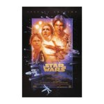
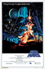
Lighting isn't the problem for me - scale is - aka 'quantity contrast', like I said earlier - it's a phrase that was drilled into my head over and over back in design school. The idea is that similar size/visual weight elements create much less visual dynamics than dissimilar ones, and to a significant extent, the more difference between them the better. So the formula in that regard, as exemplified by many famous movie posters created by top pros, is: use elements that are *drastically different* scale wise - a *huge* Russel Crowe and a small Roman Coliseum in Gladiatior, big actor faces, small title text and even (relatively) smaller spaceships in the original "Star Wars" poster (and none of the actors were big stars yet):


That is what I'm referring to.
 

Attachments

  • 41RWH3073NL._SS500_.jpg
    41RWH3073NL._SS500_.jpg
    34.3 KB · Views: 0
Last edited:
Just for the record, THIS was the original Star Wars Poster:


Frank
 

Attachments

  • star_wars_hildebrandt.jpg
    star_wars_hildebrandt.jpg
    250 KB · Views: 0
Last edited:
Just for the record, THIS was the original Star Wars Poster:


Frank

Right. I realized it after I had run out of time to correct it this morning. Thank you. Nonetheless, the *actual* original one illustrates my point just as well. Probably even better (giant Vader, tiny ships and droids, etc.)...
 
Back
Top