Dark is the new Bokeh

  • Thread starter Thread starter Guest
  • Start date Start date
New trend? This has been done for ages. But I am kinda confused about what you mean about underexposing. Because the dark examples I am thinking about are not underexposed, they are just dark :). There is a difference.
You can expose perfect and still make the image look dark.

 
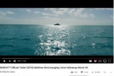
I first saw this one on instagram, and something was wrong with the instagram version, it was darker than the youtube trailer:
IMG_5853.jpg
mid day exterior, very dark. No highlights in a daylight exterior shot.


These are done well, but there is a lot of amateur stuff that is also adopting the dark look. Not Gordon Willlis or Rembrandt dark shadows, but an overall dark image where even the highlights are dark.

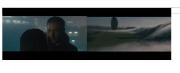
On the left is a night scene shot by Roger Deakins, on the left is an exterior day scene shot by Bradford Young:
IMG_5844.jpg
You may notice that despite one being a night scene and one a day exterior, that they share about the same amount of illumination. Roger Deakin's night scene is probably brighter than Young's daylight exterior, as it actually has a few spectral like highlights in the BG.
 
Last edited:
Although I haven't seen it in many places I found the effect in Arrival very distracting....it worked in some scenes though....less irritating though than the attempt at constant shallow DOF for which DSLRs are responsible I suppose....fortunately not practical to sustain throughout a feature length film....sorry for going off topic with this.
 
I don't think the OP is talking about Chiaroscuro or "low key" lighting. Instead I think James is referring to images where nearly the entire image is "under". What, for lack of a better term, I call "half-light" lighting. I would characterize it as "low contrast" but when people use "low contrast" they usually mean images that are washed out and on the upper end of the brightness scale.

First, an example of what I think James is NOT talking about, an example of Chiaroscuro lighting:

webversion.jpg

^^ the image has deep blacks and a portion of the image is bright. Deep blacks contrasted with strong highlights. The image is a "dark" image but not under-exposed.

Here is a music video in the same visual style- deep blacks contrasted with strong highlights:


The "half-light" look is more like the following examples where a large percentage of the image, if not the entire image, is placed in mid-tones. But unlike low-contrast there are still rich blacks and the highlights more live in mid-tone. The scale is from deep black to mid-tone. Everything is "down" on the brightness scale. As opposed to the image above where most of the image is one of two extremes and there are few mid-tones. Either way up on the brightness scale or way down. The "half-light" look is more gentle, subdued, and "smooth". It has a more natural, naturally occurring quality than does low key / Chiaroscuro. And a more natural look than "low contrast" / washed out images. It is a look that many see as "cinematic" in that it looks natural and, unlike "low-key", does not look artificially lit. It looks "natural". It looks like things often look in our daily lives.


Screen Shot 2018-07-25 at 11.15.42 AM.jpg

Screen Shot 2018-07-25 at 11.15.19 AM.jpg

Screen Shot 2018-07-25 at 11.14.17 AM.jpg


Very different from "Low contrast" where there is little that is true black or even near black:

Screen Shot 2018-07-25 at 11.30.33 AM.jpg

Screen Shot 2018-07-25 at 11.28.47 AM.jpg
 
Last edited:
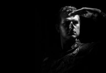
I did a self portrait recently with "dark lighting," rembrant, or whatever you want to call it. Shot with Arri Amira sideways, lit with one household lamp and a Litepanels Caliber as an eye light. I was surprised with the look you can get with just a household lamp. I setup a Litepanels Gemini as a key, but ended up not using it as I liked the lamp look better.


25305896147fc8081b47d95ceb05638d9a5c175338870827896897e21c84ce1908176b80.jpg


972103794aa07865cc3980acb287146b6161da847e688e3837e088e019ff9465665a5147.jpg


37877270f51869a9c77f0118be08f1dc06d73401aa979c654941d458085d9381998a6408.jpg


And a shot from a recent short film I did.

031655078439f8a60bc1714e3d68e6ed546344a0b99e234f70b8138b346fde2c30df0a1b.jpg

First shot is great.

That last one looks like the talent has jaundice.
 
Let's not get sidetracked with critiques of other's work.

Regardless of color hue, the image is a low-key image. The luminance levels are mostly on the two extremes- deep black or bright. With little in between:

Screen Shot 2018-07-25 at 11.50.35 AM.jpg


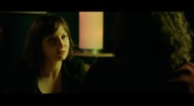
The look from james' example of the film "Mid-90's" is a very different look. One where more of the image is in the mid-tone. There are blacks or near blacks, but most of the image lives in the mids and the brights are not that bright:

mid-90s-700x383.jpg

maxresdefault.jpg


Eric's image with the woman is "dark" but the light ratios are extreme. It doesn't have an "underexposed" look. Same with Eric's self-portrait. It is a contrasty image. It doesn't have the "muted" / half-light look.
 
It's hard to make generalizations about larger trends, so I generally try not to. Plus, tastes vary and it's just important to know what you like...of course, taste is informed by the zeitgeist, so kind of a feedback loop.

However, I do know that the higher sensitivity of digital sensors has allowed for more naturalistic lighting styles. This is coming from older DPs who use to shoot film and are embracing the newer possibilities. Part of this is needing less light, not needing bright hair lights and such for narrative scenes that don't call for it. And I also think that there is more acceptance of not having to clearly see the faces of actors on every shot, where it frees up more variations for using light to create an emotional impact as opposed to having actor's faces do all the work.

I know that there is a generalization about all cinematic images have to have the highest brights and the lowest lows. And while I think that is good for certain things or in certain moments, but it's not the only way to make images. Low contrast images, dark images and washed out images are just part of the larger vocabulary of cinema.

Ultimately it's just about does someone's work connect with you? Or does it not? Do you connect with the intent behind the images?

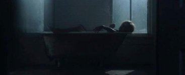
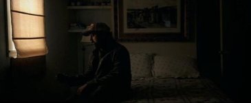
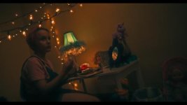
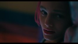
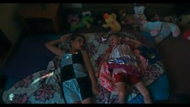
Below are some dailies from a recent project. With on-set LUT, not a final grade, so clipped windows on one shot is not intentional and is not blown-out in the RAW. Anyways, definitely darker images. Gritty dark interiors motivated by a lack of overhead lights in the house, but also an emotional metaphor for the dark weight of poverty...just a particular approach. one of the images, with the child sitting in front of the desk, with the string lights. It's a night interior, with low luminance contrast and monochromatic. Done with intent to help communicate an aspect of the narrative. Definitely not everyone's cup of tea. But we are not making work for everyone. We are making work that we connect to, in the hope that it will connect with other like-minded folk.

WTTB_5.jpg
WTTB_4.jpg
WTTB_3.jpg
WTTB_2.jpg
WTTB_1.jpg

I do think the final graded images will be slightly different, so these are not meant as perfect examples, but hopefully it adds to the conversation.
 
Last edited:
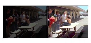
Screen Shot 2018-07-25 at 10.24.22 AM.jpg
Original on the left, pushed to ultra bright for effect on the right. Just insane the amount of underexposure. It looks like a joke, as if I added additional curves adjust to make it look that dark.

It's one thing to expose like this for a dark bedroom night scene, but quite another for an outdoor mid day southern california day.
 
Last edited:
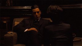
I hear people cite Gordon Willis as an inspiration for the darkness, but Willis was working with actual darkness, not just under exposing to add a cast or patina to the image.
View attachment 131944
View attachment 131945
The-Godfather-Trilogy-08.jpg
There is darkness, yet contrast. There is darkness, yet a darkness that feels motivated because a room is dark, not because the camera was underexposing.
 
Last edited:
@JPnola

I feel these examples are still motivated darkness.

View attachment 131949

What I am talking about is the arbitrary underexposing across all scenes irrespective of their content to give a look or style to an image.
 
Last edited:
It is looking like it is becoming a part of the cinematic zeitgeist language of this era.

Curious to know why you all might surmise the reasoning is.
 
It is looking like it is becoming a part of the cinematic zeitgeist language of this era.

Curious to know why you all might surmise the reasoning is.
Just saying and repeating that is it so does not make it so.

I think a camera operator who consistently underexposes because he feels it is the trend does not know what he is doing.

You expose right (unless it is something extraordinary or psychedelic) and leave the grading and effects to post.
 
2014:

The reason the 'lit normal' looks more like video if darkened in post is specular highlights. Shoot with really diffuse light and it won't be an issue to darken in post.

As for zeitgeist, after darkness comes light! There is a major shift happening right now, can you feel it?
 
Some cinematographers are shooting ridiculously dark, others more mildly.

Christopher Blauvelt:
"Don't Worry, He Won't Get Far on Foot" (2018)
"Certain Women" (2016)
"Mid90s" (2018)

Bradford Young:
"Solo" (2018)
"Arrival" (2015)

Rachel Morrison:
"Mudbound" (2017)

Zoe White:
"Hand Maiden's Tale"
"JOSIE"

Jess Hall's work in "Serenity" gets the highlight darkening:
Screen Shot 2018-07-25 at 12.57.59 PM.jpg

So, while not all shooters are actually under exposing, the trend for dark is pretty obvious.

And there is a growing number of instagram DP's shooting very dark.

In any case, the darkness or muted highlights, and variations, the general trend of the hip films are darker.
 
Certainly interesting observation. I'm more curious about what you think about it. After all, it is your feelings about your observation that has led you to start this thread. This way, if it's anchored on your opinion, it can prompt others to better respond. This way we're not talking about trying to state objective facts about if it is or if it isn't, we can respond to you.

Sorry if this sounds snarky, not trying to be. It's just a confrontational request so it is easy to come across as a jab or some such thing. But just curious and I think it could help the conversation flow better...but then again, I could be wrong :)
 
I think he has made himself reasonably clear in the title and in his comments.

Dark is the new Bokeh - an effect for effects sake without motivation. He also said "What I am talking about is the arbitrary underexposing across all scenes irrespective of their content.... He also said "ridiculously underexposed". So it's use without purpose, overused, unmotivated, going too far.

It's not new. It's like any video look/effect; someone does something new and everyone copies it for a while until it becomes old and something new comes along.
 
I think my opinions as, Paul F said, are pretty clear, but I am seeing if any one else has insights into the look. It is interesting in the dawn of HDR, that ultra low contrast and squashing of highlights becomes a thing.
 
Back
Top