Hey Everyone,
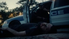
Still relatively new with the F35. Still trying to figure out how to maximize the grade best I can / how far can it be pushed before it becomes distasteful. Would love some feedback from members that have ample experience grading the F35 ( in ACES if possible ) or just some feedback from fresh eyes. What you like / don't like or any tips of the sort. I'm trying to avoid luts and accomplish the grade in ACES. Using the latest version of resolve. I'm not opposed to using luts by any means but I'm also trying to move away from relying on them. I'm working with a novice editor who has a terrible computer lol the plan is to grade all the footage first as a first pass, give him all the footage in one long clip to cut up ( in a compressed format he can handle ), then give me the complete edit to tweak color if needed. Not ideal but it is what it is, I'm really trying to dial the look in now. As always with the F35 I'm really trying to push that high end classic cinematic look with personal taste of cooler / darker vibes. The screen grabs are what I have as the first pass now. I got involved in the project as a favor to a friend so dont judge the process Thanks!!
Still relatively new with the F35. Still trying to figure out how to maximize the grade best I can / how far can it be pushed before it becomes distasteful. Would love some feedback from members that have ample experience grading the F35 ( in ACES if possible ) or just some feedback from fresh eyes. What you like / don't like or any tips of the sort. I'm trying to avoid luts and accomplish the grade in ACES. Using the latest version of resolve. I'm not opposed to using luts by any means but I'm also trying to move away from relying on them. I'm working with a novice editor who has a terrible computer lol the plan is to grade all the footage first as a first pass, give him all the footage in one long clip to cut up ( in a compressed format he can handle ), then give me the complete edit to tweak color if needed. Not ideal but it is what it is, I'm really trying to dial the look in now. As always with the F35 I'm really trying to push that high end classic cinematic look with personal taste of cooler / darker vibes. The screen grabs are what I have as the first pass now. I got involved in the project as a favor to a friend so dont judge the process
Thanks!!